Skip to content

How to fix header side as boxed

Solved Customisation
10 3 3.0k 1
  • wrote on last edited by
    #1

    Hi again,
    Could we fix header as boxed type? I wanna fix it like contet size.
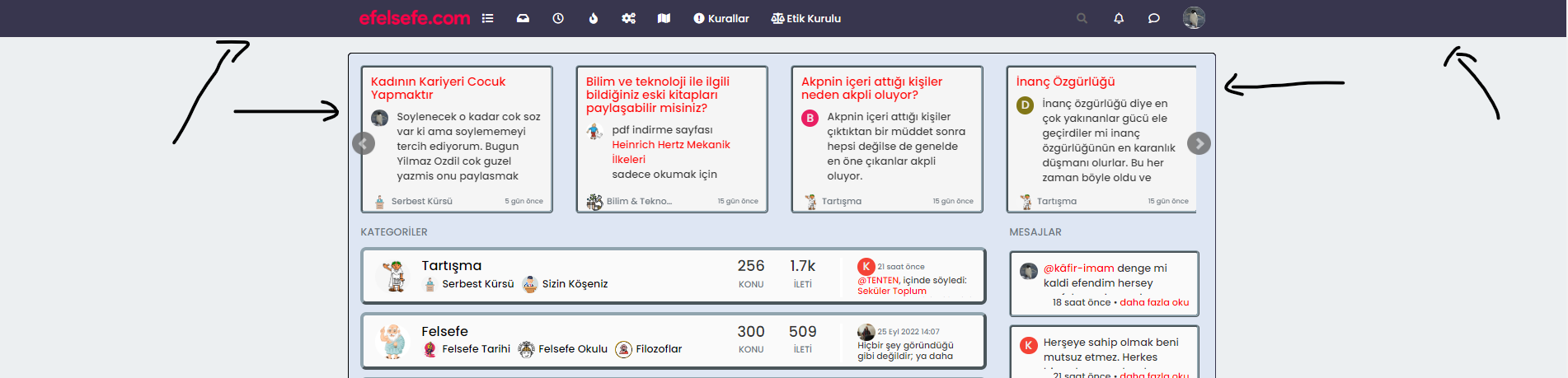
    be25cf49-9a59-4f96-b80c-fdd13bc3ac31-image.png

  • Hi again,
    Could we fix header as boxed type? I wanna fix it like contet size.

    be25cf49-9a59-4f96-b80c-fdd13bc3ac31-image.png

    wrote on last edited by
    #2

    @cagatay Hi - do you want the view wider ?

    You can amend the container class such as below

    @media (min-width: 1200px) {
    .container {
        width: 1920px;
    }
    }
    

    That would give you the below

    b1d416f6-6130-43c5-b58b-d181a2d0bb2f-image.png

  • @cagatay Hi - do you want the view wider ?

    You can amend the container class such as below

    @media (min-width: 1200px) {
    .container {
        width: 1920px;
    }
    }
    

    That would give you the below

    b1d416f6-6130-43c5-b58b-d181a2d0bb2f-image.png

    wrote on last edited by cagatay
    #3

    @phenomlab no dear i want to view header side like boxed type not wide. Where is dark blue colored.

  • @phenomlab no dear i want to view header side like boxed type not wide. Where is dark blue colored.

    wrote on last edited by DownPW
    #4

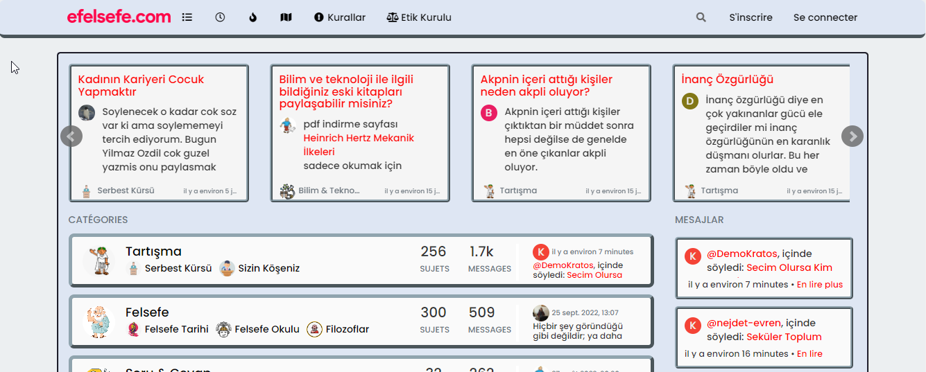
    @cagatay

    like this ?

    36afb9c2-9d47-4a15-b194-c1e5bdd291b4-image.png

    if yes :

    .navbar-fixed-top {
        background: #dee6f3;
        border-bottom: 5px outset #90A4AE;
        border-radius: 8px;
    }
    
    .navbar-default .navbar-nav>li>a {
        color: #000;
    }
    
  • @cagatay

    like this ?

    36afb9c2-9d47-4a15-b194-c1e5bdd291b4-image.png

    if yes :

    .navbar-fixed-top {
        background: #dee6f3;
        border-bottom: 5px outset #90A4AE;
        border-radius: 8px;
    }
    
    .navbar-default .navbar-nav>li>a {
        color: #000;
    }
    
    wrote on last edited by cagatay
    #5

    @DownPW no, I want the header to align with the contents of my homepage.
    i want to narrow my header which shown photo. (header = navbar)
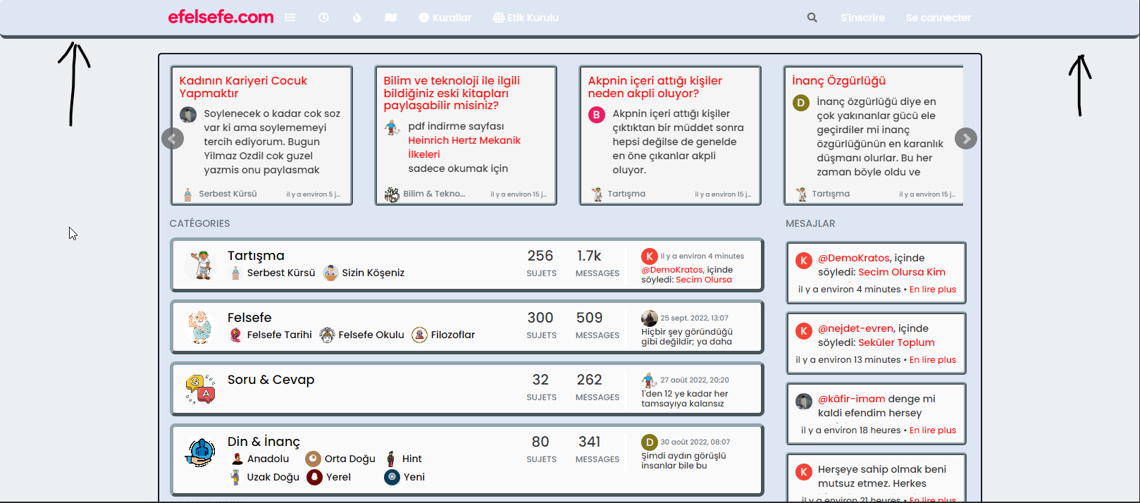
    bf6584da-bdd4-4f2d-ac70-5c50c5aee05f-image.png

  • @DownPW no, I want the header to align with the contents of my homepage.
    i want to narrow my header which shown photo. (header = navbar)

    bf6584da-bdd4-4f2d-ac70-5c50c5aee05f-image.png

    wrote on last edited by
    #6

    @cagatay You want the header to be the same width as the main content, yes? I personally wouldn’t do that because if you do, it’s likely to impact the main content

  • @DownPW no, I want the header to align with the contents of my homepage.
    i want to narrow my header which shown photo. (header = navbar)

    bf6584da-bdd4-4f2d-ac70-5c50c5aee05f-image.png

    wrote on last edited by DownPW
    #7

    @cagatay

    ha okkk sorry

    yo ucan play with left and right like this :

    .navbar-fixed-bottom, .navbar-fixed-top {
        position: fixed;
        right: 80px;
        left: 80px;
        z-index: 1030;
    }
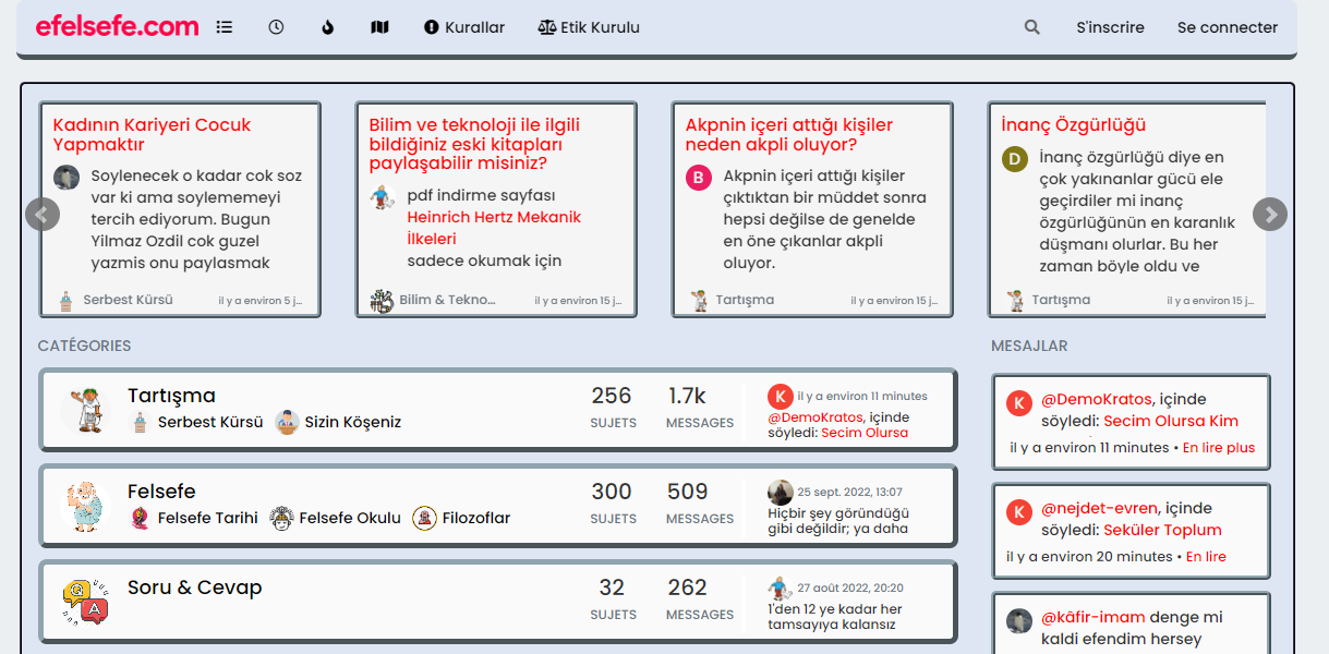
    

    2e6472ad-f947-49a0-9539-be7a83463bcc-image.png

    EDIT:

    But @phenomlab is right, this can be a problem depending on the content of this element 🙂

  • @cagatay

    ha okkk sorry

    yo ucan play with left and right like this :

    .navbar-fixed-bottom, .navbar-fixed-top {
        position: fixed;
        right: 80px;
        left: 80px;
        z-index: 1030;
    }
    

    2e6472ad-f947-49a0-9539-be7a83463bcc-image.png

    EDIT:

    But @phenomlab is right, this can be a problem depending on the content of this element 🙂

    wrote on last edited by
    #8

    @DownPW Whilst this works, I wouldn’t recommend changing it. The CSS above is global in nature and will be effective against all breakpoints, including mobile, which doesn’t work very well for the user experience. The theme is responsive out of the box, so (in my view) you should leave it as it is.

    It’s the Bootstrap standard 🙂

  • @DownPW Whilst this works, I wouldn’t recommend changing it. The CSS above is global in nature and will be effective against all breakpoints, including mobile, which doesn’t work very well for the user experience. The theme is responsive out of the box, so (in my view) you should leave it as it is.

    It’s the Bootstrap standard 🙂

    wrote on last edited by
    #9

    @phenomlab absolutely👍

  • @DownPW Whilst this works, I wouldn’t recommend changing it. The CSS above is global in nature and will be effective against all breakpoints, including mobile, which doesn’t work very well for the user experience. The theme is responsive out of the box, so (in my view) you should leave it as it is.

    It’s the Bootstrap standard 🙂

    wrote on last edited by cagatay
    #10

    @phenomlab yes it caused a problem for mobile users.
    thank you for helping …

  • cagatay cagatay has marked this topic as solved on

Did this solution help you?
Did you find the suggested solution useful? Support 💗 Sudonix with a coffee ☕
If your organisation needs deeper expertise around infrastructure, security, or technology leadership, learn more about Phenomlab Ltd. Many of the deeper technical guides behind Sudonix are published there.

Related Topics
  • Nodebb and emails

    Solved Configure nodebb
    27
    5 Votes
    27 Posts
    10k Views
    phenomlab
    @Panda it will use SMTP. In all cases, I never use any plugin to send email. I’ll always send it raw.
  • Sidebar Widget is no longer on the side!

    Moved Solved General nodebb
    4
    2
    2 Votes
    4 Posts
    1k Views
    phenomlab
    @Panda said in Sidebar Widget is no longer on the side!: Ah, so sidebar wont work on mobile? Correct. If you review the docs on bootstrap, you’ll notice that it is designed on a grid system https://getbootstrap.com/docs/5.0/layout/grid/ What I mean by changing the category is moving it on here to general as you posted it in bugs, when it isn’t.
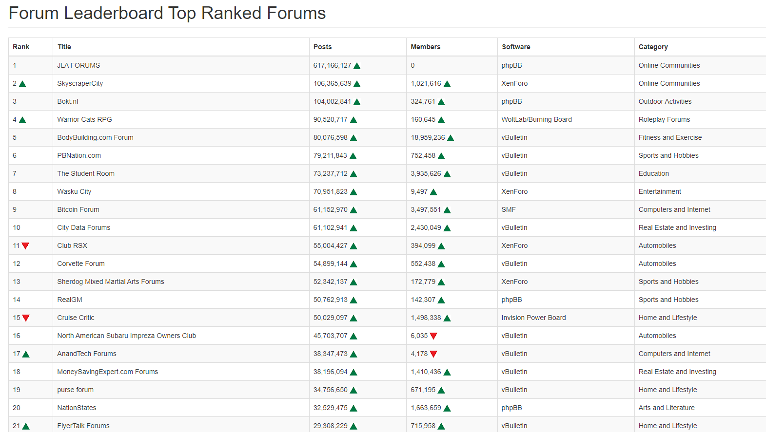
  • Top Ranked Forums

    Chitchat nodebb top ranked
    9
    1
    3 Votes
    9 Posts
    3k Views
    phenomlab
    The real issue here is that most people consider forums to be “dead” in the sense that nobody uses them anymore, and social media groups have taken their place. Their once dominant stance in the 90’s and early 00’s will never be experienced again, but having said that, there are a number of forums that did in fact survive the social media onslaught, and still enjoy a large user base. Forums tend to be niche. One that immediately sticks out is Reddit - despite looking like it was designed in the 80s, it still has an enormous user base. Another is Stack Overflow, which needs no introduction. The key to any forum is the content it offers, and the more people whom contribute in terms of posting , the more popular and widely respected it becomes as a reliable source of information. Forums are still intensely popular with gamers, alongside those that offer tips on hacking etc.
  • Blinking text Effect

    Customisation nodebb text effect css
    3
    5 Votes
    3 Posts
    2k Views
    DownPW
    @phenomlab I love it too @phenomlab said in Blinking text Effect: Has that “broken neon light” look that you see in films. It’s exactly that, kind of old neon signs of bar or pubs a bit cyberpunk too
  • 11 Votes
    23 Posts
    10k Views
    phenomlab
    @DownPW No issues. Thanks to the Google Chrome “bug”, it does have some restrictions, but works fine other than that. I have an odd issue where it doesn’t work on Firefox mobile, but works fine on Firefox desktop.
  • NodeBB 1.19.3

    Solved Performance nodebb 1.19.3 performance
    33
    4 Votes
    33 Posts
    16k Views
    DownPW
    @phenomlab I find the problem Mark The error message indicated this path : http://localhost:4567/assets/plugins/nodebb-plugin-emoji/emoji/styles.css?v=6983dobg16u I change the path url on config.json [image: 47bacc80-f141-41e4-a261-3f8d650cc6f6-image.png] And all it’s good Weird, I didn’t have to change that path before 1.19.3 But this does not prevent the problem from a clean install with Emoji Plugin EDIT: After test, that resolv the problem installation for 1.18.x but not for 1.19.x (I have other error message when I run ./nodebb Setup For resume: NodeJS 16_x with 1.18.x is ok
  • Adjusting the size of boxes in posts-list class

    Solved Customisation nodebb
    3
    3 Votes
    3 Posts
    2k Views
    crazycells
    @phenomlab thanks a lot, this combination works best .posts-list .posts-list-item .content { overflow: auto; max-height: 600px; }
  • Avatar on Topic Header

    Solved Customisation css avatar header
    9
    1
    0 Votes
    9 Posts
    3k Views
    JAC
    @jac said in Avatar on Topic Header: @downpw said in Avatar on Topic Header: Great Plugin I make it a bit cleaner via this CSS code: /*------------------------------------------------------------------*/ /*---------------- nodebb-plugin-browsing-users -----------------*/ /*------------------------------------------------------------------*/ /*Space between the avatar and the RSS icon */ .topic [component="topic/browsing-users"] { margin-bottom: -5px; padding-left: 10px; } /*Space between avatars*/ .pull-left { float: left!important; padding-right: 5px; } Do you have a screenshot of how this looks with the CSS change? Just added this change, thanks @DownPW