Skip to content

How to fix header side as boxed

Solved Customisation
10 3 3.0k 1
  • wrote on last edited by
    #1

    Hi again,
    Could we fix header as boxed type? I wanna fix it like contet size.
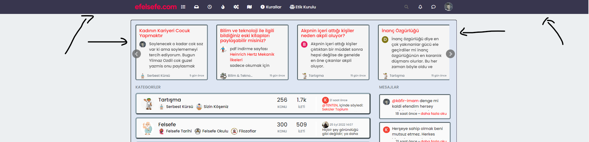
    be25cf49-9a59-4f96-b80c-fdd13bc3ac31-image.png

  • Hi again,
    Could we fix header as boxed type? I wanna fix it like contet size.

    be25cf49-9a59-4f96-b80c-fdd13bc3ac31-image.png

    wrote on last edited by
    #2

    @cagatay Hi - do you want the view wider ?

    You can amend the container class such as below

    @media (min-width: 1200px) {
    .container {
        width: 1920px;
    }
    }
    

    That would give you the below

    b1d416f6-6130-43c5-b58b-d181a2d0bb2f-image.png

  • @cagatay Hi - do you want the view wider ?

    You can amend the container class such as below

    @media (min-width: 1200px) {
    .container {
        width: 1920px;
    }
    }
    

    That would give you the below

    b1d416f6-6130-43c5-b58b-d181a2d0bb2f-image.png

    wrote on last edited by cagatay
    #3

    @phenomlab no dear i want to view header side like boxed type not wide. Where is dark blue colored.

  • @phenomlab no dear i want to view header side like boxed type not wide. Where is dark blue colored.

    wrote on last edited by DownPW
    #4

    @cagatay

    like this ?

    36afb9c2-9d47-4a15-b194-c1e5bdd291b4-image.png

    if yes :

    .navbar-fixed-top {
        background: #dee6f3;
        border-bottom: 5px outset #90A4AE;
        border-radius: 8px;
    }
    
    .navbar-default .navbar-nav>li>a {
        color: #000;
    }
    
  • @cagatay

    like this ?

    36afb9c2-9d47-4a15-b194-c1e5bdd291b4-image.png

    if yes :

    .navbar-fixed-top {
        background: #dee6f3;
        border-bottom: 5px outset #90A4AE;
        border-radius: 8px;
    }
    
    .navbar-default .navbar-nav>li>a {
        color: #000;
    }
    
    wrote on last edited by cagatay
    #5

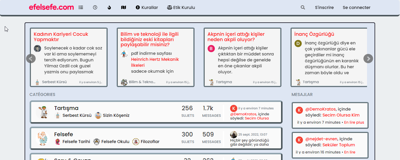
    @DownPW no, I want the header to align with the contents of my homepage.
    i want to narrow my header which shown photo. (header = navbar)
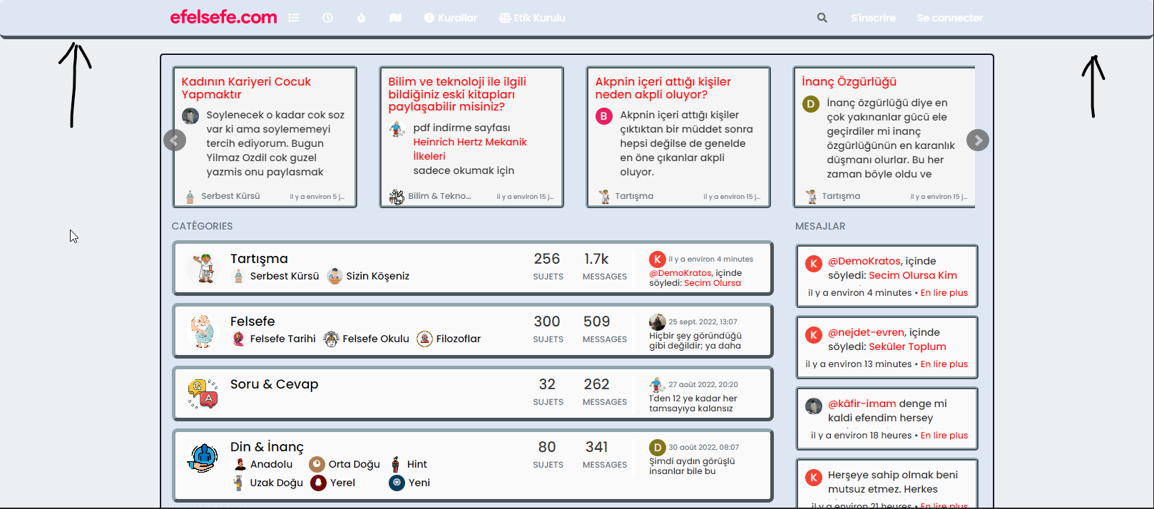
    bf6584da-bdd4-4f2d-ac70-5c50c5aee05f-image.png

  • @DownPW no, I want the header to align with the contents of my homepage.
    i want to narrow my header which shown photo. (header = navbar)

    bf6584da-bdd4-4f2d-ac70-5c50c5aee05f-image.png

    wrote on last edited by
    #6

    @cagatay You want the header to be the same width as the main content, yes? I personally wouldn’t do that because if you do, it’s likely to impact the main content

  • @DownPW no, I want the header to align with the contents of my homepage.
    i want to narrow my header which shown photo. (header = navbar)

    bf6584da-bdd4-4f2d-ac70-5c50c5aee05f-image.png

    wrote on last edited by DownPW
    #7

    @cagatay

    ha okkk sorry

    yo ucan play with left and right like this :

    .navbar-fixed-bottom, .navbar-fixed-top {
        position: fixed;
        right: 80px;
        left: 80px;
        z-index: 1030;
    }
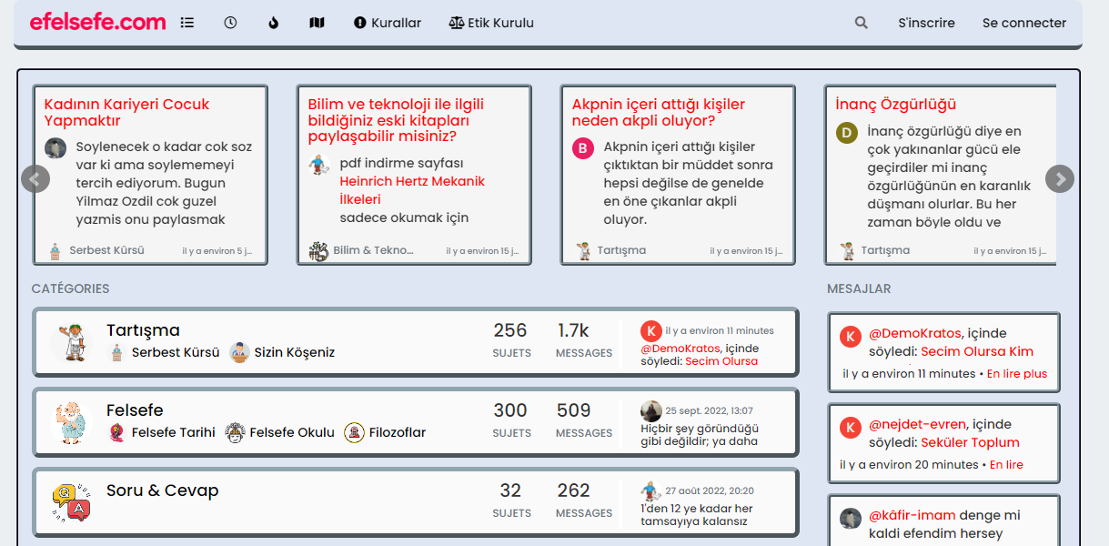
    

    2e6472ad-f947-49a0-9539-be7a83463bcc-image.png

    EDIT:

    But @phenomlab is right, this can be a problem depending on the content of this element 🙂

  • @cagatay

    ha okkk sorry

    yo ucan play with left and right like this :

    .navbar-fixed-bottom, .navbar-fixed-top {
        position: fixed;
        right: 80px;
        left: 80px;
        z-index: 1030;
    }
    

    2e6472ad-f947-49a0-9539-be7a83463bcc-image.png

    EDIT:

    But @phenomlab is right, this can be a problem depending on the content of this element 🙂

    wrote on last edited by
    #8

    @DownPW Whilst this works, I wouldn’t recommend changing it. The CSS above is global in nature and will be effective against all breakpoints, including mobile, which doesn’t work very well for the user experience. The theme is responsive out of the box, so (in my view) you should leave it as it is.

    It’s the Bootstrap standard 🙂

  • @DownPW Whilst this works, I wouldn’t recommend changing it. The CSS above is global in nature and will be effective against all breakpoints, including mobile, which doesn’t work very well for the user experience. The theme is responsive out of the box, so (in my view) you should leave it as it is.

    It’s the Bootstrap standard 🙂

    wrote on last edited by
    #9

    @phenomlab absolutely👍

  • @DownPW Whilst this works, I wouldn’t recommend changing it. The CSS above is global in nature and will be effective against all breakpoints, including mobile, which doesn’t work very well for the user experience. The theme is responsive out of the box, so (in my view) you should leave it as it is.

    It’s the Bootstrap standard 🙂

    wrote on last edited by cagatay
    #10

    @phenomlab yes it caused a problem for mobile users.
    thank you for helping …

  • cagatay cagatay has marked this topic as solved on

Did this solution help you?
Did you find the suggested solution useful? Support 💗 Sudonix with a coffee ☕
If your organisation needs deeper expertise around infrastructure, security, or technology leadership, learn more about Phenomlab Ltd. Many of the deeper technical guides behind Sudonix are published there.

Related Topics
  • Whitespace fixes in Nodebb

    Solved Customisation nodebb
    18
    2
    7 Votes
    18 Posts
    6k Views
    phenomlab
    @Panda Just circling back here with something of an update (which I think you’ll like). I’ve completely restructured the ranking system. There are now less ranks, with a higher point threshold to reach them. More importantly, if you reload the site, you’ll notice that the ranks are now icons. I also removed the “Author” badge, and made this a single icon, which (to me) looks much better.
  • Header Menu After Upgrading V3.1.1

    Solved Customisation header nodebb
    2
    1
    2 Votes
    2 Posts
    1k Views
    phenomlab
    @cagatay this relates to a change the css classes used for the brand header meaning it will now float to the left instead of right. If you’d like to retain the original behavior, you can add this css class [data-widget-area="brand-header"] { justify-content: end; display: flex; } Further information here https://community.nodebb.org/topic/17090/manual-build-a-custom-header-in-harmony/19?_=1684069325296
  • How to fix size of photos & videos NodeBB

    Solved Customisation nodebb nodebb size
    7
    3 Votes
    7 Posts
    3k Views
    phenomlab
    @crazycells pleasure. Using percentages makes much more sense in this case. It’s the same argument with px vs pt vs em with fonts, margins, padding, etc., in the sense that em is generally preferred over px and pt https://stackoverflow.com/questions/609517/why-em-instead-of-px
  • Forum Statistics Box

    Solved Customisation customization
    5
    2
    4 Votes
    5 Posts
    2k Views
    phenomlab
    @Sampo2910 said in Forum Statistics Box: Say i wanted new theme for example or again something like this? Yes, exactly the same process.
  • 11 Votes
    23 Posts
    10k Views
    phenomlab
    @DownPW No issues. Thanks to the Google Chrome “bug”, it does have some restrictions, but works fine other than that. I have an odd issue where it doesn’t work on Firefox mobile, but works fine on Firefox desktop.
  • [NODEBB] Welcome Message

    Solved Customisation css html nodebb
    20
    2
    13 Votes
    20 Posts
    9k Views
    phenomlab
    @DownPW the ‘js’ code for the banner takes the time from the client, so what it displays really depends on the regional settings for the operating system. I’ve not seen this issue myself but would like to see some examples of screenshots if possible.
  • Avatar on Topic Header

    Solved Customisation css avatar header
    9
    1
    0 Votes
    9 Posts
    3k Views
    JAC
    @jac said in Avatar on Topic Header: @downpw said in Avatar on Topic Header: Great Plugin I make it a bit cleaner via this CSS code: /*------------------------------------------------------------------*/ /*---------------- nodebb-plugin-browsing-users -----------------*/ /*------------------------------------------------------------------*/ /*Space between the avatar and the RSS icon */ .topic [component="topic/browsing-users"] { margin-bottom: -5px; padding-left: 10px; } /*Space between avatars*/ .pull-left { float: left!important; padding-right: 5px; } Do you have a screenshot of how this looks with the CSS change? Just added this change, thanks @DownPW
  • WordPress & NodeBB

    Solved WordPress
    6
    0 Votes
    6 Posts
    3k Views
    phenomlab
    @jac That won’t matter. You just redirect at nginx or apache level and it’ll work. The generally accepted standard though is to use a subdomain.