fading in /tags page

-
@DownPW said in fading in /tags page:
.header .forum-logo, img.forum-logo.head {
max-height: 50px;
width: auto;
height: 30px;
margin-top: 9px;
max-width: 150px;
min-width: 32px;
display: inline-block;
animation-name: rotate180, rotate0;
animation-duration: 1000ms;
animation-delay: 0s, 1000ms;
animation-iteration-count: 1;
animation-timing-function: linear;
transition: transform 1000ms ease-in-out;
}like this ? Because I have the effect but just at the refresh page and not on Mouse over
.header .forum-logo, img.forum-logo.head:hover {
    max-height: 50px;
    width: auto;
    height: 30px;
    margin-top: 9px;
    max-width: 150px;
    min-width: 32px;
    display: inline-block;
    animation-name: rotate180, rotate0;
    animation-duration: 1000ms;
    animation-delay: 0s, 1000ms;
    animation-iteration-count: 1;
    animation-timing-function: linear;
    transition: transform 1000ms ease-in-out;

    @keyframes rotate180 {
        from {
          transform: rotate(0deg);
        }

        to {
          transform: rotate(180deg);
        }
      }

      @keyframes rotate0 {
        from {
          transform: rotate(180deg);
        }

        to {
          transform: rotate(0deg);
        }
      }

}
EDIT:
I have it !!!
@keyframes rotate180 { from { transform: rotate(0deg); } to { transform: rotate(180deg); } } @keyframes rotate0 { from { transform: rotate(180deg); } to { transform: rotate(0deg); } } .header .forum-logo:hover { display: inline-block; animation-name: rotate180, rotate0; animation-duration: 1000ms; animation-delay: 0s, 1000ms; animation-iteration-count: 1; animation-timing-function: linear; transition: transform 1000ms ease-in-out; }@DownPW thanks for the codes, how should we edit it if we want a full turn? and keep turning as long as the mouse is hovered on?
-
@DownPW thanks for the codes, how should we edit it if we want a full turn? and keep turning as long as the mouse is hovered on?
@crazycells change
180to360on the keyframes and set to time toinfiniteon the animation, so an example would beanimation-iteration-count: infinite;Don’t do this on mobile devices though as performance will be greatly impacted.
Mark Cutting also advises organisations as a Fractional CIO, Fractional CISO and Executive Advisor, helping boards improve technology governance, cyber resilience and executive decision making. Learn more at Phenomlab Ltd
-
@crazycells change
180to360on the keyframes and set to time toinfiniteon the animation, so an example would beanimation-iteration-count: infinite;Don’t do this on mobile devices though as performance will be greatly impacted.
@phenomlab thanks

-
hmmm
Strange with the code I put above, as soon as I remove the mouse pointer from the logo, it returns to it’s original place and it cuts the animation.
How can we let the animation end even if we remove the mouse pointer from the logo ?
PW and WS Spirit alive
-
-
hmmm
Strange with the code I put above, as soon as I remove the mouse pointer from the logo, it returns to it’s original place and it cuts the animation.
How can we let the animation end even if we remove the mouse pointer from the logo ?
@DownPW said in fading in /tags page:
as soon as I remove the mouse pointer from the logo, it returns to it’s original place and it cuts the animation.
Yes, that’s expected because you have the css set for
hoverstate meaning once you remove that state, the animation will stop
You need to refactor the css to achieve the effect the looking for. Personally, I wouldn’t go for a constantly spinning logo. If you’re as old as I am, you’ll recall this being a thing in Internet Explorer 4 with the spinning globe on the right that was a constant presence and quite a distraction.
I also wouldn’t do this on any mobile devices as it can severely degrade the browser performance.
Mark Cutting also advises organisations as a Fractional CIO, Fractional CISO and Executive Advisor, helping boards improve technology governance, cyber resilience and executive decision making. Learn more at Phenomlab Ltd
-
@DownPW said in fading in /tags page:
as soon as I remove the mouse pointer from the logo, it returns to it’s original place and it cuts the animation.
Yes, that’s expected because you have the css set for
hoverstate meaning once you remove that state, the animation will stopYou need to refactor the css to achieve the effect the looking for. Personally, I wouldn’t go for a constantly spinning logo. If you’re as old as I am, you’ll recall this being a thing in Internet Explorer 4 with the spinning globe on the right that was a constant presence and quite a distraction.
I also wouldn’t do this on any mobile devices as it can severely degrade the browser performance.
no no my god, not constantly animation !!
If I hover over the logo, the animation triggers as currently, continues and ends even if I remove the mouse from the logo.
That’s what’s happening here on Sudonix.
PW and WS Spirit alive
-
no no my god, not constantly animation !!
If I hover over the logo, the animation triggers as currently, continues and ends even if I remove the mouse from the logo.
That’s what’s happening here on Sudonix.
@DownPW I see what you mean. The reason for this is that you are calling both
rotate180androtate0which are two separate effects.animation-name: rotate180, rotate0;You could remove
rotate0from this section and that will stop the animation as soon as themouseLeaveevent is triggered in theDOM(in other words, as soon as you remove the hover)animation-name: rotate180; -
hmm not work
can you provide your CSS code and keyframe for I see it ?
On sudonix, the animation stop and restart when we leave the mouse over.PW and WS Spirit alive
-
hmm not work
can you provide your CSS code and keyframe for I see it ?
On sudonix, the animation stop and restart when we leave the mouse over.@DownPW it’s here
https://sudonix.com/post/3590The exact CSS I have here is
@keyframes rotate180 { from { transform: rotate(0deg); } to { transform: rotate(180deg); } } @keyframes rotate0 { from { transform: rotate(180deg); } to { transform: rotate(0deg); } } .forum-logo:hover { transform: rotate(180deg); } .hover { transform: rotate(180deg); } -
 undefined phenomlab forked this topic on
-
The tags page looked better before, it does not look good when it is very “ordered”. @phenomlab do you have any intention to change that page in harmony thema?
-
The tags page looked better before, it does not look good when it is very “ordered”. @phenomlab do you have any intention to change that page in harmony thema?
@crazycells I must admit, I’ve neglected the tags page somewhat, but I do agree with you - it’s pretty dull and could do with some magic.
-
The tags page looked better before, it does not look good when it is very “ordered”. @phenomlab do you have any intention to change that page in harmony thema?
@crazycells just for you…

Mark Cutting also advises organisations as a Fractional CIO, Fractional CISO and Executive Advisor, helping boards improve technology governance, cyber resilience and executive decision making. Learn more at Phenomlab Ltd
-
@crazycells just for you…
@phenomlab nice
 this looks very good…
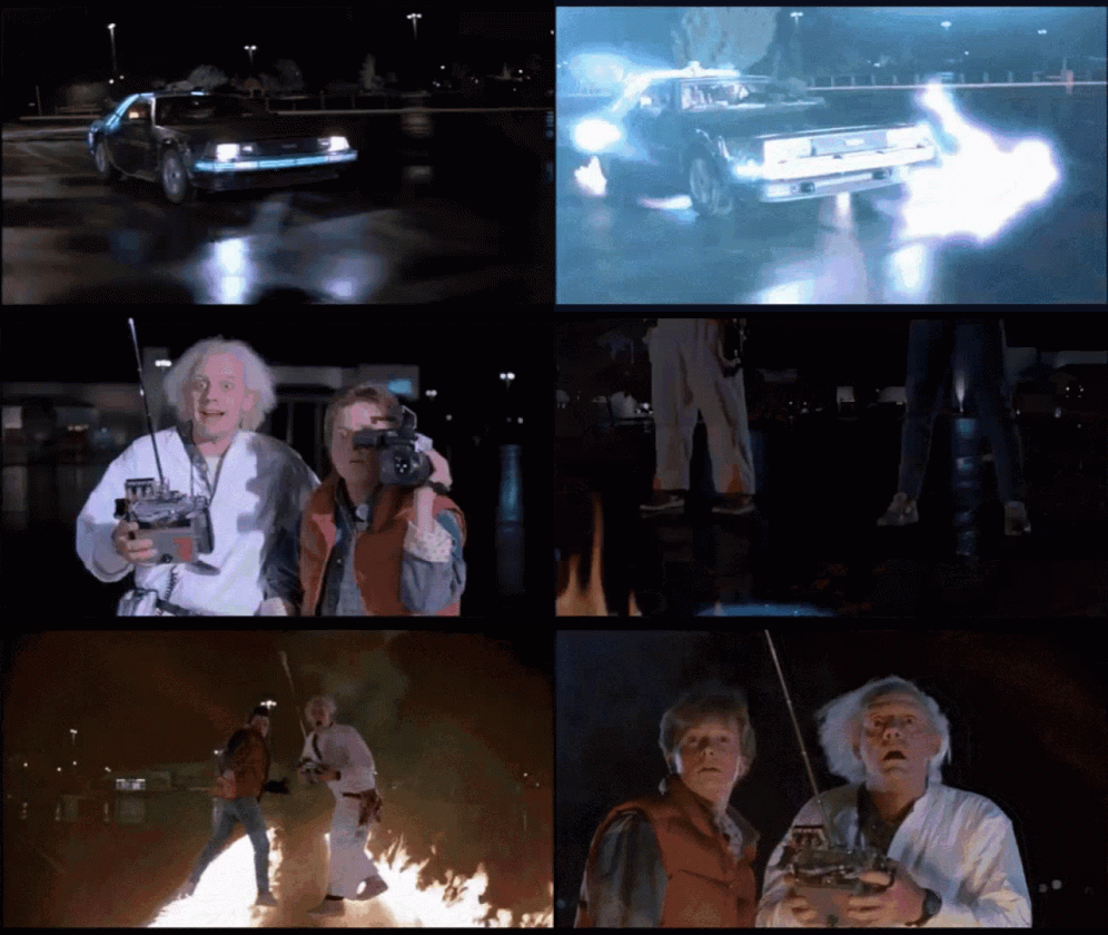
On a side note, I have been just watching/listening Doc and Marty’s adventures in the background and then I see this

-
@phenomlab can you please share the CSS codes?
-
@phenomlab can you please share the CSS codes?
@crazycells Of course… You did ask me for these

.tags:not([component="topic/tags"]) a[href*="/tags/"] { border: 1px solid var(--bs-border-color); border-radius: 0.375rem; margin: 8px; width: 145px; background: var(--bs-body-navbar); } /* SIBLING FADE: fade out siblings around a hovered item */ .tag-list { visibility: hidden; } /* Prevents :hover from triggering in the gaps between items */ .tag-list > * { visibility: visible; } /* Brings the child items back in, even though the parent is `hidden` */ .tag-list > * { transition: opacity 150ms linear 100ms, transform 150ms ease-in-out 100ms; } /* Makes the fades smooth with a slight delay to prevent jumps as the mouse moves between items */ .tag-list:hover > * { opacity: 0.4; transform: scale(0.9); } /* Fade out all items when the parent is hovered */ .tag-list > *:hover { opacity: 1; transform: scale(1); transition-delay: 0ms, 0ms; } /* Fade in the currently hovered item */ .tags a[href*="/tags/"] .tag-item { border-bottom: 4px solid var(--bs-border-color) !important; } -
And the magic happens
Same effect as on the V2 but I love it ^^
PW and WS Spirit alive
-
@DownPW Thanks, and welcome to “Grand Master” status
-
Ohhh yes

-
hi mark
just a small note
seems to that code break tags on topic header :

PW and WS Spirit alive




Hello! It looks like you're interested in this conversation, but you don't have an account yet.
Getting fed up of having to scroll through the same posts each visit? When you register for an account, you'll always come back to exactly where you were before, and choose to be notified of new replies (either via email, or push notification). You'll also be able to save bookmarks and upvote posts to show your appreciation to other community members.
With your input, this post could be even better 💗
Register Login