[NODEBB] CSS Style Sheets SelectBox
-
I have another CSS problem for me @phenomlab
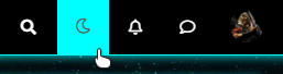
I have set the icon of theme switcher on white with this code:
.navbar-default .btn-link {
    color: #fff;
}
I have set the icon of theme switcher on black when I dropdwown on the menu with this code :
.navbar-default .btn-link:focus, .navbar-default .btn-link:hover {
    color: black;
}
The problem I have:
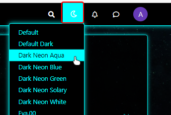
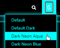
Example on aqua theme, I dropdown the menu for change a theme and I have selected a wrong theme: I select the one already used (aqua)
At this moment, the icon becomes white again and I would like it to remain black.
It’s possible to do that ?
PW and WS Spirit alive
-
EDIT:
Others things I have :
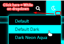
If I Click on fa-faw icon, The icon is black (its’ good) on dropdown :
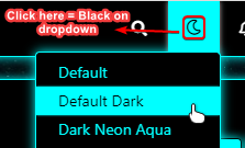
But if I click on background (here aqua), the icon is white on dropdown :
Thanks in advance @phenomlab for your help. See the older post for seeing my code
-
Hi @phenomlab
")
How are you ?
I know you are a busy man.Can you look at my last 2 posts?
I have 2 small issues to solve and I think this is fairly straightforward for you.
I’m a little lost with the fa-faw
Thanks in advance
-
I have another CSS problem for me @phenomlab
I have set the icon of theme switcher on white with this code:
.navbar-default .btn-link {
    color: #fff;
}
I have set the icon of theme switcher on black when I dropdwown on the menu with this code :
.navbar-default .btn-link:focus, .navbar-default .btn-link:hover {
    color: black;
}
The problem I have:
Example on aqua theme, I dropdown the menu for change a theme and I have selected a wrong theme: I select the one already used (aqua)
At this moment, the icon becomes white again and I would like it to remain black.
It’s possible to do that ?
@downpw You should be able to use this in each stylesheet (obviously, set the colour you actually want)
[data-original-title="Theme Switcher"] i { color: #000; } -
The code just change The color icon but not the color when I dropdown to the menu
I prefer 2 colors :
- One on the navbar
- On on hover icon and dropdown
-
-
Ola @phenomlab
If you want we can use team viewer for see that.
@downpw you may need to do this with jQuery. Can you provide a mock-up of what you’re looking for ?
-
Ola @phenomlab
If you want we can use team viewer for see that.
If I don’t use your code, here the icon = KO (Not White like other) :

Icon on Mouse Over and on Click = OK: aqua background, black icon

After click, when dropdown the menu = OK: aqua background, black icon
I I use your code with White color :
[data-original-title="Theme Switcher"] i {
    color: #fff;
}
the icon is white like others = OK

Icon on Mouse Over and on Click = OK: aqua background, black icon
After click, when dropdown the menu = KO : the icon is white and not black

-
In fact , I would loike:
-
The dominant color of each theme in the background of the icon when the mouse is hovered, when the mouse is clicked and when dropdown in the menu.
-
White color of the icon in normal.
-
Black color of the icon when the mouse is hovered, when the mouse is clicked and when dropdown in the menu. (Even choose the color for each theme if possible)
PW and WS Spirit alive
-
-
In fact , I would loike:
-
The dominant color of each theme in the background of the icon when the mouse is hovered, when the mouse is clicked and when dropdown in the menu.
-
White color of the icon in normal.
-
Black color of the icon when the mouse is hovered, when the mouse is clicked and when dropdown in the menu. (Even choose the color for each theme if possible)
@downpw Having looked at this, it will indeed require jQuery. I’m going to look further into this today hopefully.
-
-
Great man
On the default theme. All it’s perfect !!!
That’s why I thought of a CSS problem. Like a variable that I would have forgotten for examplePW and WS Spirit alive
-
Great man
On the default theme. All it’s perfect !!!
That’s why I thought of a CSS problem. Like a variable that I would have forgotten for example@downpw Yes, I saw that. Let me know when the server is available and I’ll have a look.
-
-
@downpw I’ve been able to get somewhere near this with the below custom function I’ve written
	    $(window).on('action:ajaxify.end', function(data) {
	        // Detect if the theme dropdown has been clicked. If it has, change the color to #000000
	        $("#switcher").on("click", function() {
	            $("#switcher i").css("color", "#000000");
	        });
	        // Detect if the theme dropdown has lost focus (clicked something else). If it has, change the color to #FFFFFF
	        $("#switcher").on("focusout", function() {
	            $("#switcher i").css("color", "#ffffff");
	        });
	    });
Test it and let me know ? I’ve already added it, so you don’t need to do anything.
-
It seems to be better when dropdown
")
But when I lost focus, sometimes the icon don’t back again:Example here :

EDIT : see, I have recorded a gif
The problem came on default theme too but it’s normal because it’s a javascript for all the site
PW and WS Spirit alive
-
It seems to be better when dropdown
But when I lost focus, sometimes the icon don’t back again:Example here :
EDIT : see, I have recorded a gif
The problem came on default theme too but it’s normal because it’s a javascript for all the site
@downpw thanks. Might need some tweaking to get it 100% but it’s a start. Will have a more detailed look at this as time permits. I’m back at work as of Monday
 ️
️Mark – Founder, Phenomlab Ltd
Executive IT & Security Leadership
Phenomlab Ltd -
@downpw thanks. Might need some tweaking to get it 100% but it’s a start. Will have a more detailed look at this as time permits. I’m back at work as of Monday
️ -
@phenomlab Of course it is a very good basis for work.
@downpw Small modification to address the default theme icon bug (displayed white when focus lost, when it should be black)
// Bugfix theme switcher button when dropdown / Focus / Not focus
$(window).on('action:ajaxify.end', function(data) {
    var whichTheme = localStorage.getItem("theme");
    if (whichTheme === '') {
        // Assume default theme and set icon color to #000000
        $("#switcher i").css("color", "#000000");
    }
    if (whichTheme !== '') {
        // Assume color theme and set icon color to #ffffff
        $("#switcher i").css("color", "#ffffff");
    }
    // Detect if the theme dropdown has been clicked. If it has, change the color to #000000
    $("#switcher").on("click", function() {
        $("#switcher i").css("color", "#000000");
    });
    // Detect if the theme dropdown has lost focus (clicked something else). If it has, change the color to #FFFFFF
    $("#switcher").on("focusout", function() {
        $("#switcher i").css("color", "#ffffff");
    });
});
Active now, and should also address the other bug you mentioned.
Mark – Founder, Phenomlab Ltd
Executive IT & Security Leadership
Phenomlab Ltd -
@downpw Small modification to address the default theme icon bug (displayed white when focus lost, when it should be black)
// Bugfix theme switcher button when dropdown / Focus / Not focus
$(window).on('action:ajaxify.end', function(data) {
    var whichTheme = localStorage.getItem("theme");
    if (whichTheme === '') {
        // Assume default theme and set icon color to #000000
        $("#switcher i").css("color", "#000000");
    }
    if (whichTheme !== '') {
        // Assume color theme and set icon color to #ffffff
        $("#switcher i").css("color", "#ffffff");
    }
    // Detect if the theme dropdown has been clicked. If it has, change the color to #000000
    $("#switcher").on("click", function() {
        $("#switcher i").css("color", "#000000");
    });
    // Detect if the theme dropdown has lost focus (clicked something else). If it has, change the color to #FFFFFF
    $("#switcher").on("focusout", function() {
        $("#switcher i").css("color", "#ffffff");
    });
});
Active now, and should also address the other bug you mentioned.
I have tested but sorry it’s the same problem.
PW and WS Spirit alive
-
I have tested but sorry it’s the same problem.
@downpw Can you reload the page and try again.
Hello! It looks like you're interested in this conversation, but you don't have an account yet.
Getting fed up of having to scroll through the same posts each visit? When you register for an account, you'll always come back to exactly where you were before, and choose to be notified of new replies (either via email, or push notification). You'll also be able to save bookmarks and upvote posts to show your appreciation to other community members.
With your input, this post could be even better 💗
Register LoginDid this solution help you?
Related Topics
-
-
-
-
-
-
-
-
NodeBB Footer
Solved Customisation
