Discourse Design Change
-
Hello everyone
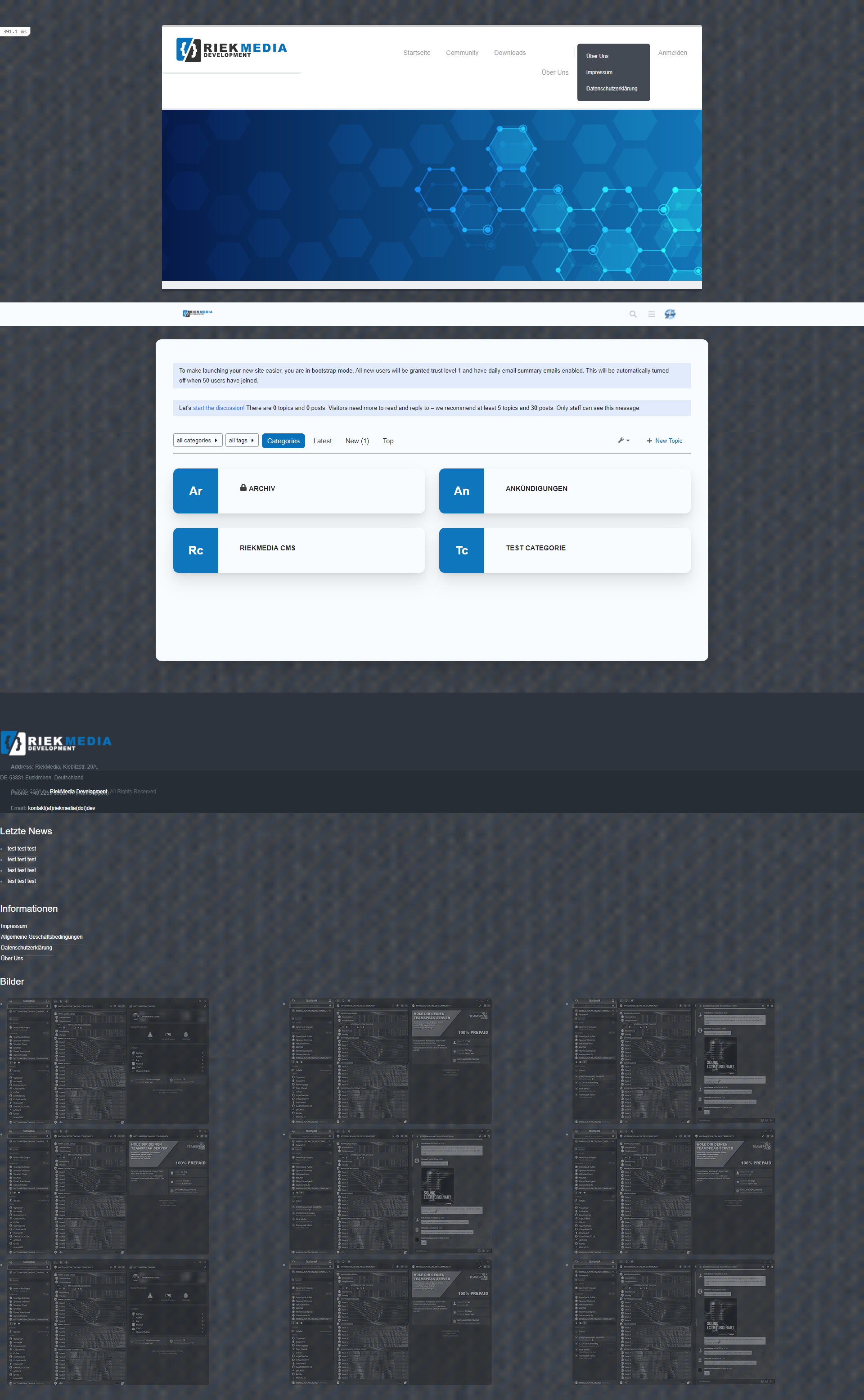
how easy is it to tap a design in Discourse? An editor is also offered as in Nodebb. Just added my design there for the test. The ergibis was then a catastrophe^^Anyone already experiences with it?
PS : @phenomlab Screenshot upload not working, max 2048 kb
Many greetings
RiekMedia -
Hello everyone
how easy is it to tap a design in Discourse? An editor is also offered as in Nodebb. Just added my design there for the test. The ergibis was then a catastrophe^^Anyone already experiences with it?
PS : @phenomlab Screenshot upload not working, max 2048 kb
@riekmedia said in Discourse Design Change:
Hello everyone
how easy is it to tap a design in Discourse? An editor is also offered as in Nodebb. Just added my design there for the test. The ergibis was then a catastrophe^^Anyone already experiences with it?
PS : @phenomlab Screenshot upload not working, max 2048 kb
Definitely be interesting to see this
 .
. -
Hello everyone
how easy is it to tap a design in Discourse? An editor is also offered as in Nodebb. Just added my design there for the test. The ergibis was then a catastrophe^^Anyone already experiences with it?
PS : @phenomlab Screenshot upload not working, max 2048 kb
@riekmedia said in Discourse Design Change:
Screenshot upload not working, max 2048 kb
EDIT - Try now ?
-
@riekmedia said in Discourse Design Change:
Hello everyone
how easy is it to tap a design in Discourse? An editor is also offered as in Nodebb. Just added my design there for the test. The ergibis was then a catastrophe^^Anyone already experiences with it?
PS : @phenomlab Screenshot upload not working, max 2048 kb
Definitely be interesting to see this
.Many greetings
RiekMedia -
@riekmedia Nothing a bit of CSS couldn’t fix.
Mark – Founder, Phenomlab Ltd
Executive IT & Security Leadership
Phenomlab Ltd -
@riekmedia Nothing a bit of CSS couldn’t fix.
@phenomlab I totally agree with you. If you take it exactly you should actually write a new css file with only what you really need.
But and that’s the hack, you are definitely right, assuming you can do it
")
I am definitely not a designer, I love php and c # but design is not my world at all and has never really dealt with it
Many greetings
RiekMedia -
@phenomlab I totally agree with you. If you take it exactly you should actually write a new css file with only what you really need.
But and that’s the hack, you are definitely right, assuming you can do it
I am definitely not a designer, I love php and c # but design is not my world at all and has never really dealt with it
@riekmedia Yes, it wouldn’t be too difficult, but I’d need access to the site of course.
Mark – Founder, Phenomlab Ltd
Executive IT & Security Leadership
Phenomlab Ltd -
@riekmedia Yes, it wouldn’t be too difficult, but I’d need access to the site of course.
@phenomlab I sent you the data via PM.
-
-
-
-
-
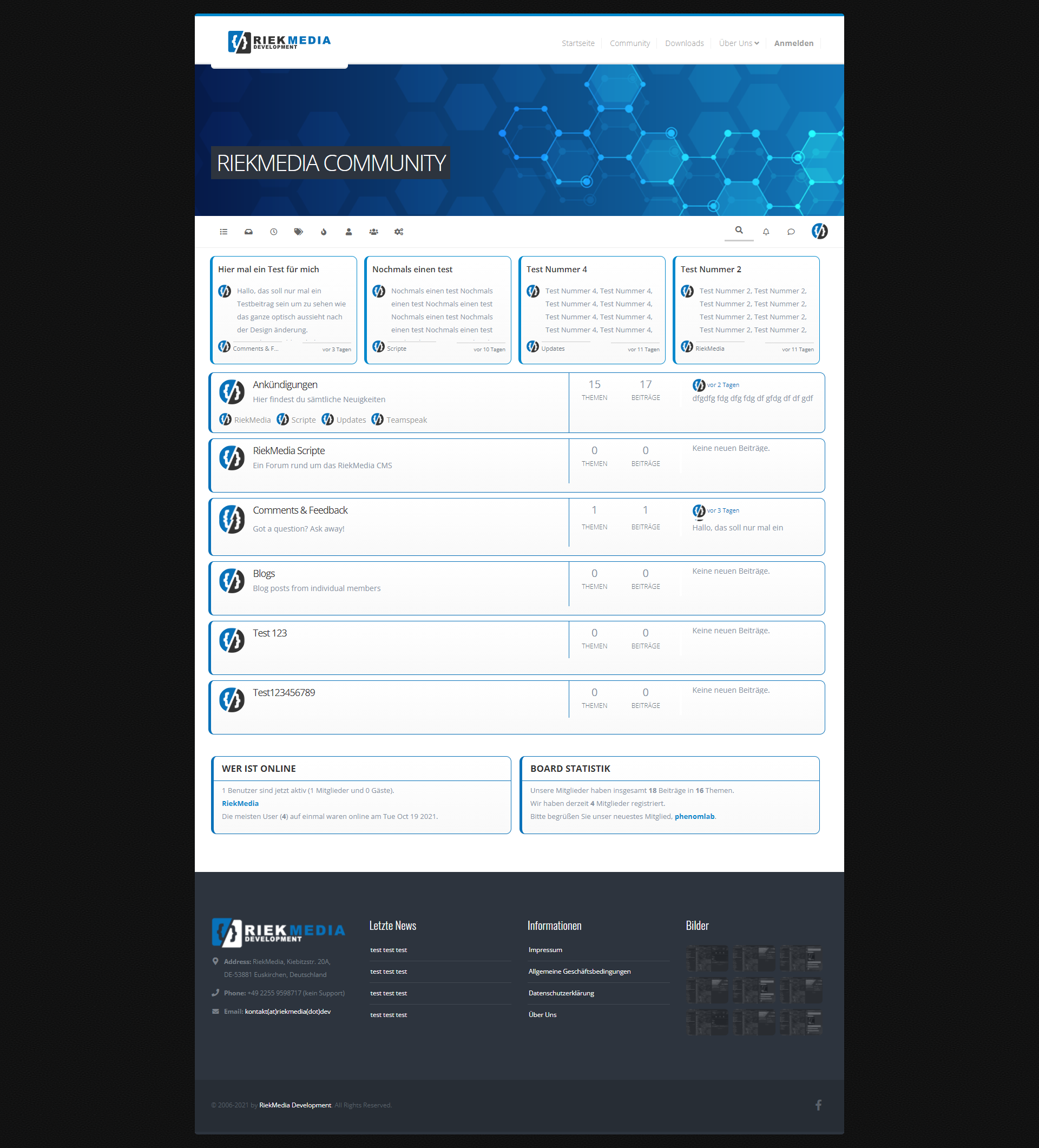
@riekmedia said in Discourse Design Change:
@jac which banner?
On the nodeBB design. I’d be interested to see how you managed to do this? I’ve been thinking of doing something similar with my forum.
-
@riekmedia said in Discourse Design Change:
@jac which banner?
On the nodeBB design. I’d be interested to see how you managed to do this? I’ve been thinking of doing something similar with my forum.
@jac I simply integrated my website design into the forum with the header HTML and the footer as a widget
phenomlab then helped me to eliminate the errors because I had a few difficulties with the footer
-
it doesn’t get better and doesn’t get any better no matter what I do
Many greetings
RiekMedia -
@riekmedia I’ll have a look at this soon.
Mark – Founder, Phenomlab Ltd
Executive IT & Security Leadership
Phenomlab Ltd -
@riekmedia I’ll have a look at this soon.
-
@phenomlab Hey phenomlab, had you already looked in?
@riekmedia Not yet. Sorry
Mark – Founder, Phenomlab Ltd
Executive IT & Security Leadership
Phenomlab Ltd -
@riekmedia Not yet. Sorry
@phenomlab Do you know when you can find time for it? I have to honestly say I can’t do it. Have tried it all the time but with the forum I have real problems to implement it. If only because I can’t access the <html> tag that makes my boxed design. Ne change to div did not bring any real success. I even find that it is much worse and more difficult in the forum software than with Nodebb
Many greetings
RiekMedia -
@phenomlab Do you know when you can find time for it? I have to honestly say I can’t do it. Have tried it all the time but with the forum I have real problems to implement it. If only because I can’t access the <html> tag that makes my boxed design. Ne change to div did not bring any real success. I even find that it is much worse and more difficult in the forum software than with Nodebb
@riekmedia I’ll try and have a look over the weekend. However, I’m not entirely conversant with discourse and it’s templating style, so would need to understand that first before we can make any changes.
Mark – Founder, Phenomlab Ltd
Executive IT & Security Leadership
Phenomlab Ltd

 .
.Hello! It looks like you're interested in this conversation, but you don't have an account yet.
Getting fed up of having to scroll through the same posts each visit? When you register for an account, you'll always come back to exactly where you were before, and choose to be notified of new replies (either via email, or push notification). You'll also be able to save bookmarks and upvote posts to show your appreciation to other community members.
With your input, this post could be even better 💗
Register Login
