CSS border gradients
-
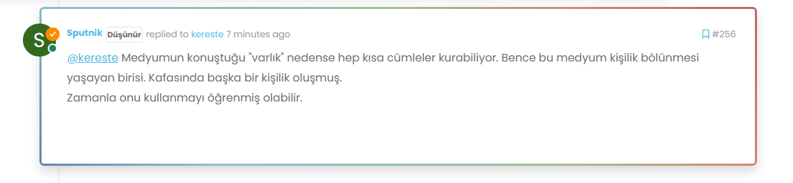
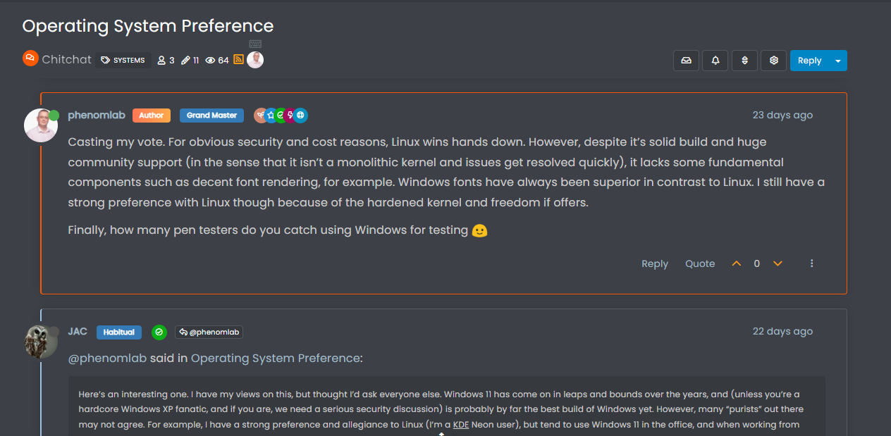
Some of you might have noticed a feature on this forum that further extends the
.highlightclass in NodeBB from the default of a different colour border such asborder-left: 1px solid blue;to something that looks like the below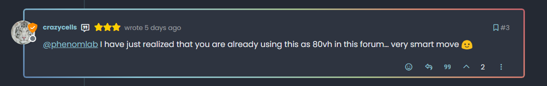
And, as Sudonix has a number of “swatches” or “themes”, these are also colour coordinated to match. For example
There are more - try changing the swatch, and then view the last post in each thread, and you’ll see where and how this is being applied.
I want this effect!!
Sure you do
") Here’s how to get it. We are going to be extending the
Here’s how to get it. We are going to be extending the .highlightclass of NodeBB and will be leveraging the:beforepseudonym class as below..highlight:before { content: ""; position: absolute; inset: 0; border-radius: 0.375rem; padding: 3px; background: var(--bs-progress-bar-bg); -webkit-mask: linear-gradient(var(--bs-body-bg) 0 0) content-box, linear-gradient(var(--bs-body-bg) 0 0); -webkit-mask-composite: xor; mask-composite: exclude; pointer-events: none; }What does this do?
In summary, this CSS snippet creates a highlighted effect around an element by using an absolutely positioned pseudo-element with a special mask to create an outline or glowing effect. The actual visual appearance would depend on the colours defined by the
--bs-progress-bar-bg(note that this is not a NodeBB variable, but one I’ve defined which this forum uses - you’ll need to factor this into your colour scheme) and--bs-body-bgvariables, but the technique is quite clever and allows for flexible styling.What does your
--bs-progress-bar-bgclass look like?Here’s an example
--bs-progress-bar-bg: linear-gradient(45deg, #5E81AC, #88C0D0, #8FBCBB, #A3BE8C, #D08770, #BF616A);Let’s break down the properties to understand how all of this works…
content: "";- This rule sets an empty content for the pseudo-element. This is necessary for the pseudo-element to be rendered.position: absolute;- This rule positions the pseudo-element absolutely within its containing element.inset: 0;- This shorthand rule sets the top, right, bottom, and left properties to 0, effectively making the pseudo-element cover the entire space of its containing element.border-radius: 0.375rem;- This rule sets the border radius of the pseudo-element to create rounded corners. The value “0.375rem” is equivalent to 6 pixels.padding: 3px;- This rule adds padding of 3 pixels to the pseudo-element.background: var(--bs-progress-bar-bg);- This rule sets the background color of the pseudo-element to the value of the CSS custom property “–bs-progress-bar-bg”. Custom properties are a way to define reusable values in CSS.-webkit-mask: linear-gradient(var(--bs-body-bg) 0 0) content-box, linear-gradient(var(--bs-body-bg) 0 0);- This rule applies two linear gradients as masks to the pseudo-element. These gradients essentially create transparent regions in the pseudo-element, revealing the background color underneath.-webkit-mask-composite: xor;- This rule sets the compositing mode for the masks. The “xor” mode combines the two masks using the XOR (exclusive OR) operation.mask-composite: exclude;- This rule sets the compositing mode for the mask to “exclude”. This means that areas where the mask and the content overlap will be excluded, effectively creating a cutout effect.pointer-events: none;- This rule ensures that the pseudo-element does not respond to pointer events, allowing clicks and other interactions to pass through to the underlying elements.
Using this approach, it’s possible to extend the capabilities of CSS much further than you probably imagined. Obviously, this isn’t something you’d want to overuse, but it can certainly provide a much needed edge for when you are trying to draw attention to a specific object or element.
Enjoy.
Mark – Founder, Phenomlab Ltd
Executive IT & Security Leadership
Phenomlab Ltd -
i do it but not working last message highlight.
-
@cagatay said in CSS border gradients:
i do it but not working last message highlight.
Can you provide the CSS you used?
-
.highlight:before { content: ""; position: absolute; inset: 0; border-radius: 0.375rem; padding: 3px; background: var(--bs-progress-bar-bg); -webkit-mask: linear-gradient(var(--bs-body-bg) 0 0) content-box, linear-gradient(var(--bs-body-bg) 0 0); -webkit-mask-composite: xor; mask-composite: exclude; pointer-events: none; }this one
-
.highlight:before {
    content: "";
    position: absolute;
    inset: 0;
    border-radius: 0.375rem;
    padding: 3px;
    background: var(--bs-progress-bar-bg);
    -webkit-mask: linear-gradient(var(--bs-body-bg) 0 0) content-box, linear-gradient(var(--bs-body-bg) 0 0);
    -webkit-mask-composite: xor;
    mask-composite: exclude;
    pointer-events: none;
}
this one
@cagatay Yes, that’s because you do not have a variable called
var(--bs-progress-bar-bg)in your swatch.See below for example
--bs-progress-bar-bg: linear-gradient(45deg, #5E81AC, #88C0D0, #8FBCBB, #A3BE8C, #D08770, #BF616A); -
where i should add this code? in css also?
added light.css -
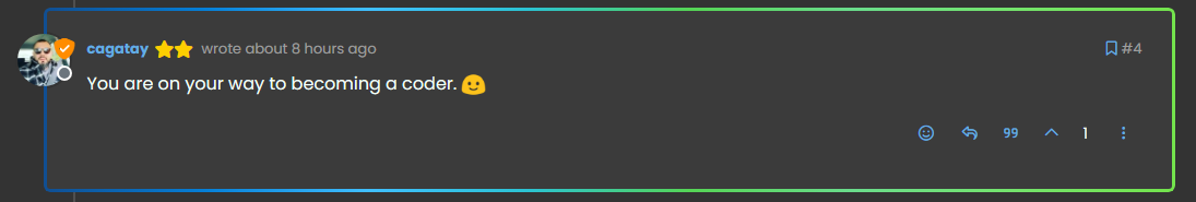
@cagatay Yes, that works as intended, although you have an extra border being added. To remove that, in your custom CSS, locate the below block
.page-topic .topic .posts.timeline .timeline-event.highlight, .page-topic .topic .posts.timeline > [component="post/placeholder"].highlight, .page-topic .topic .posts.timeline > [component=post].highlightand remove it.
-
-
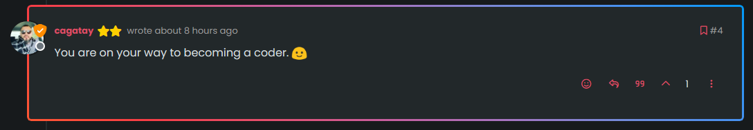
@cagatay It has changed as the extra border is no longer present
-
ah f5 need

Hello! It looks like you're interested in this conversation, but you don't have an account yet.
Getting fed up of having to scroll through the same posts each visit? When you register for an account, you'll always come back to exactly where you were before, and choose to be notified of new replies (either via email, or push notification). You'll also be able to save bookmarks and upvote posts to show your appreciation to other community members.
With your input, this post could be even better 💗
Register Login

