Widget | CSS customization
-
Sudonix, there is a problem with my website that I am unable to resolve. The widget in article posts is much smaller than the other widgets on Frontpage and Pages. This is evident when looking at the word count in the screenshot below.
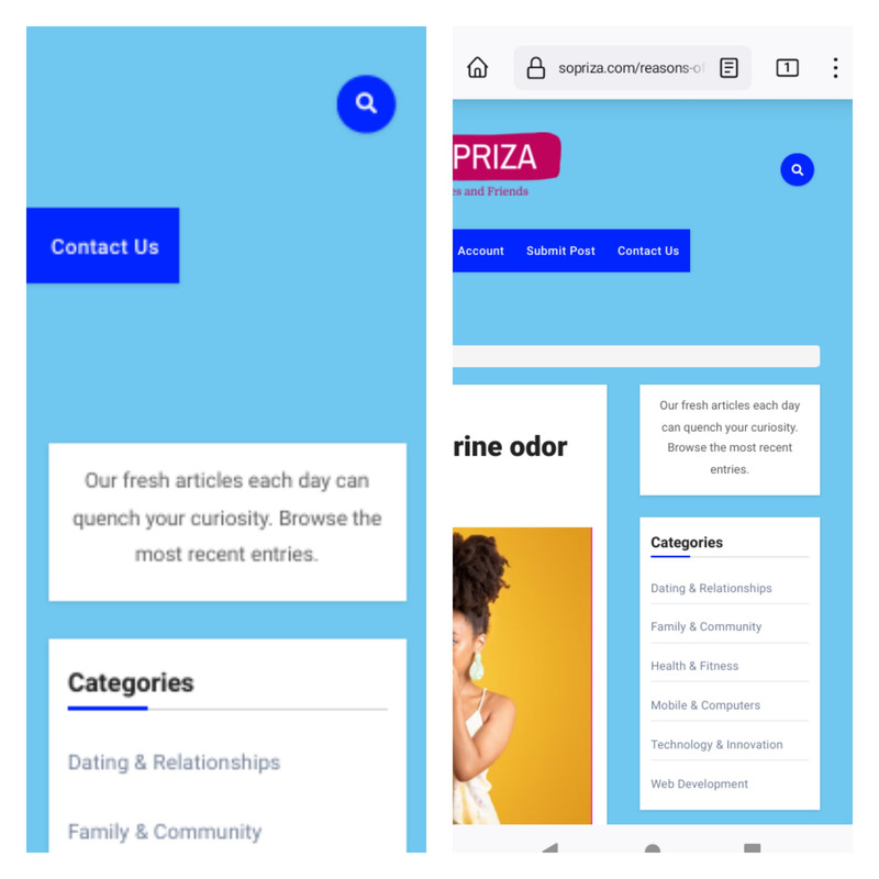
Please assist us with creating CSS so that the widget on the posts page has the same width as Frontpage.
-
@Sala having checked this, it’s not something you can change with CSS without severely impacting the layout of the entire site, and (surprisingly) there are no templates being used. It’s a “known issue” in the sense that the free version lacks this functionality, but is available in the Pro version.
https://wordpress.org/support/topic/resize-page-sidebar/
This is always the problem with “freemium” themes - as soon as you step outside the “free” zone, you’ll run into issues.
-
Sudonix, there is a problem with my website that I am unable to resolve. The widget in article posts is much smaller than the other widgets on Frontpage and Pages. This is evident when looking at the word count in the screenshot below.
Please assist us with creating CSS so that the widget on the posts page has the same width as Frontpage.
@Sala My immediate thoughts here are that the blog posts page is using a different template to the main page which will be the cause of the layout shift you are seeing with the sidebar widget. Can you provide me with a username and password with admin capabilities via PM so I can have a look ?
Mark – Founder, Phenomlab Ltd
Executive IT & Security Leadership
Phenomlab Ltd -
@Sala My immediate thoughts here are that the blog posts page is using a different template to the main page which will be the cause of the layout shift you are seeing with the sidebar widget. Can you provide me with a username and password with admin capabilities via PM so I can have a look ?
@phenomlab I have PM it to you, also paused cloudflare.
-
@phenomlab I have PM it to you, also paused cloudflare.
@Sala Thanks
-
@Sala having checked this, it’s not something you can change with CSS without severely impacting the layout of the entire site, and (surprisingly) there are no templates being used. It’s a “known issue” in the sense that the free version lacks this functionality, but is available in the Pro version.
https://wordpress.org/support/topic/resize-page-sidebar/
This is always the problem with “freemium” themes - as soon as you step outside the “free” zone, you’ll run into issues.
-
 undefined phenomlab has marked this topic as solved on
-
@phenomlab You conducted excellent research, and the biggest issue I see is that I made a huge mistake because the license requires an annual recurring payment. It’s absurd; perhaps you have any suggestions for another theme I might use?
-
@phenomlab You conducted excellent research, and the biggest issue I see is that I made a huge mistake because the license requires an annual recurring payment. It’s absurd; perhaps you have any suggestions for another theme I might use?
@Sala Yes, this one - Impreza. One time payment, and cheap for what you get
https://themeforest.net/item/impreza-retina-responsive-wordpress-theme/6434280
Or the X-theme, but more expensive - but similarly a one-time payment, and lifetime updates for both.
The only two themes I actually trust. I have extensive experience with both.
Mark – Founder, Phenomlab Ltd
Executive IT & Security Leadership
Phenomlab Ltd -
@Sala Yes, this one - Impreza. One time payment, and cheap for what you get
https://themeforest.net/item/impreza-retina-responsive-wordpress-theme/6434280
Or the X-theme, but more expensive - but similarly a one-time payment, and lifetime updates for both.
The only two themes I actually trust. I have extensive experience with both.
@phenomlab sir, on this page i can see the video height is 397, and its being reported to be tall. How can i reduce it using css?
Line 234
<p><iframe title=" " width="706" height="397" src="?feature=oembed" frameborder="0" allow="accelerometer; autoplay; clipboard-write; encrypted-media; gyroscope; picture-in-picture; web-share" allowfullscreen></iframe></p>
</div>
In additional css, i’ve iframe { width 100% and height 315 but without important. If i add important, it affects the height of the ads
-
@phenomlab sir, on this page i can see the video height is 397, and its being reported to be tall. How can i reduce it using css?
Line 234
<p><iframe title=" " width="706" height="397" src="?feature=oembed" frameborder="0" allow="accelerometer; autoplay; clipboard-write; encrypted-media; gyroscope; picture-in-picture; web-share" allowfullscreen></iframe></p>
</div>
In additional css, i’ve iframe { width 100% and height 315 but without important. If i add important, it affects the height of the ads
@Sala said in Widget | CSS customization:
In additional css, i’ve iframe { width 100% and height 315 but without important. If i add important, it affects the height of the ads
It will do, yes, because you have this CSS present
div.text img {
    width: 100%;
    height: 315px;
}
You’d need to be more specific here in terms of CSS target. The below would work
.perfmatters-lazy-youtube img {
    height: 500px !important;
}
Mark – Founder, Phenomlab Ltd
Executive IT & Security Leadership
Phenomlab Ltd -
@Sala said in Widget | CSS customization:
In additional css, i’ve iframe { width 100% and height 315 but without important. If i add important, it affects the height of the ads
It will do, yes, because you have this CSS present
div.text img {
    width: 100%;
    height: 315px;
}
You’d need to be more specific here in terms of CSS target. The below would work
.perfmatters-lazy-youtube img { height: 500px !important; }@phenomlab it was hidden in the outskirts
 … Thanks for opening my eyes.
 -
@phenomlab it was hidden in the outskirts
… Thanks for opening my eyes. -
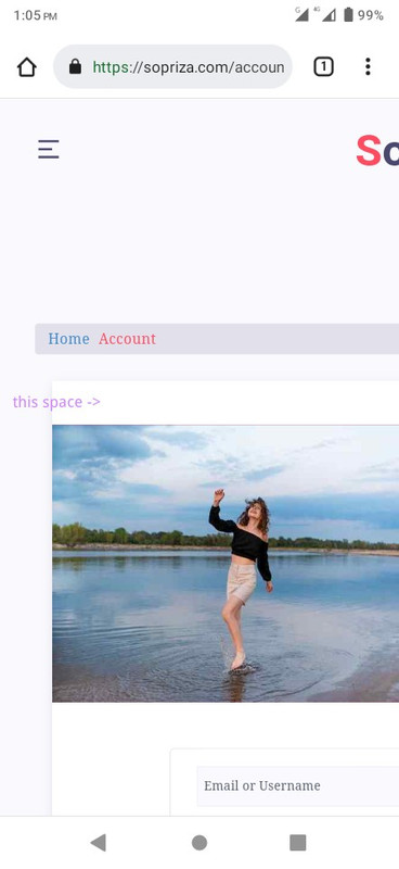
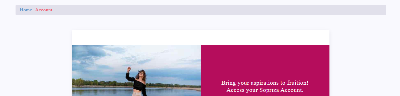
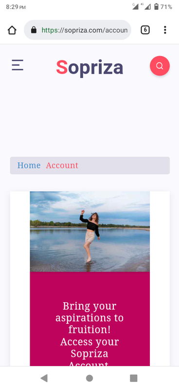
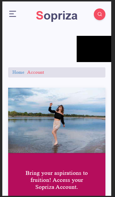
@phenomlab Sometimes you don’t remember to ask questions until you actually see them. Like onto every page I created, there is a space between the images that I would like to remove using CSS. It was built with a code that looks like this:
<!-- wp:media-text {"align":"wide","mediaId":673,"mediaLink":"https://wordpress.org/patterns/pear-half/","mediaType":"image","verticalAlignment":"center","style":{"color":{"background":"#BE035C"}}} -->
<div class="wp-block-media-text alignwide is-stacked-on-mobile is-vertically-aligned-center has-background" style="background-color:#BE035C"><figure class="wp-block-media-text__media"><img src="/wp-content/uploads/2023/01/sign-in.jpg" alt="Account" class="wp-image-673 size-full"/></figure><div class="wp-block-media-text__content"><!-- wp:group {"style":{"spacing":{"padding":{"top":"2em","right":"2em","bottom":"2em","left":"2em"}}}} -->
<div class="wp-block-group" style="padding-top:2em;padding-right:2em;padding-bottom:2em;padding-left:2em"><!-- wp:html -->
<p class="has-text-align-center" style="font-size:20px;line-height:1.3"><p class="has-text-align-center" style="font-size:20px;color:#ffffff;line-height:1.2">Bring your .. to fruition!</p></p>
<!-- /wp:html --></div>
<!-- /wp:group --></div></div>
<!-- /wp:media-text -->
Space
-
@phenomlab Sometimes you don’t remember to ask questions until you actually see them. Like onto every page I created, there is a space between the images that I would like to remove using CSS. It was built with a code that looks like this:
<!-- wp:media-text {"align":"wide","mediaId":673,"mediaLink":"https://wordpress.org/patterns/pear-half/","mediaType":"image","verticalAlignment":"center","style":{"color":{"background":"#BE035C"}}} -->
<div class="wp-block-media-text alignwide is-stacked-on-mobile is-vertically-aligned-center has-background" style="background-color:#BE035C"><figure class="wp-block-media-text__media"><img src="/wp-content/uploads/2023/01/sign-in.jpg" alt="Account" class="wp-image-673 size-full"/></figure><div class="wp-block-media-text__content"><!-- wp:group {"style":{"spacing":{"padding":{"top":"2em","right":"2em","bottom":"2em","left":"2em"}}}} -->
<div class="wp-block-group" style="padding-top:2em;padding-right:2em;padding-bottom:2em;padding-left:2em"><!-- wp:html -->
<p class="has-text-align-center" style="font-size:20px;line-height:1.3"><p class="has-text-align-center" style="font-size:20px;color:#ffffff;line-height:1.2">Bring your .. to fruition!</p></p>
<!-- /wp:html --></div>
<!-- /wp:group --></div></div>
<!-- /wp:media-text -->
Space
@Sala let me have a look. That theme is using inline styling which is bad practice and means you’d have to force override with
!importantMark – Founder, Phenomlab Ltd
Executive IT & Security Leadership
Phenomlab Ltd -
@Sala let me have a look. That theme is using inline styling which is bad practice and means you’d have to force override with
!important@phenomlab Actually, I was the one who made it utilize inline CSS because I believed it would be a simpler method to lessen the load of http requests.
-
@phenomlab Actually, I was the one who made it utilize inline CSS because I believed it would be a simpler method to lessen the load of http requests.
@Sala ah, OK. That wouldn’t have any impact on the http requests as such as its only text that is being requested. The best way to optimise in that case is to minify the css.
-
@phenomlab Sometimes you don’t remember to ask questions until you actually see them. Like onto every page I created, there is a space between the images that I would like to remove using CSS. It was built with a code that looks like this:
<!-- wp:media-text {"align":"wide","mediaId":673,"mediaLink":"https://wordpress.org/patterns/pear-half/","mediaType":"image","verticalAlignment":"center","style":{"color":{"background":"#BE035C"}}} -->
<div class="wp-block-media-text alignwide is-stacked-on-mobile is-vertically-aligned-center has-background" style="background-color:#BE035C"><figure class="wp-block-media-text__media"><img src="/wp-content/uploads/2023/01/sign-in.jpg" alt="Account" class="wp-image-673 size-full"/></figure><div class="wp-block-media-text__content"><!-- wp:group {"style":{"spacing":{"padding":{"top":"2em","right":"2em","bottom":"2em","left":"2em"}}}} -->
<div class="wp-block-group" style="padding-top:2em;padding-right:2em;padding-bottom:2em;padding-left:2em"><!-- wp:html -->
<p class="has-text-align-center" style="font-size:20px;line-height:1.3"><p class="has-text-align-center" style="font-size:20px;color:#ffffff;line-height:1.2">Bring your .. to fruition!</p></p>
<!-- /wp:html --></div>
<!-- /wp:group --></div></div>
<!-- /wp:media-text -->
Space
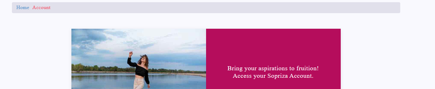
@Sala That is in the below class
#single .main-article {
    position: relative;
    z-index: 1;
    background: #fff;
    padding: 50px 60px;
    -webkit-box-shadow: 0 3px 12px -1px rgba(7,10,25,.1), 0 22px 27px -30px rgba(7,10,25,.1);
    box-shadow: 0 3px 12px -1px rgba(7,10,25,.1), 0 22px 27px -30px rgba(7,10,25,.1);
}
You should experiment with the
padding: 50px 60px;to get the spacing you need.Changing to
padding: 0px 60px;ought to do it")
Before
After
Mark – Founder, Phenomlab Ltd
Executive IT & Security Leadership
Phenomlab Ltd -
@Sala That is in the below class
#single .main-article {
    position: relative;
    z-index: 1;
    background: #fff;
    padding: 50px 60px;
    -webkit-box-shadow: 0 3px 12px -1px rgba(7,10,25,.1), 0 22px 27px -30px rgba(7,10,25,.1);
    box-shadow: 0 3px 12px -1px rgba(7,10,25,.1), 0 22px 27px -30px rgba(7,10,25,.1);
}
You should experiment with the
padding: 50px 60px;to get the spacing you need.Changing to
padding: 0px 60px;ought to do itBefore
After
@phenomlab i tried with 0; and 60; padding, it works fine on desktop but not on mobile version. Somehow on the content on mobile are also squeezed at the center,
Probably @media can be a good thought
-
@phenomlab i tried with 0; and 60; padding, it works fine on desktop but not on mobile version. Somehow on the content on mobile are also squeezed at the center,
Probably @media can be a good thought
@Sala Yes, try
@media screen and (max-width: 767px) {
#single .main-article {
    padding: 0px 20px 20px 20px;
   }
}
Result
Mark – Founder, Phenomlab Ltd
Executive IT & Security Leadership
Phenomlab Ltd -
@Sala Yes, try
@media screen and (max-width: 767px) {
#single .main-article {
    padding: 0px 20px 20px 20px;
   }
}
Result
-
@phenomlab it’s applied
@Sala Working? From what I see, it is
Mark – Founder, Phenomlab Ltd
Executive IT & Security Leadership
Phenomlab Ltd
Hello! It looks like you're interested in this conversation, but you don't have an account yet.
Getting fed up of having to scroll through the same posts each visit? When you register for an account, you'll always come back to exactly where you were before, and choose to be notified of new replies (either via email, or push notification). You'll also be able to save bookmarks and upvote posts to show your appreciation to other community members.
With your input, this post could be even better 💗
Register Login

