Bug Report
-
composer previews have problems… when I show the preview, it becomes transparent.
@crazycells Can you reload your browser and try again?
Mark Cutting also advises organisations as a Fractional CIO, Fractional CISO and Executive Advisor, helping boards improve technology governance, cyber resilience and executive decision making. Learn more at Phenomlab Ltd
-
@crazycells Can you reload your browser and try again?
@phenomlab yeap, it is fixed… somehow I was on the wrong theme… what is the theme that was loaded first? cache issue?
-
@phenomlab yeap, it is fixed… somehow I was on the wrong theme… what is the theme that was loaded first? cache issue?
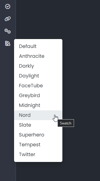
@crazycells Yes - sorry. It’s because I’ve been changing the theme names so the old ones aren’t officially supported (as such - they have been renamed). If you are using light mode on your OS, then you’ll get the light theme (which you clearly have). Reloading forces the
JSto reevaluate and select the right theme.Should have made an announcement about this. Sorry.
Mark Cutting also advises organisations as a Fractional CIO, Fractional CISO and Executive Advisor, helping boards improve technology governance, cyber resilience and executive decision making. Learn more at Phenomlab Ltd
-
@crazycells Yes - sorry. It’s because I’ve been changing the theme names so the old ones aren’t officially supported (as such - they have been renamed). If you are using light mode on your OS, then you’ll get the light theme (which you clearly have). Reloading forces the
JSto reevaluate and select the right theme.Should have made an announcement about this. Sorry.
@phenomlab no problem at all
 next time before reporting, I will refresh the page…
 -
@crazycells Yes - sorry. It’s because I’ve been changing the theme names so the old ones aren’t officially supported (as such - they have been renamed). If you are using light mode on your OS, then you’ll get the light theme (which you clearly have). Reloading forces the
JSto reevaluate and select the right theme.Should have made an announcement about this. Sorry.
@phenomlab There is one thing I have to mention, yesterday I was checking sudonix as PWA (but my comment can be thought as related to general mobile design) and I realized that there is no easy way to go to
/categoriespage… It is indirect through the category panel…If someone is accessing your website first time, I believe that is the page they would want to see to understand the general theme/aim of the forum… This is usually done either clicking the title or clicking the home icon…
But for this website, they both direct you to the
/recentpage… I knew how to reach there since I use NodeBB daily but if I was outside user, I would struggle little bit
Of course, if everything is intentional, then there is no problem… I just wanted to bring this to your attention…
-
@phenomlab There is one thing I have to mention, yesterday I was checking sudonix as PWA (but my comment can be thought as related to general mobile design) and I realized that there is no easy way to go to
/categoriespage… It is indirect through the category panel…If someone is accessing your website first time, I believe that is the page they would want to see to understand the general theme/aim of the forum… This is usually done either clicking the title or clicking the home icon…
But for this website, they both direct you to the
/recentpage… I knew how to reach there since I use NodeBB daily but if I was outside user, I would struggle little bitOf course, if everything is intentional, then there is no problem… I just wanted to bring this to your attention…
@crazycells Good points. Thanks. I will review this.
-
@phenomlab There is one thing I have to mention, yesterday I was checking sudonix as PWA (but my comment can be thought as related to general mobile design) and I realized that there is no easy way to go to
/categoriespage… It is indirect through the category panel…If someone is accessing your website first time, I believe that is the page they would want to see to understand the general theme/aim of the forum… This is usually done either clicking the title or clicking the home icon…
But for this website, they both direct you to the
/recentpage… I knew how to reach there since I use NodeBB daily but if I was outside user, I would struggle little bitOf course, if everything is intentional, then there is no problem… I just wanted to bring this to your attention…
@crazycells hmm. Just looking at this and I do see what you mean but if you tap the category icon it should auto expand with the first option in the list being “All Categories” which will take you to
/categories.In addition, it’s possible to change the default home page in your profile settings.
Mark Cutting also advises organisations as a Fractional CIO, Fractional CISO and Executive Advisor, helping boards improve technology governance, cyber resilience and executive decision making. Learn more at Phenomlab Ltd
-
@crazycells hmm. Just looking at this and I do see what you mean but if you tap the category icon it should auto expand with the first option in the list being “All Categories” which will take you to
/categories.In addition, it’s possible to change the default home page in your profile settings.
@phenomlab yes I know, but that is “two clicks”… nowadays “two” is too much to get the main page
it is ok for me, I know how to navigate, but I was talking from a new user’s perspective (even unregistered one)… no need for any change if it is OK for you
-
@phenomlab yes I know, but that is “two clicks”… nowadays “two” is too much to get the main page
it is ok for me, I know how to navigate, but I was talking from a new user’s perspective (even unregistered one)… no need for any change if it is OK for you
@crazycells yep. I get it! Good point.
Mark Cutting also advises organisations as a Fractional CIO, Fractional CISO and Executive Advisor, helping boards improve technology governance, cyber resilience and executive decision making. Learn more at Phenomlab Ltd
-
@crazycells yep. I get it! Good point.
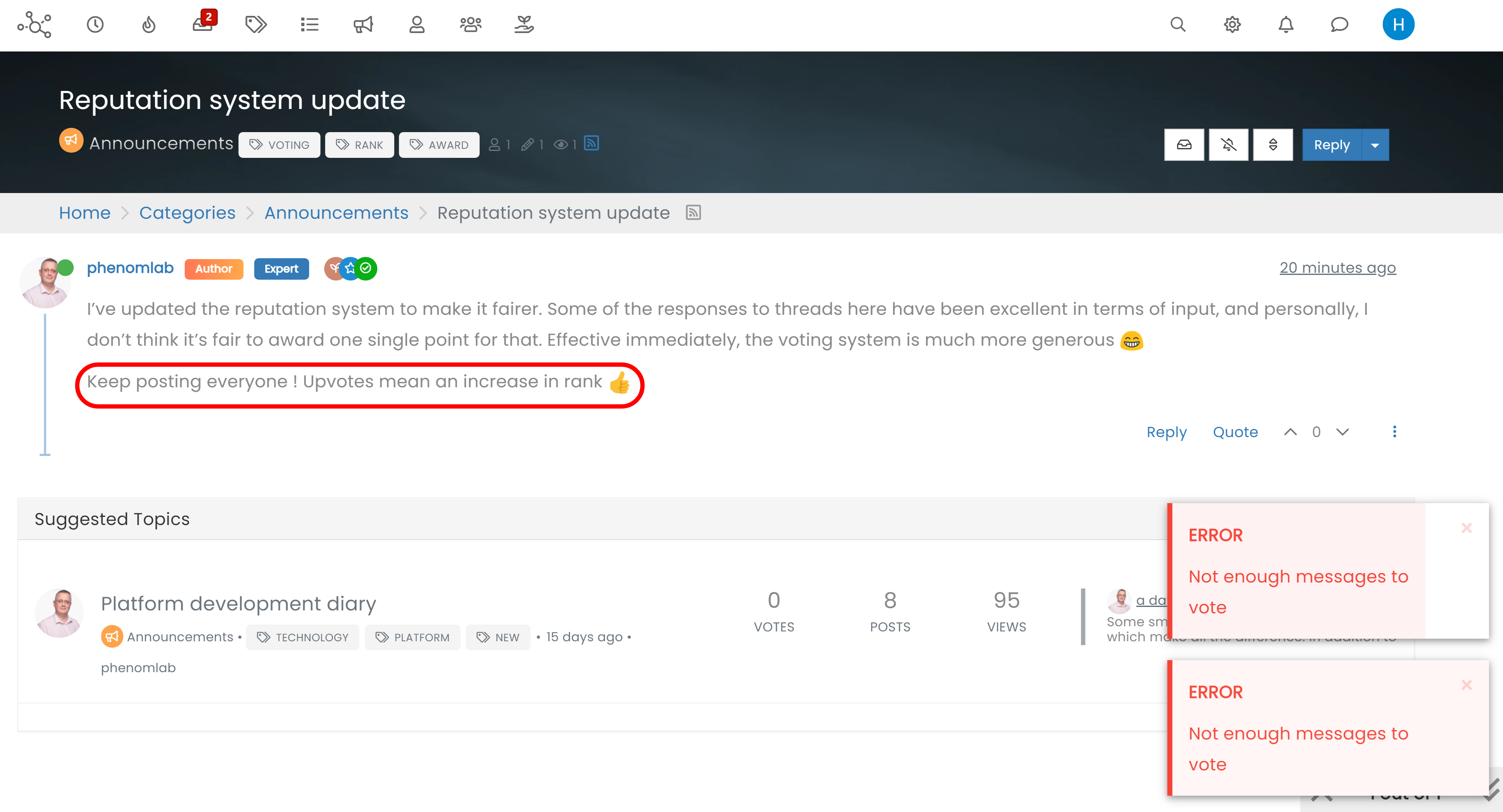
Hi @phenomlab , upvote icon is better as a triangle, however I would love to see my upvoted posts more clearly, because currently, when I upvote, nothing on the post tool is changing, it would be nicer if there is an indication that I have upvoted (like a filled or colored triangle?) .
-
Hi @phenomlab , upvote icon is better as a triangle, however I would love to see my upvoted posts more clearly, because currently, when I upvote, nothing on the post tool is changing, it would be nicer if there is an indication that I have upvoted (like a filled or colored triangle?) .
@crazycells hmm. Nice idea, but not that easy to implement unless there’s a hook that fires (not sure there is). Could be done with
JSbut that could be too the detriment of page loads and ajax calls.Mark Cutting also advises organisations as a Fractional CIO, Fractional CISO and Executive Advisor, helping boards improve technology governance, cyber resilience and executive decision making. Learn more at Phenomlab Ltd
-
@crazycells hmm. Nice idea, but not that easy to implement unless there’s a hook that fires (not sure there is). Could be done with
JSbut that could be too the detriment of page loads and ajax calls.@phenomlab I think in this case a custom CSS code suffice…
we were using something like this:
.topic [component="post/upvote"].upvoted { color: #085EAC; } .topic [component="post/upvote"].upvoted { border: 0px !important; } .topic [component="post/downvote"].downvoted { color: #EF4042; } .topic [component="post/downvote"].downvoted { border: 0px !important; } -
@phenomlab I think in this case a custom CSS code suffice…
we were using something like this:
.topic [component="post/upvote"].upvoted { color: #085EAC; } .topic [component="post/upvote"].upvoted { border: 0px !important; } .topic [component="post/downvote"].downvoted { color: #EF4042; } .topic [component="post/downvote"].downvoted { border: 0px !important; }@crazycells Good points, thanks. I completely forgot that classes are added - makes life much simpler!
EDIT - seems this is pretty straightforward, and only needs the below CSS
.upvoted i {
    color: var(--bs-user-level) !important;
}
This then yields

However, the caveat here is that the
.upvotedclass will only show for your upvotes, and nobody else’s. However, this does satisfy the original requesthowever I would love to see my upvoted posts more clearly, because currently, when I upvote, nothing on the post tool is changing, it would be nicer if there is an indication that I have upvoted (like a filled or colored triangle?)


Hello! It looks like you're interested in this conversation, but you don't have an account yet.
Getting fed up of having to scroll through the same posts each visit? When you register for an account, you'll always come back to exactly where you were before, and choose to be notified of new replies (either via email, or push notification). You'll also be able to save bookmarks and upvote posts to show your appreciation to other community members.
With your input, this post could be even better 💗
Register LoginDid this solution help you?
Related Topics
-
-
-
-
Nodebb design
Solved General -
-
-
Forum Icons NodeBB
Solved Customisation -