Bug Report
-
hi @phenomlab , I found this:
https://github.com/NodeBB/NodeBB/commit/844cb91beb3f2335e724770b29553081454b1297
so, recently
_is changed to-in notifications. are you using the last version of nodebb?@crazycells yes, as far as I know
Mark – Founder, Phenomlab Ltd
Executive IT & Security Leadership
Phenomlab Ltd -
@crazycells yes, as far as I know
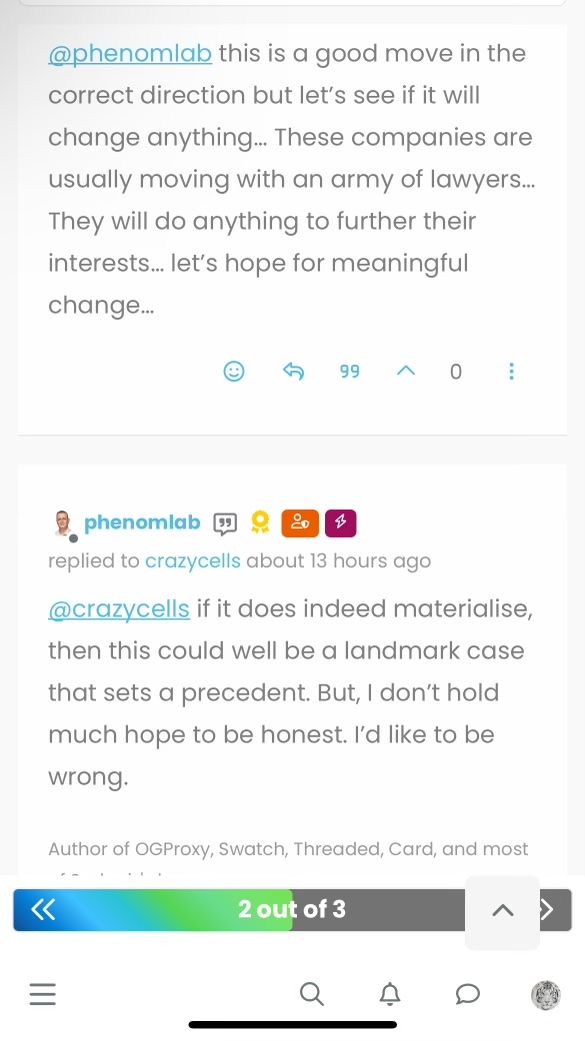
@phenomlab I guess this will be fixed in 3.6… so, we should wait…
-
@phenomlab I guess this will be fixed in 3.6… so, we should wait…
@crazycells yes, I think so. There are a number of other features in that release too such as extended social sharing.
-
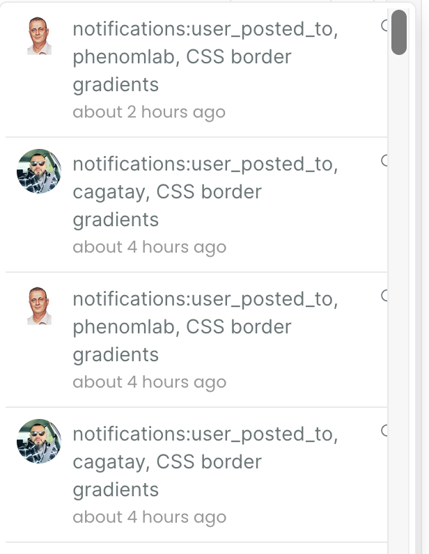
hi @phenomlab , this notification problem continues for me… I believe those “user_posted_to” should be changed to “user-posted-to” in the codes…
-
do you use “nodebb-plugin-category-notifications” plugin?
-
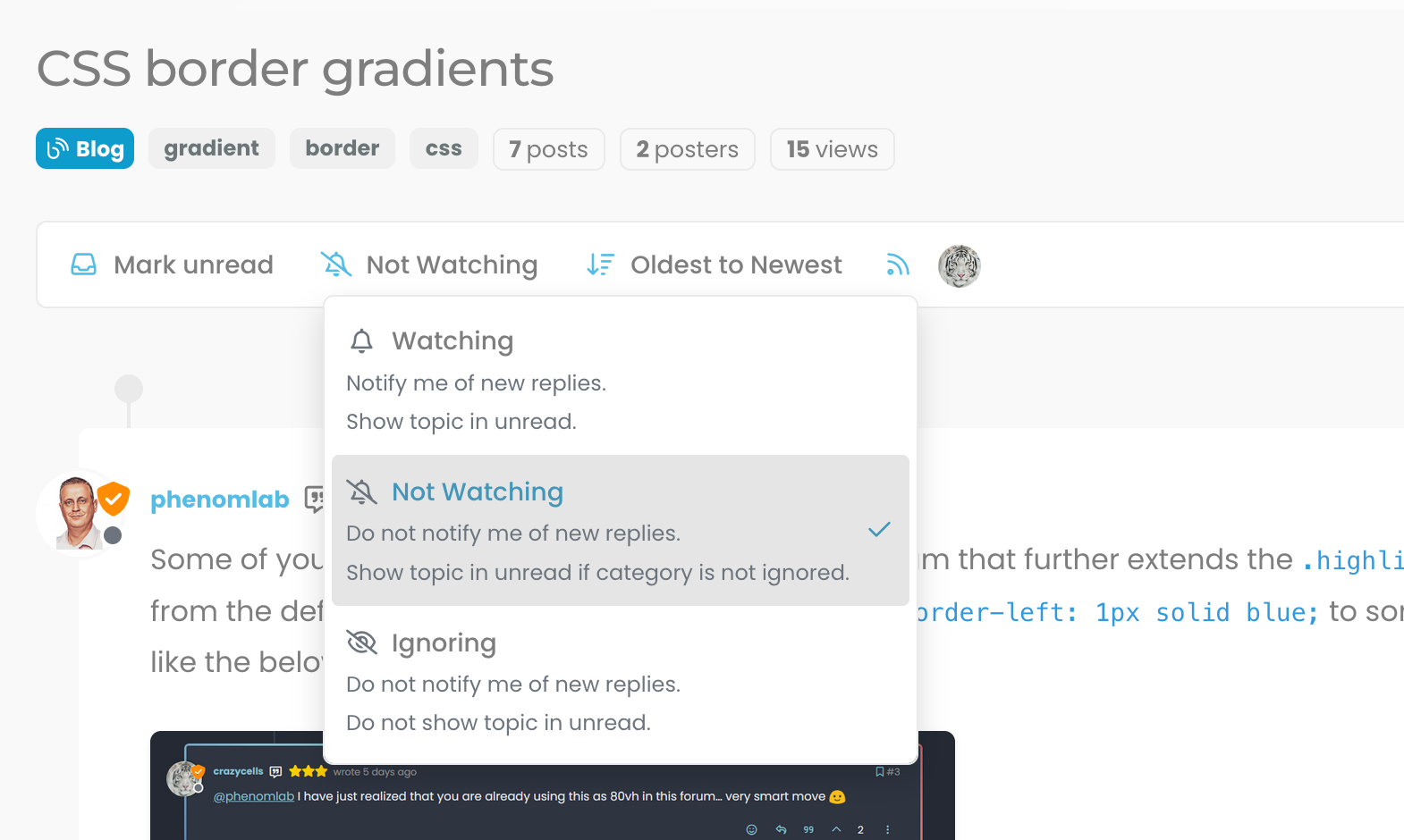
Additionally, it looks like I am not watching this topic, but I get notification… strange… Does category-notification plugin cause this?
-
do you use “nodebb-plugin-category-notifications” plugin?
@crazycells said in Bug Report:
do you use “nodebb-plugin-category-notifications” plugin?
Yes, but am going to remove it. I think that’s the case because it’s out of date.
-
Additionally, it looks like I am not watching this topic, but I get notification… strange… Does category-notification plugin cause this?
@crazycells It might do. Sudonix does not impose anything on it’s users - they have complete control over notifications and emails they receive. I’ve just disabled the plugin. Let me know if it continues.
Mark – Founder, Phenomlab Ltd
Executive IT & Security Leadership
Phenomlab Ltd -
@crazycells It might do. Sudonix does not impose anything on it’s users - they have complete control over notifications and emails they receive. I’ve just disabled the plugin. Let me know if it continues.
@phenomlab no need to worry
") I am aware how sensitive you are about GDPR compliance… You are probably the one who is the most careful regarding GDPR within the NodeBB community. I was simply trying to understand the cause of this problem, receiving notifications from your forum at any time is perfectly fine with me
I am aware how sensitive you are about GDPR compliance… You are probably the one who is the most careful regarding GDPR within the NodeBB community. I was simply trying to understand the cause of this problem, receiving notifications from your forum at any time is perfectly fine with me -
@phenomlab no need to worry
I am aware how sensitive you are about GDPR compliance… You are probably the one who is the most careful regarding GDPR within the NodeBB community. I was simply trying to understand the cause of this problem, receiving notifications from your forum at any time is perfectly fine with me @crazycells Thanks for the comments. Yes, I take privacy very seriously, and would much rather users of this site have control over their own content.
Mark – Founder, Phenomlab Ltd
Executive IT & Security Leadership
Phenomlab Ltd -
hi Mark,
“go to top of the page arrow” on the lower right side is overlapping with the post navigation bar on mobile, fyi…
-
hi Mark,
“go to top of the page arrow” on the lower right side is overlapping with the post navigation bar on mobile, fyi…
@crazycells Fixed. Thanks
Mark – Founder, Phenomlab Ltd
Executive IT & Security Leadership
Phenomlab Ltd -
@crazycells Fixed. Thanks
@phenomlab yeap, it is much better now
thanks… -
@phenomlab yeap, it is much better now
thanks…@phenomlab the arrow stays up when I am not on a topic (so there is no post navigation tool)…
-
@phenomlab the arrow stays up when I am not on a topic (so there is no post navigation tool)…
@crazycells that’s intended behaviour. If you press it, it’ll return to the top of the screen and then disappear.
Mark – Founder, Phenomlab Ltd
Executive IT & Security Leadership
Phenomlab Ltd -
@crazycells that’s intended behaviour. If you press it, it’ll return to the top of the screen and then disappear.
@phenomlab yeah, but isn’t it too up? I thought ideal place would be right above the menu bar on those pages?
-
additionally, do you think a similar button can be made for “go back one page” button? something I have mentioned here before?
https://community.nodebb.org/topic/17931/page-control-arrows-for-pwa
-
@phenomlab yeah, but isn’t it too up? I thought ideal place would be right above the menu bar on those pages?
@crazycells Hmm, yes, I see what you mean, but that would require 2 sets of code. Worth thinking about though
-
additionally, do you think a similar button can be made for “go back one page” button? something I have mentioned here before?
https://community.nodebb.org/topic/17931/page-control-arrows-for-pwa
@crazycells Yes, easily. Wouldn’t be difficult at all.
Mark – Founder, Phenomlab Ltd
Executive IT & Security Leadership
Phenomlab Ltd -
@crazycells Yes, easily. Wouldn’t be difficult at all.
@phenomlab then here it is


Hello! It looks like you're interested in this conversation, but you don't have an account yet.
Getting fed up of having to scroll through the same posts each visit? When you register for an account, you'll always come back to exactly where you were before, and choose to be notified of new replies (either via email, or push notification). You'll also be able to save bookmarks and upvote posts to show your appreciation to other community members.
With your input, this post could be even better 💗
Register Login