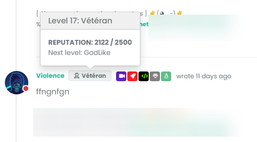
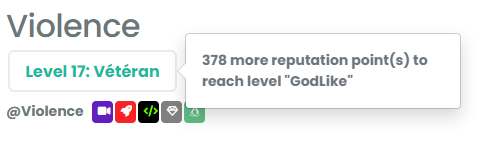
nodebb-user-level customisation : popover element
-
arf I can’t edit first post
PW and WS Spirit alive
-
@cagatay Initial post edited. Not sure why that is…

-
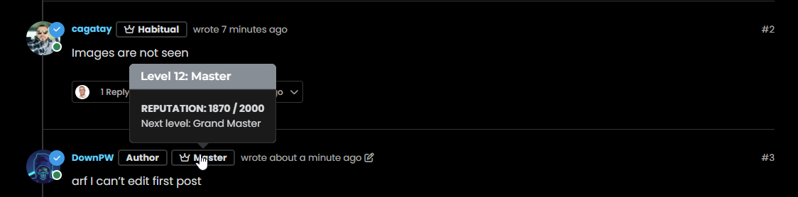
@DownPW You mean something like this ?
Mark Cutting also advises organisations as a Fractional CIO, Fractional CISO and Executive Advisor, helping boards improve technology governance, cyber resilience and executive decision making. Learn more at Phenomlab Ltd
-
exactly my friend

same things for second screenshot
PW and WS Spirit alive
-
@DownPW This will work - obviously, modify to suit your needs
.popover { border-radius: 0.375rem; } .popover-body { background: var(--bs-body-navbar) !important; color: var(--bs-body-color) !important; border: 1px solid var(--bs-border-color); border-radius: 0 0 0.375rem 0.375rem; } .popover-header { background-color: var(--bs-alert-info-bg); color: var(--bs-alert-info-color); } .bs-popover-auto[data-popper-placement^=top]>.popover-arrow::after, .bs-popover-top>.popover-arrow::after { border-top-color: var(--bs-border-color); } -
@DownPW Try this
.bs-popover-auto[data-popper-placement^=right]>.popover-arrow::after, .bs-popover-end>.popover-arrow::after {
    border-right-color: var(--bs-border-color);
}
It’s important to remember that
JSwill determine the popup position and then add the arrow to suit. In this case, you’d need the below CSS to capture all of them.bs-popover-auto[data-popper-placement^=top]>.popover-arrow::after, .bs-popover-top>.popover-arrow::after,{ border-top-color: var(--bs-border-color); } .bs-popover-auto[data-popper-placement^=top]>.popover-arrow::after, .bs-popover-bottom>.popover-arrow::after,{ border-bottom-color: var(--bs-border-color); } .bs-popover-auto[data-popper-placement^=left]>.popover-arrow::after, .bs-popover-end>.popover-arrow::after { border-left-color: var(--bs-border-color); } .bs-popover-auto[data-popper-placement^=right]>.popover-arrow::after, .bs-popover-end>.popover-arrow::after { border-right-color: var(--bs-border-color); } -
 undefined phenomlab has marked this topic as solved on
-
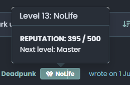
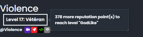
better result than me but did you see this ?
- The border radius is much larger than the original
- On light theme, seems border was blurry
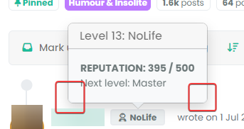
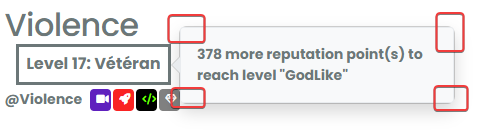
- And in addition of blur, on dark/mid theme, we have 2 border with haven’t radius. Don’t know why
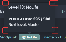
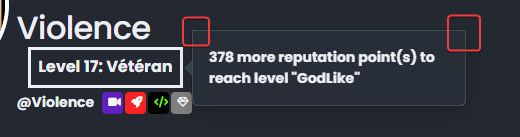
–> I have the same behavior with my code when I have tested
PW and WS Spirit alive
-
better result than me but did you see this ?
- The border radius is much larger than the original
- On light theme, seems border was blurry
- And in addition of blur, on dark/mid theme, we have 2 border with haven’t radius. Don’t know why
–> I have the same behavior with my code when I have tested
@DownPW Ooops…
Sorry - I forgot a class - original answer modified
.popover { border-radius: 0.375rem; } -
hmmm nope it doesn’t change anything
see it’s worse ^^
–> I have the same behavior with my code last night

EDIT:
I f you play with border-radius you better seen the bug
There missing somethingPW and WS Spirit alive
-
hmmm nope it doesn’t change anything
see it’s worse ^^
–> I have the same behavior with my code last night
EDIT:
I f you play with border-radius you better seen the bug
There missing something@DownPW This isn’t as simple as it looks, because
bootstrapis usinginsetborder radiusHere’s a workaround
.popover-body {
    background: var(--bs-body-bg) !important;
    color: var(--bs-body-color) !important;
    border: 1px solid var(--bs-border-color);
    border-radius: 0 0 0.375rem 0.375rem;
    margin: 0px;
}
.popover-header {
    background-color: var(--bs-alert-info-bg);
    color: var(--bs-alert-info-color);
    border-top-left-radius: 0.375rem;
    border-top-right-radius: 0.375rem;
    margin: 0px;
}
.bs-popover-auto[data-popper-placement^=top]>.popover-arrow::after, .bs-popover-top>.popover-arrow::after,{
    border-top-color: var(--bs-border-color);
}
.bs-popover-auto[data-popper-placement^=top]>.popover-arrow::after, .bs-popover-bottom>.popover-arrow::after,{
    border-bottom-color: var(--bs-border-color);
}
.bs-popover-auto[data-popper-placement^=left]>.popover-arrow::after, .bs-popover-end>.popover-arrow::after {
    border-left-color: var(--bs-border-color);
}
.bs-popover-auto[data-popper-placement^=right]>.popover-arrow::after, .bs-popover-end>.popover-arrow::after {
    border-right-color: var(--bs-border-color);
}
Then, in the
widgetssection -/admin/extend/widgetsselect theaccount/profile.tplwidget, and add the below HTML<style> .popover-body { border-radius: 0.375rem; } </style>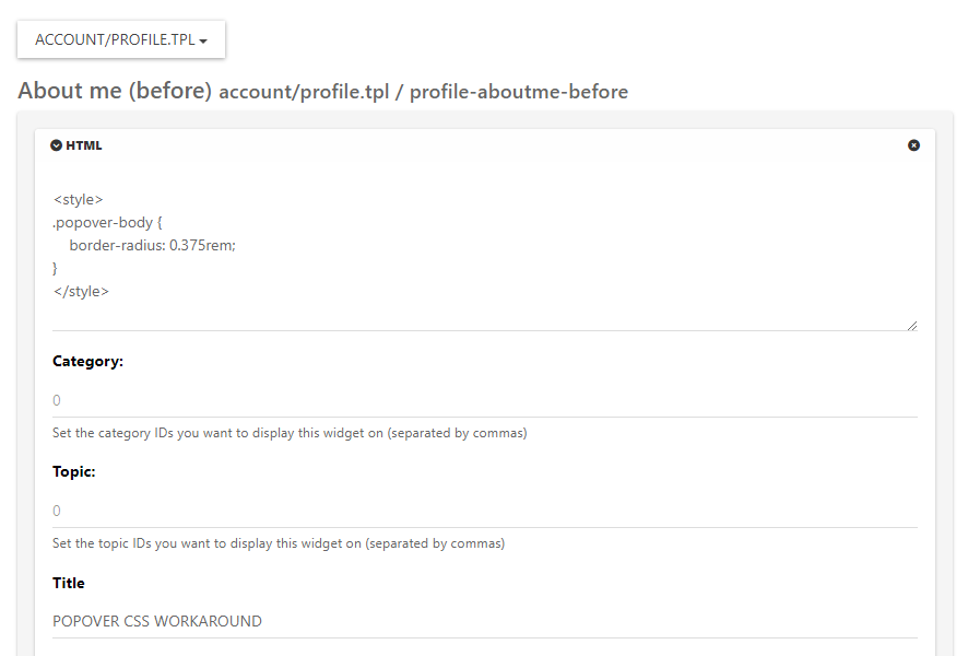
Save the widget.
This is the closest you can get unfortunately. It’s something of a hack, but a necessary evil.
Mark Cutting also advises organisations as a Fractional CIO, Fractional CISO and Executive Advisor, helping boards improve technology governance, cyber resilience and executive decision making. Learn more at Phenomlab Ltd
-
undefined phenomlab has marked this topic as solved on
-
@DownPW This isn’t as simple as it looks, because
bootstrapis usinginsetborder radiusHere’s a workaround
.popover-body {
    background: var(--bs-body-bg) !important;
    color: var(--bs-body-color) !important;
    border: 1px solid var(--bs-border-color);
    border-radius: 0 0 0.375rem 0.375rem;
    margin: 0px;
}
.popover-header {
    background-color: var(--bs-alert-info-bg);
    color: var(--bs-alert-info-color);
    border-top-left-radius: 0.375rem;
    border-top-right-radius: 0.375rem;
    margin: 0px;
}
.bs-popover-auto[data-popper-placement^=top]>.popover-arrow::after, .bs-popover-top>.popover-arrow::after,{
    border-top-color: var(--bs-border-color);
}
.bs-popover-auto[data-popper-placement^=top]>.popover-arrow::after, .bs-popover-bottom>.popover-arrow::after,{
    border-bottom-color: var(--bs-border-color);
}
.bs-popover-auto[data-popper-placement^=left]>.popover-arrow::after, .bs-popover-end>.popover-arrow::after {
    border-left-color: var(--bs-border-color);
}
.bs-popover-auto[data-popper-placement^=right]>.popover-arrow::after, .bs-popover-end>.popover-arrow::after {
    border-right-color: var(--bs-border-color);
}
Then, in the
widgetssection -/admin/extend/widgetsselect theaccount/profile.tplwidget, and add the below HTML<style> .popover-body { border-radius: 0.375rem; } </style>Save the widget.
This is the closest you can get unfortunately. It’s something of a hack, but a necessary evil.
@phenomlab said in nodebb-user-level customisation : popover element:
@DownPW This isn’t as simple as it looks, because bootstrap is using inset border radius
yes, that’s what I noticed !!

Thank you baris ^^Hence the need to open this topic
This hack seems to work, thanks again. If there is anything I will come back
PW and WS Spirit alive
-
@phenomlab said in nodebb-user-level customisation : popover element:
@DownPW This isn’t as simple as it looks, because bootstrap is using inset border radius
yes, that’s what I noticed !!
Thank you baris ^^Hence the need to open this topic
This hack seems to work, thanks again. If there is anything I will come back
@DownPW said in nodebb-user-level customisation : popover element:
Thank you baris ^^
Not his fault really - it’s the
BSlibrary behaviour by default. -
No no, I said that in the sense that he told me it was simple ^^
I was able to see that this was not the case by targeting the elements he had advised me.PW and WS Spirit alive
-
undefined phenomlab referenced this topic on




Hello! It looks like you're interested in this conversation, but you don't have an account yet.
Getting fed up of having to scroll through the same posts each visit? When you register for an account, you'll always come back to exactly where you were before, and choose to be notified of new replies (either via email, or push notification). You'll also be able to save bookmarks and upvote posts to show your appreciation to other community members.
With your input, this post could be even better 💗
Register LoginDid this solution help you?
Related Topics
-
-
Forum Icons NodeBB
Solved Customisation -
-
-
[NODEBB] CSS Style Sheets SelectBox
Locked Solved Customisation -
-
-
Customising NodeBB
Locked Customisation