Material View Support for Stock NodeBB
-
Thank you Mark for the button in Smartphone.
In nodeBB 3.5.0, we can use
.bottombar-nav-leftor.bottombar-nav-rightbecause @baris have created this components follow-up to my topic.Maybe update the code at this moment because cleaner.
See here:
https://community.nodebb.org/post/96323
@phenomlab said in Material View Support foir Stock NodeBB:
There are are two checks - one tests the screen estate and positions the menu item depending on size, and the other will see if the user is logged in or not, and if they are, it uses ul#menu-logged-in else it uses ul#menu-logged-out
Seems to be good.
I have again one or 2 other modification like the scroll to top button .material class to add because the button is hard to see on small phone resolutions It blends in with the color of the block of the categories. Nothing insurmountable I think. I’m getting good results
I’m happy, this code is starting to look like something
")
PW and WS Spirit alive
-
Thank you Mark for the button in Smartphone.
In nodeBB 3.5.0, we can use
.bottombar-nav-leftor.bottombar-nav-rightbecause @baris have created this components follow-up to my topic.Maybe update the code at this moment because cleaner.
See here:
https://community.nodebb.org/post/96323
@phenomlab said in Material View Support foir Stock NodeBB:
There are are two checks - one tests the screen estate and positions the menu item depending on size, and the other will see if the user is logged in or not, and if they are, it uses ul#menu-logged-in else it uses ul#menu-logged-out
Seems to be good.
I have again one or 2 other modification like the scroll to top button .material class to add because the button is hard to see on small phone resolutions It blends in with the color of the block of the categories. Nothing insurmountable I think. I’m getting good results
I’m happy, this code is starting to look like something
@DownPW great. I did see the
3.5.0changes and they look like a good idea, but can’t comment until I’ve tried them. -
you’re right as usual my friend
-
Test material view display on my smartphone. Seems I have a little work again
PW and WS Spirit alive
-
@DownPW Good luck - let me know if you need any help.
-
Seems to be good :
just the line from the timeline on the left that I can’t seem to display. But I note that it’s the same here on Smartphones
I need to check and recheck now
")
-
–> For now test function in production…
I provide all JS and CSS code for all after… and after @phenomlab check and validate of course– EDIT :
Can you correct the title of the topic please ?
PW and WS Spirit alive
-
–> For now test function in production…
I provide all JS and CSS code for all after… and after @phenomlab check and validate of course– EDIT :
Can you correct the title of the topic please ?
@DownPW done. Fixed a typo
-
Hello @phenomlab
I didn’t even notice because I never use this mode. But when I say never it’s so much that I forget that it’s possible to do it.
When right sidebar is expand, the button is at the bottom of the sidebar like this :
–> For now, I resolve the problem by change
var buttonContainer = $('[component="sidebar/right"]');forvar buttonContainer = $('[component="sidebar/drafts"]');// ------------------------------------------ function material() { $(document).ready(function () { // Create the button for custom thread view mode with custom IDs if ($('#materialThreadViewButton').length === 0) { var threadViewButton = $('<div class="material-threads-wrapper"><form class="form"><div class="form-check form-switch form-switch-sm material-threads-wrapper"> \ <input class="form-check-input" id="materialThreadViewButton" type="checkbox" data-field="materialThreadView"> \ <label class=" d-none d-md-inline fw-semibold" for="materialThreadViewButton"></label> \ </div></form></div>'); // Check if the screen width is 991px or more if ($(window).width() >= 991) { // Check if the custom thread view button already exists in the right sidebar var buttonContainer = $('[component="sidebar/drafts"]'); // Append the button to the selected container buttonContainer.append(threadViewButton); } if ($(window).width() <= 991) { // Check if the custom thread view button already exists in the bottom bar //$buttonContainer = $('.bottombar-nav.p-2.text-dark.bg-light.d-flex.justify-content-between.align-items-center.w-100'); if ($("#logged-in-menu").length > 0) { var buttonContainer = $('.bottombar-nav ul#logged-in-menu'); } else { var buttonContainer = $('.bottombar-nav ul#logged-out-menu'); } // Prepend the button to the selected container buttonContainer.prepend(threadViewButton); } } ..............it’s clearly better :
but if you have better solution (like add text if sidebar is expand for example) I take it
PW and WS Spirit alive
-
Seems this solution give me a new bug for tooltip
I have test this with no working :
if (isChecked) {
       $('[component="sidebar/drafts"]').find('[data-toggle="tooltip"]').tooltip('dispose');
   } else {
       $('[component="sidebar/drafts"]').find('[data-toggle="tooltip"]').tooltip();
   }
PW and WS Spirit alive
-
Seems this solution give me a new bug for tooltip
I have test this with no working :
if (isChecked) { $('[component="sidebar/drafts"]').find('[data-toggle="tooltip"]').tooltip('dispose'); } else { $('[component="sidebar/drafts"]').find('[data-toggle="tooltip"]').tooltip(); }@DownPW Seems to work fine for me?
-
Hello @phenomlab
I didn’t even notice because I never use this mode. But when I say never it’s so much that I forget that it’s possible to do it.
When right sidebar is expand, the button is at the bottom of the sidebar like this :
–> For now, I resolve the problem by change
var buttonContainer = $('[component="sidebar/right"]');forvar buttonContainer = $('[component="sidebar/drafts"]');// ------------------------------------------ function material() { $(document).ready(function () { // Create the button for custom thread view mode with custom IDs if ($('#materialThreadViewButton').length === 0) { var threadViewButton = $('<div class="material-threads-wrapper"><form class="form"><div class="form-check form-switch form-switch-sm material-threads-wrapper"> \ <input class="form-check-input" id="materialThreadViewButton" type="checkbox" data-field="materialThreadView"> \ <label class=" d-none d-md-inline fw-semibold" for="materialThreadViewButton"></label> \ </div></form></div>'); // Check if the screen width is 991px or more if ($(window).width() >= 991) { // Check if the custom thread view button already exists in the right sidebar var buttonContainer = $('[component="sidebar/drafts"]'); // Append the button to the selected container buttonContainer.append(threadViewButton); } if ($(window).width() <= 991) { // Check if the custom thread view button already exists in the bottom bar //$buttonContainer = $('.bottombar-nav.p-2.text-dark.bg-light.d-flex.justify-content-between.align-items-center.w-100'); if ($("#logged-in-menu").length > 0) { var buttonContainer = $('.bottombar-nav ul#logged-in-menu'); } else { var buttonContainer = $('.bottombar-nav ul#logged-out-menu'); } // Prepend the button to the selected container buttonContainer.prepend(threadViewButton); } } ..............it’s clearly better :
but if you have better solution (like add text if sidebar is expand for example) I take it
@DownPW It doesn’t look right - the toggle switch is now located at the top of the menu
-
PW and WS Spirit alive
-
@DownPW Try this. Change the function to
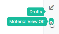
function material() {
    $(document).ready(function () {
            // Create the button for custom thread view mode with custom IDs
            if ($('#materialThreadViewButton').length === 0) {
                var threadViewButton = $('<div class="material-threads-wrapper"><form class="form"><div class="form-check form-switch form-switch-sm material-threads-wrapper"> \
                    <input class="form-check-input" id="materialThreadViewButton" type="checkbox" data-field="materialThreadView"> \
                    <label class=" d-none d-md-inline fw-semibold" for="materialThreadViewButton"></label> \
                </div></form></div>');

            // Check if the screen width is 991px or more
            if ($(window).width() >= 991) {
                // Check if the custom thread view button already exists in the right sidebar
                //var buttonContainer = $('[component="sidebar/right"]ul#logged-in-menu');
            if ($("#logged-in-menu").length > 0) {
                var buttonContainer = $('ul#logged-in-menu');
                }
            else {
                var buttonContainer = $('ul#logged-out-menu');
            }
                // Append the button to the selected container
                buttonContainer.append(threadViewButton);
        }
            if ($(window).width() <= 991) {
                // Check if the custom thread view button already exists in the bottom bar
                //$buttonContainer = $('.bottombar-nav.p-2.text-dark.bg-light.d-flex.justify-content-between.align-items-center.w-100');
            if ($("#logged-in-menu").length > 0) {
                var buttonContainer = $('.bottombar-nav ul#logged-in-menu');
                }
            else {
                var buttonContainer = $('.bottombar-nav ul#logged-out-menu');
            }
            // Prepend the button to the selected container
            buttonContainer.prepend(threadViewButton);
        }
            }
            // Check if there's a stored state for the checkbox and update it
                var storedState = localStorage.getItem('materialThreadViewState');
                console.log("Stored State is " + storedState);
                if (storedState === 'true') {
                    $('#materialThreadViewButton').prop('checked', true);
                }

            // Toggle the class 'material' on or off when the checkbox changes state
            $('#materialThreadViewButton').on('change', function () {
                var isChecked = $(this).is(':checked');
                var theTooltip = isChecked ? "Material View Off" : "Material View On"; // Update tooltip message

            // Remove any existing tooltips
    $(this).tooltip('dispose');

            // Toggle CSS rules when the button is turned on or off
                if (isChecked) {
                    console.log('Material Thread view is active.');
                    // Apply your CSS rules here
                    $('[component="category/topic"]').addClass('material');
                    $('li[component="category/topic"]').addClass('material');
                    $('[component="categories/category"]').addClass('material');

                    $('.posts-container').addClass('material')
                    $('ul[component="topic"]').addClass('material')
                    $('.post-container').addClass('material')
                    $('.timeline-event').addClass('material')
                    $('[component="post/footer"]').addClass('material')
                    $('li.pt-4.deleted').addClass('material')

                    $('.page-topic .topic .posts.timeline .timeline-event > div:first-of-type, .page-topic .topic .posts.timeline > [component="post/placeholder"] > div:first-of-type, .page-topic .topic .posts.timeline > [component=post] > div:first-of-type').addClass('material');
                    $('#pageUp.show').addClass('material');

                    $('[component="post"]').each(function () {
                        // Add the 'material' class to matching elements
                        if ($(this).hasClass('pt-4') || $(this).hasClass('self-post')) {
                            $(this).addClass('material');
                            $('[component="sidebar/right"]').addClass('material');
                        }
                    });
                    $('[component="topic/necro-post"]').each(function () {
                        // Add the 'material' class to matching elements
                        if ($(this).hasClass('timeline-event')) {
                            $(this).addClass('material');
                        }
                    });

                } else {
                    console.log('Material Thread view is inactive.');
                    // Remove the CSS rules here
                    $('[component="category/topic"]').removeClass('material');
                    $('li[component="category/topic"]').removeClass('material');
                    $('[component="categories/category"]').removeClass('material');

                    $('[component="post"]').removeClass('material');
                    $('ul[component="topic"]').removeClass('material');
                    $('.posts-container').removeClass('material')
                    $('ul[component="topic"]').removeClass('material')
                    $('.post-container').removeClass('material')
                    $('.timeline-event').removeClass('material')
                    $('[component="post/footer"]').removeClass('material');
                    $('li.pt-4.deleted').removeClass('material');

                    $('.page-topic .topic .posts.timeline .timeline-event > div:first-of-type, .page-topic .topic .posts.timeline > [component="post/placeholder"] > div:first-of-type, .page-topic .topic .posts.timeline > [component=post] > div:first-of-type').removeClass('material');
                    $('#pageUp.show').removeClass('material');

                    $('[component="sidebar/right"]').removeClass('material');

                }

                // Store the checkbox state in localStorage
                localStorage.setItem('materialThreadViewState', isChecked);

                // Update the tooltip title
                $(this).attr('data-original-title', theTooltip).tooltip('dispose').tooltip({
                    placement: 'bottom',
                    title: theTooltip,
                    trigger: 'hover'
                });
            });

            // Check for changes in the checkbox state when the page loads
            $('#materialThreadViewButton').trigger('change');

    });
}
And modify this CSS to the below
@media (min-width: 991px) {
#materialThreadViewButton {
    border-radius: 7px;
    cursor: pointer;
    position: relative !important;
    z-index: 999;
    display: flex;
    left: 15px !important;
    top: 5px !important;
    transform: rotate(90deg) !important;
    }
}
Essentially, we have to change the positioning of the block to use the logged-in and logged-out ID’s
// Check if the screen width is 991px or more if ($(window).width() >= 991) { // Check if the custom thread view button already exists in the right sidebar //var buttonContainer = $('[component="sidebar/right"]ul#logged-in-menu'); if ($("#logged-in-menu").length > 0) { var buttonContainer = $('ul#logged-in-menu'); } else { var buttonContainer = $('ul#logged-out-menu'); } // Append the button to the selected container buttonContainer.append(threadViewButton); } -
I tested the same thing but added a container like
[component="sidebar/right"]or[component="sidebar/drafts"]or thesidebar rightCSS class. it worked but it created other bugsI’m not sure I would have thought to do this without specifying a container and just use
ul#logged-out-menu&ul#logged-in-menuALONE, no component or CSS classThanks @phenomlab
PW and WS Spirit alive
-
I tested the same thing but added a container like
[component="sidebar/right"]or[component="sidebar/drafts"]or thesidebar rightCSS class. it worked but it created other bugsI’m not sure I would have thought to do this without specifying a container and just use
ul#logged-out-menu&ul#logged-in-menuALONE, no component or CSS classThanks @phenomlab
@DownPW The real issue here is that you should always bind (either
appendorprepend) to an ID rather than a class. You can guarantee in most cases that the ID is unique, whereas the class probably isn’t, and that’s what is causing your issue. -
Oh yes, that’s what’s super cool, I learn something every day. Afterwards I start from so low in JS
Hello! It looks like you're interested in this conversation, but you don't have an account yet.
Getting fed up of having to scroll through the same posts each visit? When you register for an account, you'll always come back to exactly where you were before, and choose to be notified of new replies (either via email, or push notification). You'll also be able to save bookmarks and upvote posts to show your appreciation to other community members.
With your input, this post could be even better 💗
Register LoginRelated Topics
-
-
-
-
-
-
-
[NODEBB] CSS Style Sheets SelectBox
Locked Solved Customisation -
