NodeBB Theme/Skin Switcher
-
@phenomlab here’s what I have in my default.css which is located in /assets/customcss/default.css
:root {
  --body: #fff;
  --primary-color: #000;
}
here’s what I in dark_skin.css
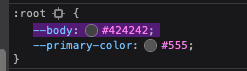
:root {
  --body: #424242;
}
here’s what I have in ACP > CUSTOM CSS
body {
  background-color: var(--body);
}

/*----------------------------------------------------------------------------*/
/*----------------------        Themes Switcher        -----------------------*/
/*----------------------------------------------------------------------------*/

/* Works with CUSTOM JS */
/* DON'T DELETE - DON'T MOVE */
/* -- */
/* Fonctionne avec du CUSTOM JS */
/* NE PAS SUPPRIMER - NE PAS  DEPLACER */

/*Desktop*/
/*Allows to have the "Theme Switcher" icon in black after a mouse click and during the dropdown */
/*Permet d'avoir l'icone du "Theme Switcher" en noir après un clic souris et lors du dropdown */
[aria-expanded="true"] a #ticon {
  color: #000000;
}

/*Theme Switcher icon color via CUSTOM JAVASCRIPT */
/* Blank without mouse over */
/*Couleur de l'icone du Theme Switcher via le CUSTOM JAVASCRIPT */
/* Blanc sans mouse over*/
.themeon {
  color: #ffffff !important;
}

/*Black with mouseover*/
/*Noir avec mouse over*/
.themeoff {
  color: #000000 !important;
}

/*Smartphone*/
@media all and (max-width: 1024px) {

  /*BUGFIX: Placement of the "Theme Switcher" */
  /*BUGFIX: Placement du "Theme Switcher" */
  #switcher {
    list-style: none;
    margin-left: -80px;
    padding-top: 15px;
  }

  /*BUGFIX: Space between the icon and the text "Theme Switcher" */
  /*BUGFIX: Espace entre l'icone et le texte "Theme Switcher" */
  #switcher .fa-fw {
    text-align: center;
    width: 1.25em;
    padding-right: 25px;
  }

  /* DON'T DELETE - DON'T MOVE */
  /*Allows to have the "Theme Switcher" icon in white after a mouse click and during the dropdown */
  /* NE PAS SUPPRIMER - NE PAS  DEPLACER */
  /*Permet d'avoir l'icone du "Theme Switcher" en blanc après un clic souris et lors du dropdown */
  [aria-expanded="true"] a #ticon {
    color: #ffffff;
  }

  /*Theme Switcher icon color via CUSTOM JAVASCRIPT */
  /* Blank without mouse over */
  /*Couleur de l'icone du Theme Switcher via le CUSTOM JAVASCRIPT */
  /* Blanc sans mouse over*/
  .themeoff {
    color: #ffffff !important;
  }
}

/*FIREFOX BUGFIX: Remove dotted border from icon when clicked */
/*BUGFIX FIREFOX: Suppression de la bordure pointillée de l'icône quand on clique dessus */
/*Desktop*/
a:focus {
  outline: 0;
}

/*Smartphone*/
@media all and (max-width: 1024px) {
  a:focus {
    outline: 0;
  }
}


/* Desktop */
/*Button Position */
/*Position du Bouton */
.header #theme_dropdown {
  /*padding: 9px 15px;*/
  padding: 9px 15px;
  padding-top: 9px;
  padding-bottom: 9px;
  margin-top: -4px;
  padding-top: 15px;
  padding-bottom: 14px;
}

/* ---- Appearance of the "Theme Switcher" icon in the navbar via Font Awesome (!!Change the CSS class also in the JS!!) ----*/
/*Ampule*/
/* ---- Apparence de l'icône du "Theme Switcher" dans la navbar via Font Awesome (!!Changer la class CSS aussi dans le JS!!) ----*/
/*Ampoule*/
.fa.fa-lightbulb-o:before {
  content: "\f0eb";
}

/*Navbar height to play with background height */
/*Hauteur navbar pour jouer avec la hauteur du background */
.navbar-default {
  height: 51px;
}

/*Spacing between "Search" and "Notifications" icons */
/*Espacement entre les icônes "Recherche" et "Notifications" */
#switcher {
  margin-top: 4px;
}

/*We remove the background on the icon */
/*On supprime le background sur l'icone */
#switcher .btn-link:hover {
  background: none !important;
}

/*Background color on mouseover (Default Theme) */
/*Couleur du background au survol souris (Default Theme) */
.navbar-default .navbar-nav>li>label:hover {
  background: #eeeeee;
}

/*Appearance of selection menu */
/*Apparence du menu de sélection */
#theme.dropdown-menu {
  position: absolute;
  top: 44px;
  right: 0px;
  z-index: 1000;
  float: left;
  min-width: 160px;
  padding: 5px 0;
  margin: 2px 0 0;
  list-style: none;
  font-size: 14px;
  text-align: left;
  background-clip: padding-box;
}

/* Smartphone */
/*Appearance of button and drop-down menu on Smartphone */
/*Apparence du bouton et du menu déroulant sur Smartphone */
@media all and (max-width: 1024px) {

  /*Dropdown menu text color */
  /*Couleur du texte du menu déroulant */
  #theme.dropdown-menu>li>a {
    display: block;
    padding: 3px 20px;
    clear: both;
    font-weight: 400;
    line-height: 1.42857143;
    color: #fff;
    white-space: nowrap;
    background: #3A3C41;
  }

  /*Appearance and position of button and drop-down menu */
  /*Apparence et position du bouton et du menu déroulant */
  #theme.dropdown-menu {
    position: fixed;
    top: 140px;
    left: 15px;
    z-index: 1000;
    float: left;
    min-width: 185px;
    padding: 5px 0;
    margin: 2px 0 0;
    list-style: none;
    font-size: 14px;
    text-align: left;
    /* background-clip: padding-box; */
    color: #fff;
    background: #3A3C41;
    width: 60px;
    /* VIOLENCE: Largeur */
    border: 1px solid black;
  }


  /*Text color and button background when selected */
  /*Couleur du texte et background du bouton lors de la selection */
  .btn-link:focus,
  .btn-link:hover {
    /*color: #23527c;*/
    color: lightgrey;
    text-decoration: underline;
    background-color: transparent;
  }

  /*We remove the white bars at the top and bottom of the button on Smartphone */
  /*On supprime les barres blanches en haut et en bas du bouton sur Smartphone */
  .navbar-form {
    left: 20px;
    box-shadow: none;
    list-style: none;
  }
}
I put body on top of custom css for visibility.
NOTE: When I create a new styles for body in the inspector using the variable, it works fine. I think once my styles in ACP > CUSTOM CSS shows up, it will start working.
@Teemberland what happens if you append the
bodyCSS class with!important? You shouldn’t need this, but I think your style is being overridden further down by the default css.Mark – Founder, Phenomlab Ltd
Executive IT & Security Leadership
Phenomlab Ltd -
@Teemberland what happens if you append the
bodyCSS class with!important? You shouldn’t need this, but I think your style is being overridden further down by the default css.@phenomlab yeah I tried this earlier, it didn’t work. In theory, when you add any css rule in ACP > CUSTOM CSS, it should show right away right? I can’t quite figure out why it’s not working.
EDIT: I also made sure I’m rebuilding/restarting after I change my CUSTOM CSS in ACP.
-
@phenomlab yeah I tried this earlier, it didn’t work. In theory, when you add any css rule in ACP > CUSTOM CSS, it should show right away right? I can’t quite figure out why it’s not working.
EDIT: I also made sure I’m rebuilding/restarting after I change my CUSTOM CSS in ACP.
@Teemberland you’re correct, it shouldn’t require a rebuild. Humour me though. In the ACP within the custom css, look at the bottom and ensure the custom css is enabled?
It’s disabled by default.
Mark – Founder, Phenomlab Ltd
Executive IT & Security Leadership
Phenomlab Ltd -
@Teemberland you’re correct, it shouldn’t require a rebuild. Humour me though. In the ACP within the custom css, look at the bottom and ensure the custom css is enabled?
It’s disabled by default.
@phenomlab ha! that’s the next thing I checked yesterday. But it is enabled. Maybe I can add the styles in Extend > Widgets > HTML ?
-
@phenomlab ha! that’s the next thing I checked yesterday. But it is enabled. Maybe I can add the styles in Extend > Widgets > HTML ?
@Teemberland that shouldn’t be necessary as the CSS is taken from the ACP. Clearly, something is amiss here. Can you provide a list of what you’ve done thus far so I can take a look? A better way would be to get access to your environment directly for review.
Mark – Founder, Phenomlab Ltd
Executive IT & Security Leadership
Phenomlab Ltd -
@Teemberland that shouldn’t be necessary as the CSS is taken from the ACP. Clearly, something is amiss here. Can you provide a list of what you’ve done thus far so I can take a look? A better way would be to get access to your environment directly for review.
@phenomlab Yeah, I’m not quite sure what I’m missing here. Anyways, here’s what I’ve done so far.
- Placed CSS in ACP > Appearance > Custom Content > Custom CSS
body { background-color: var(--body) !important; } /*----------------------------------------------------------------------------*/ /*---------------------- Themes Switcher -----------------------*/ /*----------------------------------------------------------------------------*/ /* Works with CUSTOM JS */ /* DON'T DELETE - DON'T MOVE */ /* -- */ /* Fonctionne avec du CUSTOM JS */ /* NE PAS SUPPRIMER - NE PAS DEPLACER */ /*Desktop*/ /*Allows to have the "Theme Switcher" icon in black after a mouse click and during the dropdown */ /*Permet d'avoir l'icone du "Theme Switcher" en noir après un clic souris et lors du dropdown */ [aria-expanded="true"] a #ticon { color: #000000; } /*Theme Switcher icon color via CUSTOM JAVASCRIPT */ /* Blank without mouse over */ /*Couleur de l'icone du Theme Switcher via le CUSTOM JAVASCRIPT */ /* Blanc sans mouse over*/ .themeon { color: #ffffff !important; } /*Black with mouseover*/ /*Noir avec mouse over*/ .themeoff { color: #000000 !important; } /*Smartphone*/ @media all and (max-width: 1024px) { /*BUGFIX: Placement of the "Theme Switcher" */ /*BUGFIX: Placement du "Theme Switcher" */ #switcher { list-style: none; margin-left: -80px; padding-top: 15px; } /*BUGFIX: Space between the icon and the text "Theme Switcher" */ /*BUGFIX: Espace entre l'icone et le texte "Theme Switcher" */ #switcher .fa-fw { text-align: center; width: 1.25em; padding-right: 25px; } /* DON'T DELETE - DON'T MOVE */ /*Allows to have the "Theme Switcher" icon in white after a mouse click and during the dropdown */ /* NE PAS SUPPRIMER - NE PAS DEPLACER */ /*Permet d'avoir l'icone du "Theme Switcher" en blanc après un clic souris et lors du dropdown */ [aria-expanded="true"] a #ticon { color: #ffffff; } /*Theme Switcher icon color via CUSTOM JAVASCRIPT */ /* Blank without mouse over */ /*Couleur de l'icone du Theme Switcher via le CUSTOM JAVASCRIPT */ /* Blanc sans mouse over*/ .themeoff { color: #ffffff !important; } } /*FIREFOX BUGFIX: Remove dotted border from icon when clicked */ /*BUGFIX FIREFOX: Suppression de la bordure pointillée de l'icône quand on clique dessus */ /*Desktop*/ a:focus { outline: 0; } /*Smartphone*/ @media all and (max-width: 1024px) { a:focus { outline: 0; } } /* Desktop */ /*Button Position */ /*Position du Bouton */ .header #theme_dropdown { /*padding: 9px 15px;*/ padding: 9px 15px; padding-top: 9px; padding-bottom: 9px; margin-top: -4px; padding-top: 15px; padding-bottom: 14px; } /* ---- Appearance of the "Theme Switcher" icon in the navbar via Font Awesome (!!Change the CSS class also in the JS!!) ----*/ /*Ampule*/ /* ---- Apparence de l'icône du "Theme Switcher" dans la navbar via Font Awesome (!!Changer la class CSS aussi dans le JS!!) ----*/ /*Ampoule*/ .fa.fa-lightbulb-o:before { content: "\f0eb"; } /*Navbar height to play with background height */ /*Hauteur navbar pour jouer avec la hauteur du background */ .navbar-default { height: 51px; } /*Spacing between "Search" and "Notifications" icons */ /*Espacement entre les icônes "Recherche" et "Notifications" */ #switcher { margin-top: 4px; } /*We remove the background on the icon */ /*On supprime le background sur l'icone */ #switcher .btn-link:hover { background: none !important; } /*Background color on mouseover (Default Theme) */ /*Couleur du background au survol souris (Default Theme) */ .navbar-default .navbar-nav>li>label:hover { background: #eeeeee; } /*Appearance of selection menu */ /*Apparence du menu de sélection */ #theme.dropdown-menu { position: absolute; top: 44px; right: 0px; z-index: 1000; float: left; min-width: 160px; padding: 5px 0; margin: 2px 0 0; list-style: none; font-size: 14px; text-align: left; background-clip: padding-box; } /* Smartphone */ /*Appearance of button and drop-down menu on Smartphone */ /*Apparence du bouton et du menu déroulant sur Smartphone */ @media all and (max-width: 1024px) { /*Dropdown menu text color */ /*Couleur du texte du menu déroulant */ #theme.dropdown-menu>li>a { display: block; padding: 3px 20px; clear: both; font-weight: 400; line-height: 1.42857143; color: #fff; white-space: nowrap; background: #3A3C41; } /*Appearance and position of button and drop-down menu */ /*Apparence et position du bouton et du menu déroulant */ #theme.dropdown-menu { position: fixed; top: 140px; left: 15px; z-index: 1000; float: left; min-width: 185px; padding: 5px 0; margin: 2px 0 0; list-style: none; font-size: 14px; text-align: left; /* background-clip: padding-box; */ color: #fff; background: #3A3C41; width: 60px; /* VIOLENCE: Largeur */ border: 1px solid black; } /*Text color and button background when selected */ /*Couleur du texte et background du bouton lors de la selection */ .btn-link:focus, .btn-link:hover { /*color: #23527c;*/ color: lightgrey; text-decoration: underline; background-color: transparent; } /*We remove the white bars at the top and bottom of the button on Smartphone */ /*On supprime les barres blanches en haut et en bas du bouton sur Smartphone */ .navbar-form { left: 20px; box-shadow: none; list-style: none; } }- Placed JS ACP > Appearance > Custom Content > Custom JS
$(document).ready(function() { function generateRandomString(length) { var text = ""; var possible = "ABCDEFGHIJKLMNOPQRSTUVWXYZabcdefghijklmnopqrstuvwxyz0123456789"; for (var i = 0; i < length; i++) { text += possible.charAt(Math.floor(Math.random() * possible.length)); } return text; } var string = generateRandomString(10); $("#random_string").text(string); var whichTheme = localStorage.getItem("theme"); var activeTheme = localStorage.getItem("activeTheme"); // If no theme is detected (for example, a new visitor), then set this to default if (!whichTheme) { // dark-mode media query matched or not let matched = window.matchMedia('(prefers-color-scheme: dark)').matches; //var override = getUrlParameter('override'); if (matched) { // Offer the mifnight theme by default whichTheme = "dark"; activeTheme = "/assets/customcss/dark_skin.css?version=" + string; //$("link[rel=stylesheet]").attr('href' , thishref + "?version=" + string + ""); } else { // Leave the default theme intact whichTheme = "default"; activeTheme = "/assets/customcss/default.css?version=" + string; } // See if override has been enabled if (whichTheme === 'default') { // Sudonix is overriding operating system settings and will force dark scheme activeTheme = "/assets/customcss/default.css?version=" + string; } if (whichTheme === 'default') { // $('[component="post"]').addClass("background"); $('li.self-post .content:not(.isSolved [component="post/content"]').addClass("response"); } else { // Nothing to do :) } } /*$(".forum-logo").attr("src","/assets/uploads/system/sl_" + whichTheme + ".webp?version=" + string + ""); */ var panel = $('<li id="switcher" class="dropdown"> \ <a title="" data-original-title="Swatch" class="navigation-link dropdown-toggle" href="#" role="button" data-toggle="dropdown" aria-haspopup="true" aria-expanded="false"> \ <i id="ticon" class="fa fa-light fa-swatchbook" data-content="" aria-hidden="true"></i> \ <span class="visible-xs-inline">Swatch</span> \ <i class="fa fa-caret-down" aria-hidden="true"></i> \ </a> \ <ul id="theme" class="dropdown-menu"> \ <li><a id="default" href="#" rel="/assets/customcss/default.css">Default</a></li> \ <li><a id="dark" href="#" rel="/assets/customcss/dark_skin.css">Dark</a></li> \ </ul> \ </li> \ </div> \ '); if (whichTheme) { $.get(activeTheme, function(css) { $('<style type="text/css"></style>') .html(css) .appendTo("head"); }); } else {} $('#main-nav').append(panel); if (utils.findBootstrapEnvironment() === 'xs') { $('#main-nav').append(panel); } $(document).ready(function() { $("body").on("click change", "#theme li a", function() { var thishref = $(this).attr('rel') + '?version=' + string; $.get(thishref, function(css) { $('<style type="text/css"></style>') .html(css) .appendTo("head"); }); console.log("Applying swatch " + thishref); //location.reload(); var selected = $(this).attr("id"); var theTheme = $(this).attr("rel"); if (selected === 'default') { localStorage.setItem("theme", selected); localStorage.setItem("activeTheme", "/assets/customcss/dark_skin.css?version=" + string); //location.reload(); } else { localStorage.setItem("theme", selected); localStorage.setItem("activeTheme", theTheme); } return false; }); }); });- Made sure that both custom css and js are enabled in ACP
- I can confirm that when I select a skin in the switcher, it does append the style tag to <head>
- The custom styles are found when you inspect the page
Issue: The following CSS rule is not showing on the page.
body {
  background-color: var(--body);
}
I hope this helps.
-
@phenomlab Yeah, I’m not quite sure what I’m missing here. Anyways, here’s what I’ve done so far.
- Placed CSS in ACP > Appearance > Custom Content > Custom CSS
body { background-color: var(--body) !important; } /*----------------------------------------------------------------------------*/ /*---------------------- Themes Switcher -----------------------*/ /*----------------------------------------------------------------------------*/ /* Works with CUSTOM JS */ /* DON'T DELETE - DON'T MOVE */ /* -- */ /* Fonctionne avec du CUSTOM JS */ /* NE PAS SUPPRIMER - NE PAS DEPLACER */ /*Desktop*/ /*Allows to have the "Theme Switcher" icon in black after a mouse click and during the dropdown */ /*Permet d'avoir l'icone du "Theme Switcher" en noir après un clic souris et lors du dropdown */ [aria-expanded="true"] a #ticon { color: #000000; } /*Theme Switcher icon color via CUSTOM JAVASCRIPT */ /* Blank without mouse over */ /*Couleur de l'icone du Theme Switcher via le CUSTOM JAVASCRIPT */ /* Blanc sans mouse over*/ .themeon { color: #ffffff !important; } /*Black with mouseover*/ /*Noir avec mouse over*/ .themeoff { color: #000000 !important; } /*Smartphone*/ @media all and (max-width: 1024px) { /*BUGFIX: Placement of the "Theme Switcher" */ /*BUGFIX: Placement du "Theme Switcher" */ #switcher { list-style: none; margin-left: -80px; padding-top: 15px; } /*BUGFIX: Space between the icon and the text "Theme Switcher" */ /*BUGFIX: Espace entre l'icone et le texte "Theme Switcher" */ #switcher .fa-fw { text-align: center; width: 1.25em; padding-right: 25px; } /* DON'T DELETE - DON'T MOVE */ /*Allows to have the "Theme Switcher" icon in white after a mouse click and during the dropdown */ /* NE PAS SUPPRIMER - NE PAS DEPLACER */ /*Permet d'avoir l'icone du "Theme Switcher" en blanc après un clic souris et lors du dropdown */ [aria-expanded="true"] a #ticon { color: #ffffff; } /*Theme Switcher icon color via CUSTOM JAVASCRIPT */ /* Blank without mouse over */ /*Couleur de l'icone du Theme Switcher via le CUSTOM JAVASCRIPT */ /* Blanc sans mouse over*/ .themeoff { color: #ffffff !important; } } /*FIREFOX BUGFIX: Remove dotted border from icon when clicked */ /*BUGFIX FIREFOX: Suppression de la bordure pointillée de l'icône quand on clique dessus */ /*Desktop*/ a:focus { outline: 0; } /*Smartphone*/ @media all and (max-width: 1024px) { a:focus { outline: 0; } } /* Desktop */ /*Button Position */ /*Position du Bouton */ .header #theme_dropdown { /*padding: 9px 15px;*/ padding: 9px 15px; padding-top: 9px; padding-bottom: 9px; margin-top: -4px; padding-top: 15px; padding-bottom: 14px; } /* ---- Appearance of the "Theme Switcher" icon in the navbar via Font Awesome (!!Change the CSS class also in the JS!!) ----*/ /*Ampule*/ /* ---- Apparence de l'icône du "Theme Switcher" dans la navbar via Font Awesome (!!Changer la class CSS aussi dans le JS!!) ----*/ /*Ampoule*/ .fa.fa-lightbulb-o:before { content: "\f0eb"; } /*Navbar height to play with background height */ /*Hauteur navbar pour jouer avec la hauteur du background */ .navbar-default { height: 51px; } /*Spacing between "Search" and "Notifications" icons */ /*Espacement entre les icônes "Recherche" et "Notifications" */ #switcher { margin-top: 4px; } /*We remove the background on the icon */ /*On supprime le background sur l'icone */ #switcher .btn-link:hover { background: none !important; } /*Background color on mouseover (Default Theme) */ /*Couleur du background au survol souris (Default Theme) */ .navbar-default .navbar-nav>li>label:hover { background: #eeeeee; } /*Appearance of selection menu */ /*Apparence du menu de sélection */ #theme.dropdown-menu { position: absolute; top: 44px; right: 0px; z-index: 1000; float: left; min-width: 160px; padding: 5px 0; margin: 2px 0 0; list-style: none; font-size: 14px; text-align: left; background-clip: padding-box; } /* Smartphone */ /*Appearance of button and drop-down menu on Smartphone */ /*Apparence du bouton et du menu déroulant sur Smartphone */ @media all and (max-width: 1024px) { /*Dropdown menu text color */ /*Couleur du texte du menu déroulant */ #theme.dropdown-menu>li>a { display: block; padding: 3px 20px; clear: both; font-weight: 400; line-height: 1.42857143; color: #fff; white-space: nowrap; background: #3A3C41; } /*Appearance and position of button and drop-down menu */ /*Apparence et position du bouton et du menu déroulant */ #theme.dropdown-menu { position: fixed; top: 140px; left: 15px; z-index: 1000; float: left; min-width: 185px; padding: 5px 0; margin: 2px 0 0; list-style: none; font-size: 14px; text-align: left; /* background-clip: padding-box; */ color: #fff; background: #3A3C41; width: 60px; /* VIOLENCE: Largeur */ border: 1px solid black; } /*Text color and button background when selected */ /*Couleur du texte et background du bouton lors de la selection */ .btn-link:focus, .btn-link:hover { /*color: #23527c;*/ color: lightgrey; text-decoration: underline; background-color: transparent; } /*We remove the white bars at the top and bottom of the button on Smartphone */ /*On supprime les barres blanches en haut et en bas du bouton sur Smartphone */ .navbar-form { left: 20px; box-shadow: none; list-style: none; } }- Placed JS ACP > Appearance > Custom Content > Custom JS
$(document).ready(function() { function generateRandomString(length) { var text = ""; var possible = "ABCDEFGHIJKLMNOPQRSTUVWXYZabcdefghijklmnopqrstuvwxyz0123456789"; for (var i = 0; i < length; i++) { text += possible.charAt(Math.floor(Math.random() * possible.length)); } return text; } var string = generateRandomString(10); $("#random_string").text(string); var whichTheme = localStorage.getItem("theme"); var activeTheme = localStorage.getItem("activeTheme"); // If no theme is detected (for example, a new visitor), then set this to default if (!whichTheme) { // dark-mode media query matched or not let matched = window.matchMedia('(prefers-color-scheme: dark)').matches; //var override = getUrlParameter('override'); if (matched) { // Offer the mifnight theme by default whichTheme = "dark"; activeTheme = "/assets/customcss/dark_skin.css?version=" + string; //$("link[rel=stylesheet]").attr('href' , thishref + "?version=" + string + ""); } else { // Leave the default theme intact whichTheme = "default"; activeTheme = "/assets/customcss/default.css?version=" + string; } // See if override has been enabled if (whichTheme === 'default') { // Sudonix is overriding operating system settings and will force dark scheme activeTheme = "/assets/customcss/default.css?version=" + string; } if (whichTheme === 'default') { // $('[component="post"]').addClass("background"); $('li.self-post .content:not(.isSolved [component="post/content"]').addClass("response"); } else { // Nothing to do :) } } /*$(".forum-logo").attr("src","/assets/uploads/system/sl_" + whichTheme + ".webp?version=" + string + ""); */ var panel = $('<li id="switcher" class="dropdown"> \ <a title="" data-original-title="Swatch" class="navigation-link dropdown-toggle" href="#" role="button" data-toggle="dropdown" aria-haspopup="true" aria-expanded="false"> \ <i id="ticon" class="fa fa-light fa-swatchbook" data-content="" aria-hidden="true"></i> \ <span class="visible-xs-inline">Swatch</span> \ <i class="fa fa-caret-down" aria-hidden="true"></i> \ </a> \ <ul id="theme" class="dropdown-menu"> \ <li><a id="default" href="#" rel="/assets/customcss/default.css">Default</a></li> \ <li><a id="dark" href="#" rel="/assets/customcss/dark_skin.css">Dark</a></li> \ </ul> \ </li> \ </div> \ '); if (whichTheme) { $.get(activeTheme, function(css) { $('<style type="text/css"></style>') .html(css) .appendTo("head"); }); } else {} $('#main-nav').append(panel); if (utils.findBootstrapEnvironment() === 'xs') { $('#main-nav').append(panel); } $(document).ready(function() { $("body").on("click change", "#theme li a", function() { var thishref = $(this).attr('rel') + '?version=' + string; $.get(thishref, function(css) { $('<style type="text/css"></style>') .html(css) .appendTo("head"); }); console.log("Applying swatch " + thishref); //location.reload(); var selected = $(this).attr("id"); var theTheme = $(this).attr("rel"); if (selected === 'default') { localStorage.setItem("theme", selected); localStorage.setItem("activeTheme", "/assets/customcss/dark_skin.css?version=" + string); //location.reload(); } else { localStorage.setItem("theme", selected); localStorage.setItem("activeTheme", theTheme); } return false; }); }); });- Made sure that both custom css and js are enabled in ACP
- I can confirm that when I select a skin in the switcher, it does append the style tag to <head>
- The custom styles are found when you inspect the page
Issue: The following CSS rule is not showing on the page.
body {
  background-color: var(--body);
}
I hope this helps.
@Teemberland can you try the site under incognito mode? I’m interested to know if this is related to caching.
Mark – Founder, Phenomlab Ltd
Executive IT & Security Leadership
Phenomlab Ltd -
@Teemberland can you try the site under incognito mode? I’m interested to know if this is related to caching.
@phenomlab tried it, CSS class is still not showing.

-
@phenomlab tried it, CSS class is still not showing.
@Teemberland can you remove all JS and leave the custom CSS with just the basic
bodyclass and let me know if that works?Mark – Founder, Phenomlab Ltd
Executive IT & Security Leadership
Phenomlab Ltd -
@Teemberland can you remove all JS and leave the custom CSS with just the basic
bodyclass and let me know if that works? -
@phenomlab that doesn’t work either.
@Teemberland ok, there’s definitely something wrong here. Are you sure there’s no errors in the console or you don’t have any script blockers running in your browser that could be interfering with execution?
Mark – Founder, Phenomlab Ltd
Executive IT & Security Leadership
Phenomlab Ltd -
@Teemberland ok, there’s definitely something wrong here. Are you sure there’s no errors in the console or you don’t have any script blockers running in your browser that could be interfering with execution?
@phenomlab correct. No console error or script blockers.
EDIT:
It shouldn’t matter what theme I use, correct? I’m currently using Slick theme.EDIT #2: I added my CSS rule to a widget. I can now see it on the page. Perhaps this is my only work around at this point.
-
@phenomlab correct. No console error or script blockers.
EDIT:
It shouldn’t matter what theme I use, correct? I’m currently using Slick theme.EDIT #2: I added my CSS rule to a widget. I can now see it on the page. Perhaps this is my only work around at this point.
@Teemberland can you switch to Persona and see if the issue exists there as well ? I know that the Slick theme does have some issues.
Mark – Founder, Phenomlab Ltd
Executive IT & Security Leadership
Phenomlab Ltd -
@Teemberland can you switch to Persona and see if the issue exists there as well ? I know that the Slick theme does have some issues.
@phenomlab BINGO! It does work in Persona. Unfornately, we have to use our custom Slick theme per my company’s request.
I guess for now I have to put the styles in a widget for it to work. Unless you can think of something else?
-
@phenomlab BINGO! It does work in Persona. Unfornately, we have to use our custom Slick theme per my company’s request.
I guess for now I have to put the styles in a widget for it to work. Unless you can think of something else?
@Teemberland thought as much. I personally don’t use Slick for anything because of the issues it has. However, it’s abundantly clear that this theme doesn’t seem to recognize or inline any css from the ACP which is bizarre.
The good thing is that there’s nothing wrong with your NodeBB installation, but as you say, you have to use Slick, so the only way this will work is to embed the CSS in a widget. Whilst this works, here be dragons. If you decide to change the theme or have to reset it, the widgets are all removed and placed into the drafts section - you have to put these back manually.
My last remaining suggestion would be to minify the CSS once you have it finalized as it’s presence in the widget could well affect page load speed.
Mark – Founder, Phenomlab Ltd
Executive IT & Security Leadership
Phenomlab Ltd -
 undefined phenomlab has marked this topic as solved on
-
@Teemberland thought as much. I personally don’t use Slick for anything because of the issues it has. However, it’s abundantly clear that this theme doesn’t seem to recognize or inline any css from the ACP which is bizarre.
The good thing is that there’s nothing wrong with your NodeBB installation, but as you say, you have to use Slick, so the only way this will work is to embed the CSS in a widget. Whilst this works, here be dragons. If you decide to change the theme or have to reset it, the widgets are all removed and placed into the drafts section - you have to put these back manually.
My last remaining suggestion would be to minify the CSS once you have it finalized as it’s presence in the widget could well affect page load speed.
@phenomlab Thanks! I’ll make sure the company is aware of this.
Thank you for putting up with me, @phenomlab ! I really appreciate all your help. You can mark this as resolved for now.
-
@Teemberland thought as much. I personally don’t use Slick for anything because of the issues it has. However, it’s abundantly clear that this theme doesn’t seem to recognize or inline any css from the ACP which is bizarre.
The good thing is that there’s nothing wrong with your NodeBB installation, but as you say, you have to use Slick, so the only way this will work is to embed the CSS in a widget. Whilst this works, here be dragons. If you decide to change the theme or have to reset it, the widgets are all removed and placed into the drafts section - you have to put these back manually.
My last remaining suggestion would be to minify the CSS once you have it finalized as it’s presence in the widget could well affect page load speed.
@phenomlab by the way, I fixed the issue in Slick. I just copied this code from Persona to my header.tpl in Slick.
{{{if useCustomHTML}}}
{{customHTML}}
{{{end}}}
{{{if useCustomCSS}}}
<style type="text/css">{{customCSS}}</style>
{{end}}}
It used to looke like this:
<!-- IF useCustomHTML --> {{customHTML}} <!-- END --> <!-- IF useCustomCSS --> <style type="text/css">{{customCSS}}</style> <!-- END --> -
@phenomlab by the way, I fixed the issue in Slick. I just copied this code from Persona to my header.tpl in Slick.
{{{if useCustomHTML}}}
{{customHTML}}
{{{end}}}
{{{if useCustomCSS}}}
<style type="text/css">{{customCSS}}</style>
{{end}}}
It used to looke like this:
<!-- IF useCustomHTML --> {{customHTML}} <!-- END --> <!-- IF useCustomCSS --> <style type="text/css">{{customCSS}}</style> <!-- END -->@Teemberland great spot ! You should create a PR for that so they can include it in the official repository.
Just be aware that any subsequent releases will overwrite your fix without the PR.
Hello! It looks like you're interested in this conversation, but you don't have an account yet.
Getting fed up of having to scroll through the same posts each visit? When you register for an account, you'll always come back to exactly where you were before, and choose to be notified of new replies (either via email, or push notification). You'll also be able to save bookmarks and upvote posts to show your appreciation to other community members.
With your input, this post could be even better 💗
Register LoginDid this solution help you?
Related Topics
-
-
-
Skins
Solved Customisation -
NodeBB upgrade now cant post
Solved Bugs -
Gettin Erors NodeBB
Solved Configure -
-
-