Rebranding / other changes
-
I had the same idea today for the color change for PW
PW and WS Spirit alive
-
@DownPW Yes, it is very effective. You’ll spend more time on the images themselves than you will on the code !
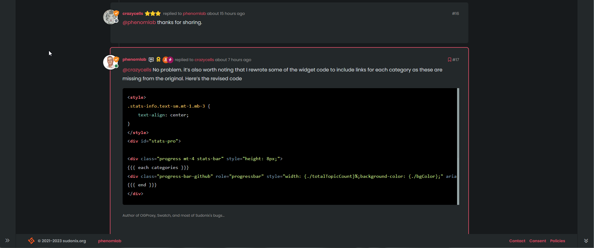
The code to switch per theme is really simple - example below
$('img[component="brand/logo"]').attr("src", "/assets/customcss/logo/" + whichTheme + ".svg"); -
I had thought of doing it in CSS but why not.
How does it work?
– Here is what I understand:
-
put this code in ACP/Custom JS
-
depending on the theme chosen in the swatch, it applies the logo files in SVG format in “/assets/customcss/logo/”
But the question I ask myself is: is there a particular naming of the logo files?
PW and WS Spirit alive
-
-
I had thought of doing it in CSS but why not.
How does it work?
– Here is what I understand:
-
put this code in ACP/Custom JS
-
depending on the theme chosen in the swatch, it applies the logo files in SVG format in “/assets/customcss/logo/”
But the question I ask myself is: is there a particular naming of the logo files?
@DownPW you’ll need to create the files first. The code I provided is just for reference and won’t work out of the gate.
Changing image by CSS is a possibility, but you can’t change an
imgtag directly which is why I’m usingjsto do just that. I modified the theme switcher so that it also stores the logo being used. -
-
Ok I think I understand.
Just out of curiosity, the person who made the logo for you, is it expensive?
Because I don’t know a designer. I manage but it’s not my job.
PW and WS Spirit alive
-
Ok I think I understand.
Just out of curiosity, the person who made the logo for you, is it expensive?
Because I don’t know a designer. I manage but it’s not my job.
@DownPW not really. It depends on the level of service you want. I can post details if you’d like them?
-
yep, sure. Pm if you prefer
-
The logo looks fantastic!
-
Those of you with a keen eye might have noticed that the logo has been changed. If you don’t see this, reload your browser as there are extensive code changes that need to be loaded so that the right image is selected with the right theme (they are colour coordinated).
Here’s the logo itself when using the default light theme (which is Flatly)
Drumroll…

Here’s the logo itself when using the default dark theme (which is Nord)

As you can see, the logo colours change depending on which theme you are using. This did mean a bit of manual work on my part using Adobe Illustrator - something of a learning curve (and monthly subscription cost
 ) I could have used Inkscape, I know, but it’s severely limited and lacks essential functionality, so it’s a non-starter in my view.
Inspiration
The inspiration from this logo comes from a variety of sources. Given that most of what we do on here is in code format (one way or the other), it made sense to use that in the logo. The original version had no radiuses, but I wanted a softer look, so here we are
")
@phenomlab nice logo. I loved it
-
Pls share with us what kind of CSS and JS code should use for it
thanks. -
@cagatay The logo itself? It’s an image.
-
Logo itself its okey but which code i should use to shown it on my website.
-
@cagatay Not sure I follow here - can you elaborate a bit more?
-
-
 undefined phenomlab referenced this topic on
-
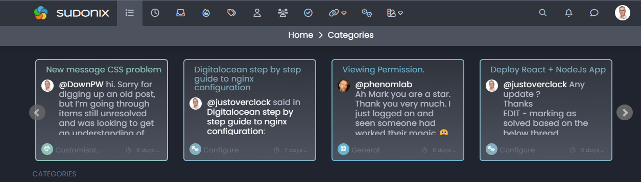
Some further re-branding changes have been made in the
aboutpage - not sure if anyone has ever actually read this, but it does explain the mission well -
good Mr.
I would like to know how you make static pages like that. It’s very nicePW and WS Spirit alive
-
@DownPW it’s just standard
html -
yep but you use a plugin to do it or make HTLML file manually ? Where put you the file etc…
PW and WS Spirit alive
-
yep but you use a plugin to do it or make HTLML file manually ? Where put you the file etc…
@DownPW I write all HTML manually. It’s inserted into page widgets created by
nodebb-custom-pagesMark – Founder, Phenomlab Ltd
Executive IT & Security Leadership
Phenomlab Ltd -
Ok, this might cause some bemusement and confusion, so apologies in advance. I’ve decided to change the logo again.
Why?
The answer here is relatively simple. It’s mostly because the more time wore on, the more I hated it’s overall look and feel. To me, it looked “cheap” and put together quickly without much consideration for the overall statement and services that this site offers.
Sure, it’s consistent with development, writing code, etc, but Sudonix has become so much more than just a support site for NodeBB. Admittedly, it’s still very much the main content of this site as it has never forgotten it’s roots, but I have ambition beyond NodeBB itself as the main topic focus. If you look at the services page, you’ll understand what I mean.
You can very easily see the justification here, and also notice that “Development” is only a portion of what Sudonix offers.
So, without any further interruptions, here’s the new logo

Great, but what does it represent?
Good question. If you look, it’s simple once you understand. The round circle in the middle is you - the user of this service. The lines around (which look very Japanese, but it wasn’t intended) is a wrapper around you - meaning that all the services and facilities here are designed for, and accessible to you - effectively, you should be able to find everything you want here, and more. Someone else made the comment about a strange sort of Turkish Eye, but it’s not
Ultimately, it’s a symbol of “community”. Somewhere we can all co-exist and learn from each other.
The “complete” version of the logo, which incorporates text etc is below

Now, I personally think that looks “hot” (probably the orange colour…) - I might be wrong here, but it looks catchy (and not cheap). You’ll also notice the intentional division of the words “SUDO” and “NIX” - it’s always been pronounced
soo-don-ixand that won’t change, but SUDO and NIX both have special meaning in the IT world as you probably know.This is the logo, and it’s not going to change
I also own the copyright for it, so it is protected at least where the jurisdiction extends to.If you’d like to know where I got this logo from, it’s below.
The platform uses AI to generate suggestions for your logo. It’s not necessarily “cheap”, but not expensive either in my view, and you can amend it as many times as you like. The only thing I didn’t like was the lack of Google Fonts, so I used the .eps file and made my own version using the fonts I wanted rather than those I was forced to use.
I’d love to get feedback on the new logo!


Hello! It looks like you're interested in this conversation, but you don't have an account yet.
Getting fed up of having to scroll through the same posts each visit? When you register for an account, you'll always come back to exactly where you were before, and choose to be notified of new replies (either via email, or push notification). You'll also be able to save bookmarks and upvote posts to show your appreciation to other community members.
With your input, this post could be even better 💗
Register Login