Custom badges

-
@DownPW said in Custom badges:
good job @crazycells
I wonder if we could do it for each badge without changing the color of course and keep the color of the original badges.
Curious to see what it would look like
")
no, this does not work. the overlap of a wavy edge circle and a circle becomes a circle. so, you cannot detect any flower shape with this method. The way that I achieved this was by removing the background color (making it transparent by CSS although there is an assigned color for it in ACP) and then creating a new flower shape on top of it by CSS.
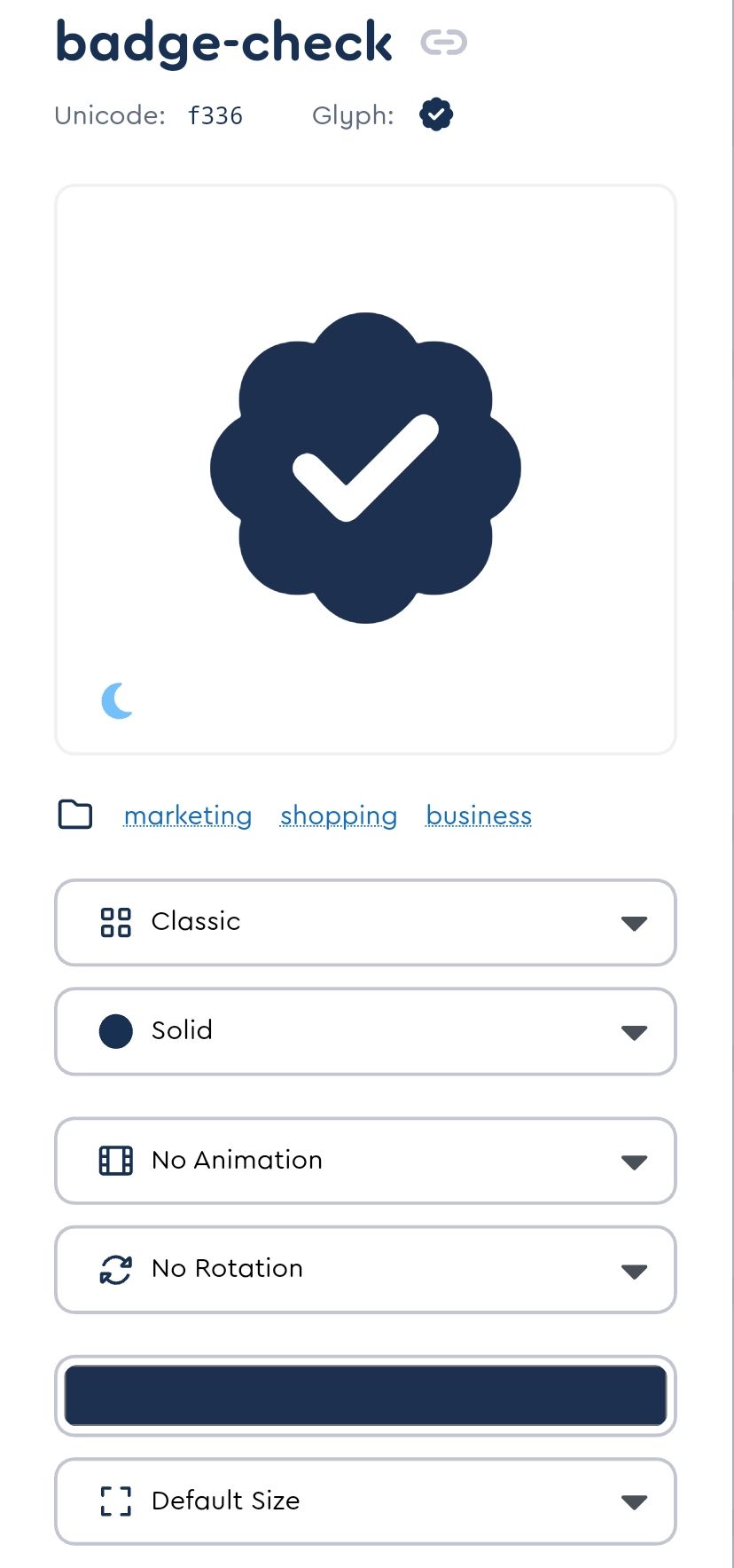
@crazycells just thinking about this. Wouldn’t it be easier to just use font awesome?
https://fontawesome.com/icons/badge-check?f=classic&s=solid
Mark – Founder, Phenomlab Ltd
Executive IT & Security Leadership
Phenomlab Ltd -
@crazycells just thinking about this. Wouldn’t it be easier to just use font awesome?
https://fontawesome.com/icons/badge-check?f=classic&s=solid
@phenomlab said in Custom badges:
@crazycells just thinking about this. Wouldn’t it be easier to just use font awesome?
https://fontawesome.com/icons/badge-check?f=classic&s=solid
as far as I remember, we discussed this before and you mentioned that that badge is not in the free tier.
-
@phenomlab said in Custom badges:
@crazycells just thinking about this. Wouldn’t it be easier to just use font awesome?
https://fontawesome.com/icons/badge-check?f=classic&s=solid
as far as I remember, we discussed this before and you mentioned that that badge is not in the free tier.
@crazycells Yes, you’re right

-
@phenomlab said in Custom badges:
@crazycells just thinking about this. Wouldn’t it be easier to just use font awesome?
https://fontawesome.com/icons/badge-check?f=classic&s=solid
as far as I remember, we discussed this before and you mentioned that that badge is not in the free tier.
@crazycells This intrigued me somewhat, I won’t lie
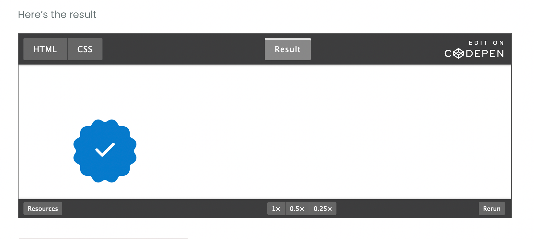
") I decided to take a stab at this myself.
I decided to take a stab at this myself.HTML
<!DOCTYPE html>
<html>
<head>
<script src="https://cdnjs.cloudflare.com/ajax/libs/font-awesome/6.4.0/js/all.min.js" integrity="sha512-fD9DI5bZwQxOi7MhYWnnNPlvXdp/2Pj3XSTRrFs5FQa4mizyGLnJcN6tuvUS6LbmgN1ut+XGSABKvjN0H6Aoow==" crossorigin="anonymous" referrerpolicy="no-referrer"></script>
<link rel="stylesheet" href="https://cdnjs.cloudflare.com/ajax/libs/font-awesome/6.4.0/css/all.min.css" integrity="sha512-iecdLmaskl7CVkqkXNQ/ZH/XLlvWZOJyj7Yy7tcenmpD1ypASozpmT/E0iPtmFIB46ZmdtAc9eNBvH0H/ZpiBw==" crossorigin="anonymous" referrerpolicy="no-referrer" />
<meta charset=utf-8 />
<title>JS Bin</title>
</head>
<body>
  <div class="base"></div>
  <div class="inner"><i class="check fa-solid fa-check"></i></div>
</body>
</html>
CSS
.base {
  left: 100px;
  top: 100px;
  height: 80px;
  width: 80px;
  background: #067acc;
  position: absolute;
  border-radius: 10px;
}
.base:before {
  height: 80px;
  width: 80px;
  background: #067acc;
  content:"";
  position: absolute;
  transform: rotate(-30deg);
  border-radius: 10px;
}
.base:after {
  padding-top: 10px;
  text-align: center;
  vertical-align: middle;
  height: 70px;
  width: 80px;
  background: #067acc;
  content: "";
  position: absolute;
  transform: rotate(30deg);
  border-radius: 10px;
}
.inner {
  color: #000000;
  left: 95px;
  top: 95px;
  position: absolute;
  text-align:center;
  padding-top: 25px;
  width: 90px;
  height: 65px;
  background: #067acc;
  border-radius: 50px;
  background: #067acc; /* Old browsers */
}
.check {
  font-size: 36px;
  color: #ffffff;
}
Here’s the result
Mark – Founder, Phenomlab Ltd
Executive IT & Security Leadership
Phenomlab Ltd -
@crazycells This intrigued me somewhat, I won’t lie
I decided to take a stab at this myself.HTML
<!DOCTYPE html>
<html>
<head>
<script src="https://cdnjs.cloudflare.com/ajax/libs/font-awesome/6.4.0/js/all.min.js" integrity="sha512-fD9DI5bZwQxOi7MhYWnnNPlvXdp/2Pj3XSTRrFs5FQa4mizyGLnJcN6tuvUS6LbmgN1ut+XGSABKvjN0H6Aoow==" crossorigin="anonymous" referrerpolicy="no-referrer"></script>
<link rel="stylesheet" href="https://cdnjs.cloudflare.com/ajax/libs/font-awesome/6.4.0/css/all.min.css" integrity="sha512-iecdLmaskl7CVkqkXNQ/ZH/XLlvWZOJyj7Yy7tcenmpD1ypASozpmT/E0iPtmFIB46ZmdtAc9eNBvH0H/ZpiBw==" crossorigin="anonymous" referrerpolicy="no-referrer" />
<meta charset=utf-8 />
<title>JS Bin</title>
</head>
<body>
  <div class="base"></div>
  <div class="inner"><i class="check fa-solid fa-check"></i></div>
</body>
</html>
CSS
.base {
  left: 100px;
  top: 100px;
  height: 80px;
  width: 80px;
  background: #067acc;
  position: absolute;
  border-radius: 10px;
}
.base:before {
  height: 80px;
  width: 80px;
  background: #067acc;
  content:"";
  position: absolute;
  transform: rotate(-30deg);
  border-radius: 10px;
}
.base:after {
  padding-top: 10px;
  text-align: center;
  vertical-align: middle;
  height: 70px;
  width: 80px;
  background: #067acc;
  content: "";
  position: absolute;
  transform: rotate(30deg);
  border-radius: 10px;
}
.inner {
  color: #000000;
  left: 95px;
  top: 95px;
  position: absolute;
  text-align:center;
  padding-top: 25px;
  width: 90px;
  height: 65px;
  background: #067acc;
  border-radius: 50px;
  background: #067acc; /* Old browsers */
}
.check {
  font-size: 36px;
  color: #ffffff;
}
Here’s the result
-
@crazycells Sorry, yes. Fixed that now.
Mark – Founder, Phenomlab Ltd
Executive IT & Security Leadership
Phenomlab Ltd -
@crazycells Sorry, yes. Fixed that now.
@phenomlab it looks very nice
but I guess one needs a subscription to use this, right?I am looking forward to seeing that on the avatars as “verified badge”, please do not forget to share your CSS code for its position
 when you implement it.
 -
@phenomlab it looks very nice
but I guess one needs a subscription to use this, right?I am looking forward to seeing that on the avatars as “verified badge”, please do not forget to share your CSS code for its position
when you implement it.@crazycells said in Custom badges:
it looks very nice but I guess one needs a subscription to use this, right?
No, there’s no subscription - what do you see ? The CodePen should be public?
Mark – Founder, Phenomlab Ltd
Executive IT & Security Leadership
Phenomlab Ltd -
@crazycells said in Custom badges:
it looks very nice but I guess one needs a subscription to use this, right?
No, there’s no subscription - what do you see ? The CodePen should be public?
@phenomlab yes I can see it very well:
since your code has “/font-awesome/6.4.0/” in it, I assumed you are using pro version.
-
@phenomlab yes I can see it very well:
since your code has “/font-awesome/6.4.0/” in it, I assumed you are using pro version.
@crazycells No, it’s the free version
https://cdnjs.com/libraries/font-awesome
You only need the check mark itself
Mark – Founder, Phenomlab Ltd
Executive IT & Security Leadership
Phenomlab Ltd -
@crazycells No, it’s the free version
https://cdnjs.com/libraries/font-awesome
You only need the check mark itself
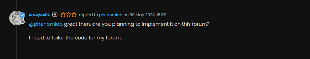
@phenomlab great then, are you planning to implement it on this forum?
I need to tailor the code for my forum…
-
@phenomlab great then, are you planning to implement it on this forum?
I need to tailor the code for my forum…
@crazycells Yes, I think I probably will.
-
@phenomlab great then, are you planning to implement it on this forum?
I need to tailor the code for my forum…
@crazycells Ok, so, I found some time to look at this properly today.
Here’s the result
Notice the “Twitter-esque” verified badge?
I found this
https://commons.wikimedia.org/wiki/File:Twitter_Verified_Badge.svg and downloaded it, then uploaded it to
/assets/public/imagesThen, I used the below CSS code
    li[component="post"] a[href*="/groups/verified"] {
        position: absolute !important;
        left: 2px;
        z-index: 2;
        margin-top: 1px;
        border-radius: 999px !important;
        line-height: 14px;
        display: block;
        height: auto;
        margin-left: 0px !important;
        background: transparent !important;
        width: auto;
    }

    li[component=post] a[href*="/groups/verified"]:before {
        background: url(https://sudonix.org/assets/images/Twitter_Verified_Badge.svg) !important;
        content: "";
        height: 22px;
        width: 22px;
        display: block;
    }
    li[component=post] a[href*="/groups/verified"]:after {
        background: #ffffff !important;
        height: 9px;
        width: 9px;
        content: "";
        display: block;
        top: 10px;
        position: absolute;
        z-index: -1;
        left: 12px;
    }
Some points to consider
- The CSS code extensively uses
:beforeand:afterpseudo elements. Essentially,:beforeadds the SVG icon and positions it, and:afteradds a smaller “white square” which is conveniently positioned behind the:beforeelement usingz:-index: -1;
The purpose of the “white square” is to provide a dirty way to fill in the transparency which is present in the SVG so it looks right.
This is pretty tough to display on mobile viewports, so it’s best to hide it completely using this code
@media (max-width: 767px) {
    li[component="post"] a[href*="/groups/verified"].badge, .account a[href*="/groups/verified"].badge {
            display: none !important;
        }
EDIT: Just realised that this icon (being a group) is also displayed on the user’s profile page, so we’ll need CSS to make that look good too…

I’ve absolutely no idea who this guy is…Here it is
    .account a[href*="/groups/verified"] {
        position: absolute !important;
        z-index: 2;
        background: transparent !important;
        margin-left: -10px;
    }
    .account a[href*="/groups/verified"]:after {
        background: #ffffff !important;
        height: 9px;
        width: 10px;
        content: "";
        display: block;
        top: 10px;
        position: absolute;
        z-index: -1;
        left: 12px;
    }
    .account a[href*="/groups/verified"]:before {
        background: url(https://sudonix.org/assets/images/Twitter_Verified_Badge.svg) !important;
        content: "";
        height: 22px;
        width: 22px;
        display: block;
    }
Enjoy.
Mark – Founder, Phenomlab Ltd
Executive IT & Security Leadership
Phenomlab Ltd - The CSS code extensively uses
-
hello @phenomlab
I am trying to apply your code for the “all” group which all my members are part of.
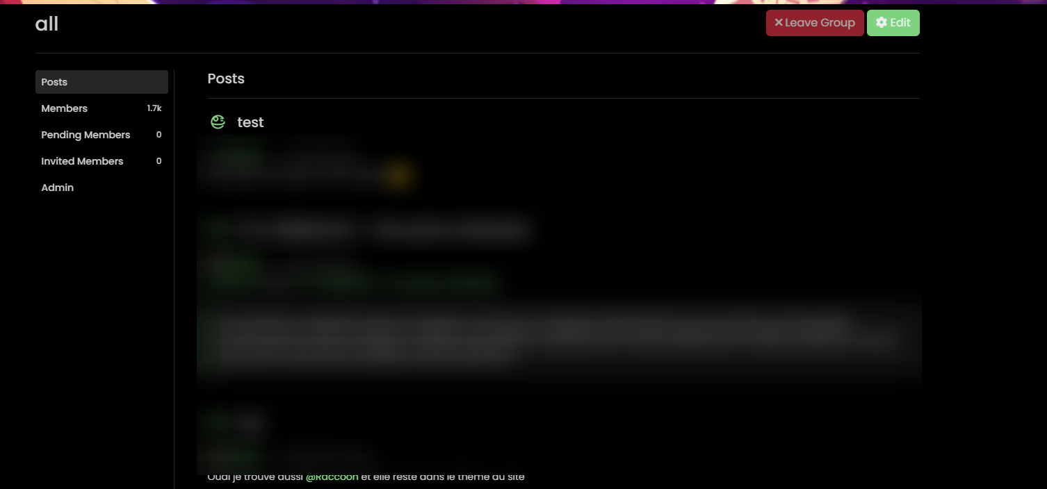
I downlaod the image of the twitter badge in full resolution and upload in the same place and I access it correctly.
On the other hand it would seem that the badge is displayed badly (cut on the right for the first on the screen) then transparent for the second and on the 3rd it is not displayed aps.
An idea ?
PW and WS Spirit alive
-
hello @phenomlab
I am trying to apply your code for the “all” group which all my members are part of.
I downlaod the image of the twitter badge in full resolution and upload in the same place and I access it correctly.
On the other hand it would seem that the badge is displayed badly (cut on the right for the first on the screen) then transparent for the second and on the 3rd it is not displayed aps.
An idea ?
@DownPW it’s really hard to see that image. I’ll need to look at your dev server directly to see what’s happening here.
-
I just found some answers @phenomlab
It is absolutely necessary that the user is displaying the badge of the group in his profile:
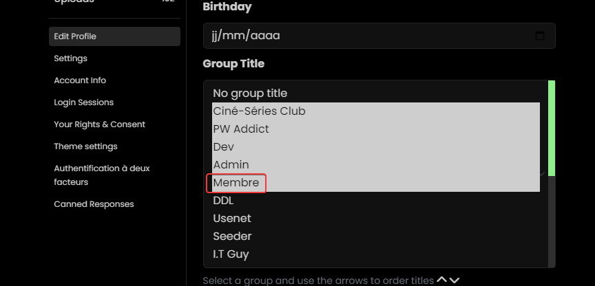
That the question, How to force put the user in a group ?
For the rest of the display bugs, I have not yet found.PW and WS Spirit alive
-
I just found some answers @phenomlab
It is absolutely necessary that the user is displaying the badge of the group in his profile:
That the question, How to force put the user in a group ?
For the rest of the display bugs, I have not yet found.@DownPW said in Custom badges:
It is absolutely necessary that the user is displaying the badge of the group in his profile:
Yes, it won’t display without that. I don’t know of a way to force it either.
-
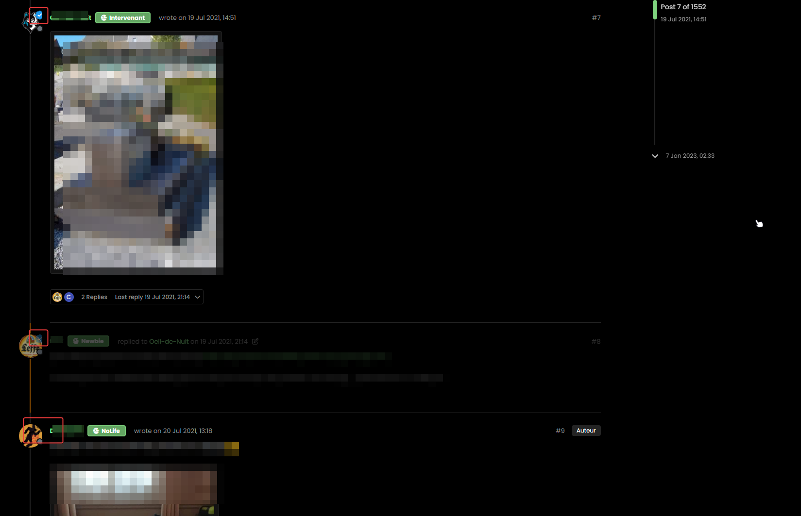
If I apply light themes we see better.
In fact, ther badge is cut on the right and we have the dexcription badge below :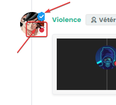
PW and WS Spirit alive
-
If I apply light themes we see better.
In fact, ther badge is cut on the right and we have the dexcription badge below :@DownPW yes, that’s just going to be positioning. Remember we are using
position: absolute;and your CSS is likely to differ so you may need to tweak the positioning slightly to suit. -
@crazycells Ok, so, I found some time to look at this properly today.
Here’s the result
Notice the “Twitter-esque” verified badge?
I found this
https://commons.wikimedia.org/wiki/File:Twitter_Verified_Badge.svg and downloaded it, then uploaded it to
/assets/public/imagesThen, I used the below CSS code
    li[component="post"] a[href*="/groups/verified"] {
        position: absolute !important;
        left: 2px;
        z-index: 2;
        margin-top: 1px;
        border-radius: 999px !important;
        line-height: 14px;
        display: block;
        height: auto;
        margin-left: 0px !important;
        background: transparent !important;
        width: auto;
    }

    li[component=post] a[href*="/groups/verified"]:before {
        background: url(https://sudonix.org/assets/images/Twitter_Verified_Badge.svg) !important;
        content: "";
        height: 22px;
        width: 22px;
        display: block;
    }
    li[component=post] a[href*="/groups/verified"]:after {
        background: #ffffff !important;
        height: 9px;
        width: 9px;
        content: "";
        display: block;
        top: 10px;
        position: absolute;
        z-index: -1;
        left: 12px;
    }
Some points to consider
- The CSS code extensively uses
:beforeand:afterpseudo elements. Essentially,:beforeadds the SVG icon and positions it, and:afteradds a smaller “white square” which is conveniently positioned behind the:beforeelement usingz:-index: -1;
The purpose of the “white square” is to provide a dirty way to fill in the transparency which is present in the SVG so it looks right.
This is pretty tough to display on mobile viewports, so it’s best to hide it completely using this code
@media (max-width: 767px) {
    li[component="post"] a[href*="/groups/verified"].badge, .account a[href*="/groups/verified"].badge {
            display: none !important;
        }
EDIT: Just realised that this icon (being a group) is also displayed on the user’s profile page, so we’ll need CSS to make that look good too…
I’ve absolutely no idea who this guy is…Here it is
    .account a[href*="/groups/verified"] {
        position: absolute !important;
        z-index: 2;
        background: transparent !important;
        margin-left: -10px;
    }
    .account a[href*="/groups/verified"]:after {
        background: #ffffff !important;
        height: 9px;
        width: 10px;
        content: "";
        display: block;
        top: 10px;
        position: absolute;
        z-index: -1;
        left: 12px;
    }
    .account a[href*="/groups/verified"]:before {
        background: url(https://sudonix.org/assets/images/Twitter_Verified_Badge.svg) !important;
        content: "";
        height: 22px;
        width: 22px;
        display: block;
    }
Enjoy.
hi @phenomlab, we should be able to download this…
https://commons.wikimedia.org/wiki/File:Twitter_Verified_Badge.svg
…and recolor it accordingly and upload it to the forum the same way, right? These colors are reminding everyone “twitter” , I believe it would be nicer if it is changed according to the personality of the forum, so it will look more original while maintaining “meaning”…
I think here on this forum, “sudonix orange” color would look cooler than “twitter blue”
- The CSS code extensively uses

Hello! It looks like you're interested in this conversation, but you don't have an account yet.
Getting fed up of having to scroll through the same posts each visit? When you register for an account, you'll always come back to exactly where you were before, and choose to be notified of new replies (either via email, or push notification). You'll also be able to save bookmarks and upvote posts to show your appreciation to other community members.
With your input, this post could be even better 💗
Register Login