Changing the look of recent cards
-
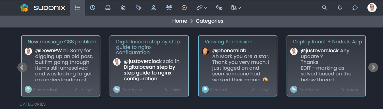
I wanted a way to draw attention to the recent cards on the categories page to make them stand out more - and what better way to do this than with some CSS. Here’s a short video of the outcome of that very exercise. Watch the recent cards closely as I cycle through the themes.
There’s a gradient being set there which is essentially two of the core colours in each theme.
Hello! It looks like you're interested in this conversation, but you don't have an account yet.
Getting fed up of having to scroll through the same posts each visit? When you register for an account, you'll always come back to exactly where you were before, and choose to be notified of new replies (either via email, or push notification). You'll also be able to save bookmarks and upvote posts to show your appreciation to other community members.
With your input, this post could be even better 💗
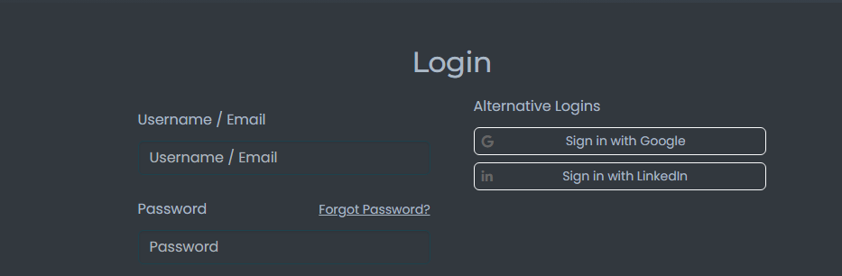
Register Login