Skip to content

FIXED: Annoying cosmetic bug on mobile view

Moved Bugs
13 2 4.1k 1
  • wrote on last edited by
    #1

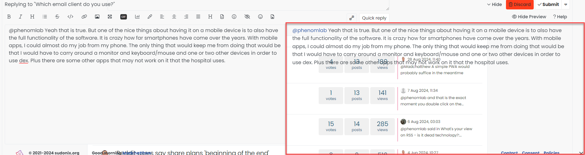
    I’ve just fixed a REALLY annoying cosmetic bug when the site is viewed on mobile. The steps to replicate were very easy, and a common action. In short

    1. Load the site
    2. Scroll down the page
    3. Scroll up again

    See how the elements are all sitting over the top of each other !! I couldn’t reproduce this at all using any mobile emulator on a PC, but no matter which phone I tried, the bug appeared no matter what browser I used, so I knew it wasn’t related to any particular browser, but aligned to the viewport on the device.

    Fixing this wasn’t a simple affair and involved multiple CSS changes depending on the viewport - plus, the header bar is now fixed instead of sticky (the header bar in fact was the overall culprit). Because of this change, I had to amend various other classes to fit in with the new mobile view.

    The upshot ? It’s resolved 👍

  • wrote on last edited by DownPW
    #2

    @phenomlab

    Hello dude 😉

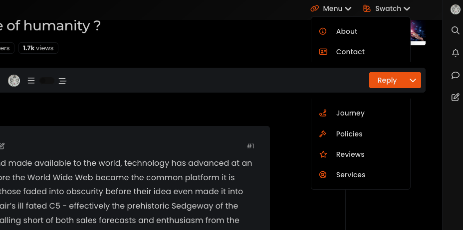
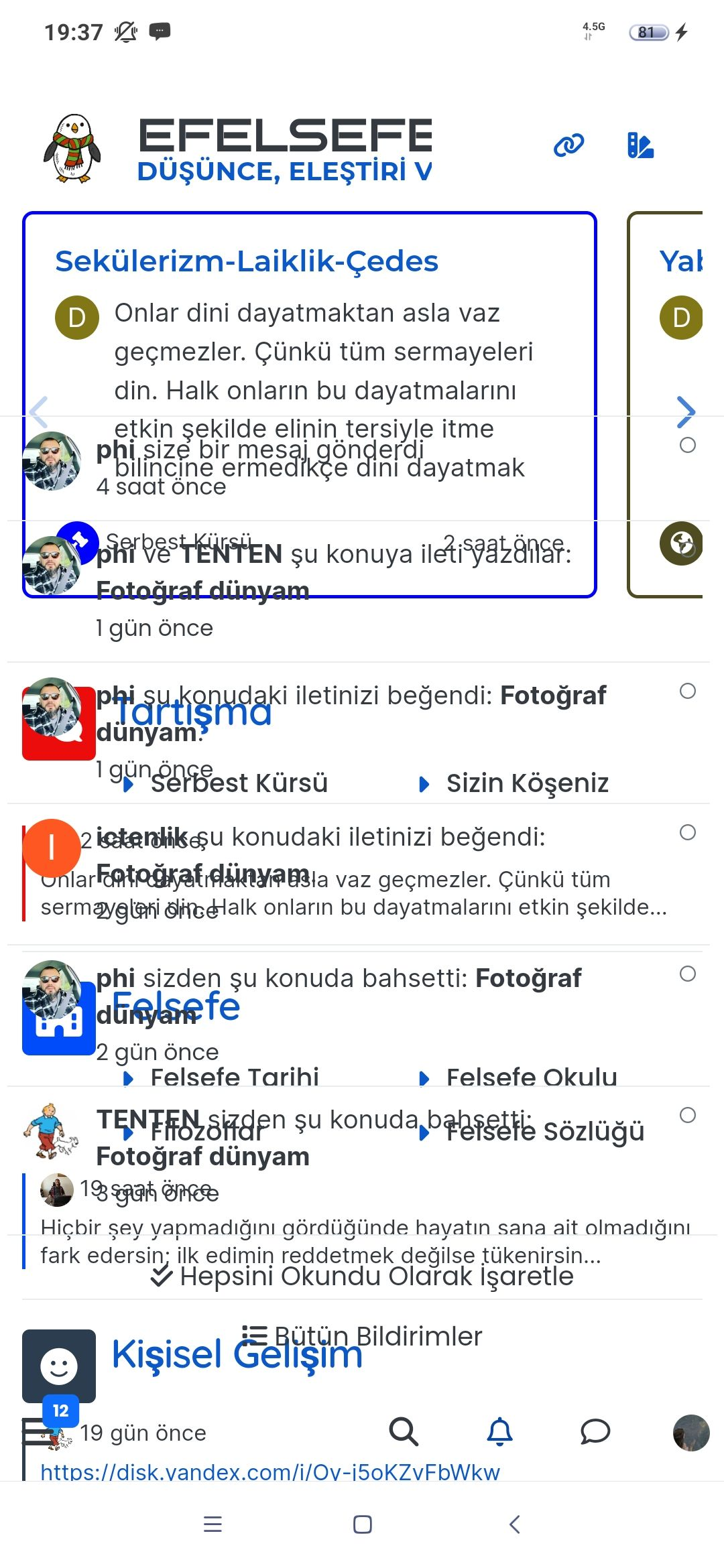
    I don’t know if it’s due to that, but you have this bug that we didn’t have before when we selects the notifications or the MPs on the navbar.

    The topic header appears in front.

    Good night !

    60a96b0f-a79d-48eb-a8cb-f05372e911eb-image.png

  • @phenomlab

    Hello dude 😉

    I don’t know if it’s due to that, but you have this bug that we didn’t have before when we selects the notifications or the MPs on the navbar.

    The topic header appears in front.

    Good night !

    60a96b0f-a79d-48eb-a8cb-f05372e911eb-image.png

    wrote on last edited by
    #3

    @downpw thanks. Nothing that can’t be fixed with z-index

  • @downpw thanks. Nothing that can’t be fixed with z-index

    wrote on last edited by
    #4

    @phenomlab

    😂

    I see that too for your to do list 🙂 :

    1de2c3a6-9184-4a81-ac88-0cf0b0e56665-image.png

  • @phenomlab

    😂

    I see that too for your to do list 🙂 :

    1de2c3a6-9184-4a81-ac88-0cf0b0e56665-image.png

    wrote on last edited by
    #5

    @downpw thanks. This fix has caused some other bugs too, so need to fix those also

  • phenomlab phenomlab moved this topic from Announcements on
  • wrote on last edited by
    #6

    @DownPW those bugs should all be fixed now hopefully 👍

  • wrote on last edited by phenomlab
    #7

    As an interesting side note, I’ve noticed that exactly the same bug exists in the NodeBB community forums. Essentially, it’s caused by the sticky header which doesn’t seem to play very well when you are using custom html to render additional content as I do here.

    The fix essentially is to make the header (bar) fixed rather than sticky but this does mean you need compensating CSS to resolve the mobile layout issues that this unfortunately creates.

  • wrote on last edited by
    #8

    Thanks to @crazycells for spotting another bug - this has also been fixed.

  • @phenomlab

    😂

    I see that too for your to do list 🙂 :

    1de2c3a6-9184-4a81-ac88-0cf0b0e56665-image.png

    wrote on last edited by
    #9

    @downpw Seems like this has been broken for a while ! Not sure why this is, as I never really use it - I type the emojis directly 😕

  • @downpw Seems like this has been broken for a while ! Not sure why this is, as I never really use it - I type the emojis directly 😕

    wrote on last edited by
    #10

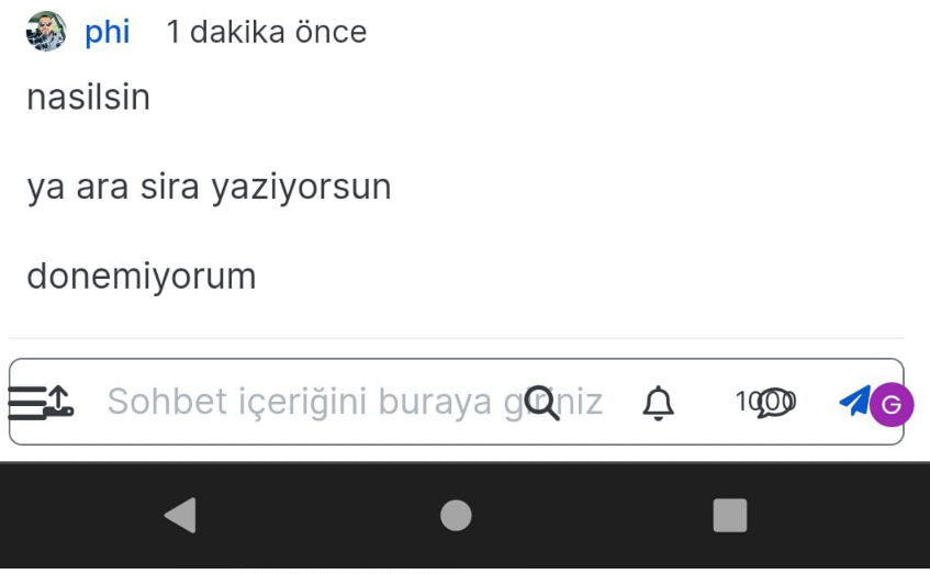
    @phenomlab said in FIXED: Annoying cosmetic bug on mobile view:

    Seems like this has been broken for a while ! Not sure why this is, as I never really use it - I type the emojis directly

    No problem.
    Maybe that ?

    0c8d6ab2-5a07-45d5-ba99-8da16bf1c6ae-image.png

  • @phenomlab said in FIXED: Annoying cosmetic bug on mobile view:

    Seems like this has been broken for a while ! Not sure why this is, as I never really use it - I type the emojis directly

    No problem.
    Maybe that ?

    0c8d6ab2-5a07-45d5-ba99-8da16bf1c6ae-image.png

    wrote on last edited by phenomlab
    #11

    @downpw I tried that earlier and rebuilt the assets. Didn’t make any difference.

  • @phenomlab said in FIXED: Annoying cosmetic bug on mobile view:

    Seems like this has been broken for a while ! Not sure why this is, as I never really use it - I type the emojis directly

    No problem.
    Maybe that ?

    0c8d6ab2-5a07-45d5-ba99-8da16bf1c6ae-image.png

    wrote on last edited by phenomlab
    #12

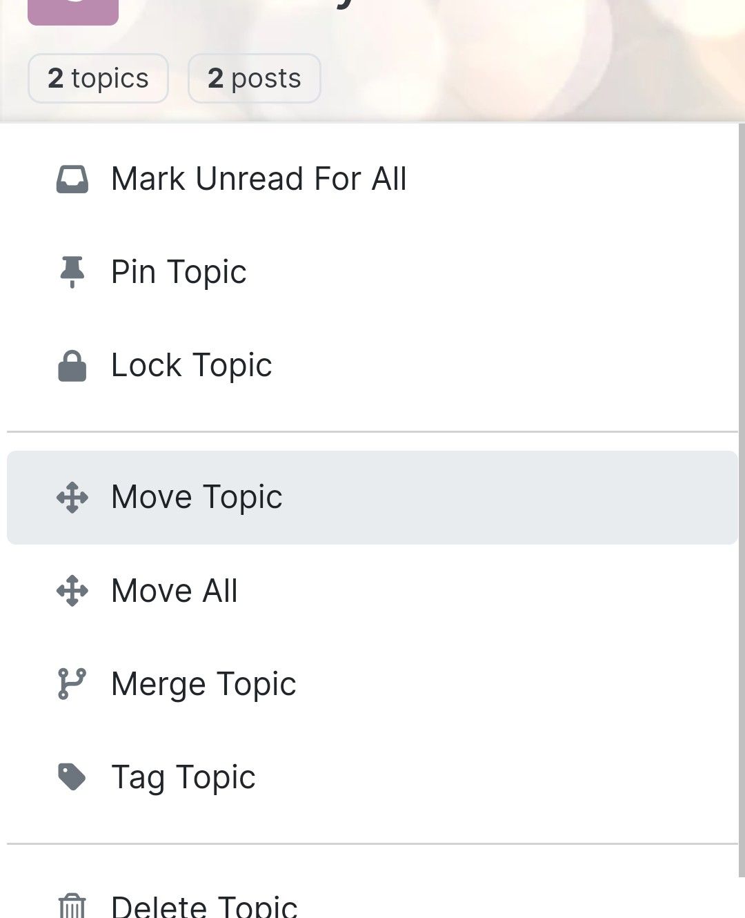
    @downpw fixed

    cb6731e0-5189-4060-a101-3e3d7a05d359-image.png

    Landed up being caused by some rogue CSS 😞 from this block

    .tab-content {
        max-height: 0;
        padding: 0 2em;
        color: #898989;
        background: #eeeeee;
        transition: all 0.35s;
        margin-top: -5px;
    }
    

    Not sure why I’m using that, but clearly it needs to be more specific 🤦

  • wrote on last edited by phenomlab
    #13

    And now, after all this time 😕 I finally discovered that the CSS I previously referenced was for something else - and used the same CSS name, so I’ve had to reinstate this block 🤦

    .tab-content {
        max-height: 0;
        padding: 0 2em;
        color: #898989;
        background: #eeeeee;
        transition: all 0.35s;
        margin-top: -5px;
    }
    

    And, add this below to make it more specific.

    .emoji-tabs .tab-content {
        height: 100%;
        max-height: 100%;
        padding: 0;
        margin: 0;
    }
    

Related Topics
  • CTA banner for visitors

    Solved Bugs bug
    3
    1
    2 Votes
    3 Posts
    2k Views
    phenomlab
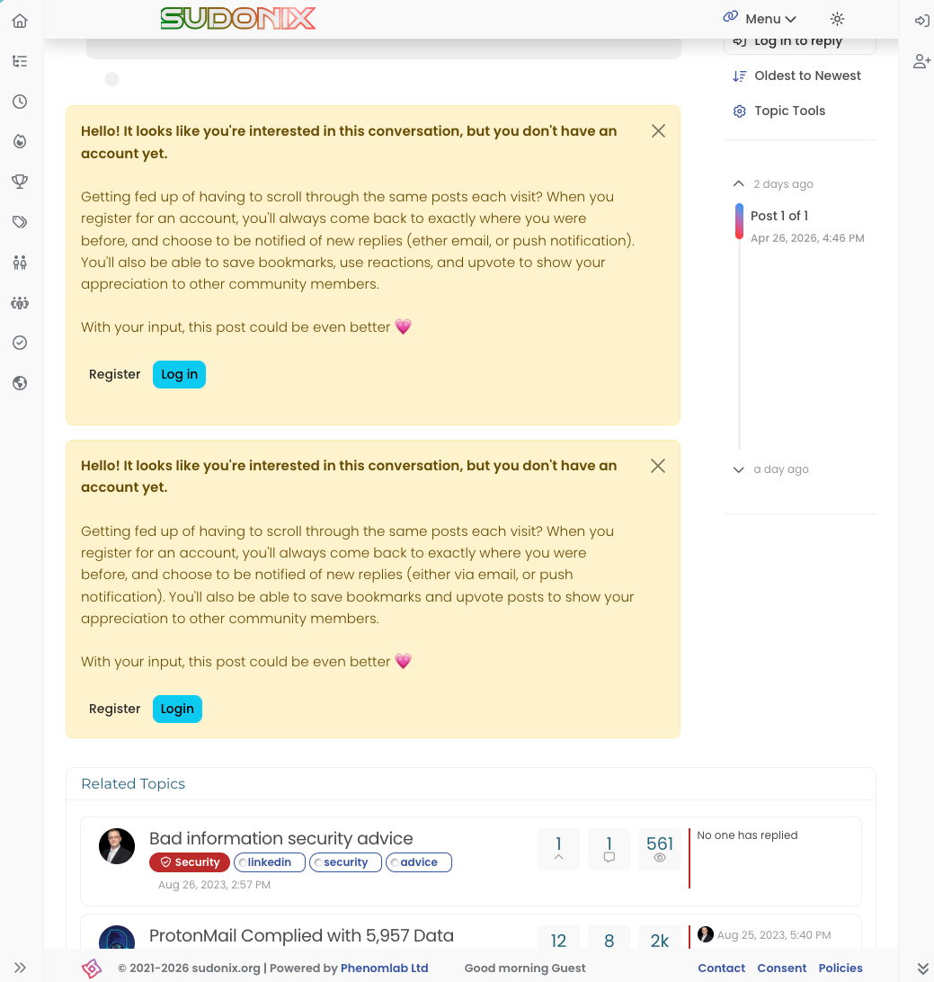
    @crazycells Yes, because of this code $(document).ready(function () { $(window).on('action:ajaxify.end', function (data) { if (config && config.uid > 0) { // User is logged in, so don't fire any message } else { // Insert content into the selected element var addAfterLastPost = $( "<div class='alert alert-warning alert-dismissible fade show' role='alert'>" + "<p><strong>Hello! It looks like you're interested in this conversation, but you don't have an account yet.</strong></p>" + "<p>Getting fed up of having to scroll through the same posts each visit? When you register for an account, you'll always come back to exactly where you were before, " + "and choose to be notified of new replies (ether email, or push notification). You'll also be able to save bookmarks, use reactions, and upvote to show your appreciation to other community members.</p>" + "<p>With your input, this post could be even better 💗"+ "<br><br>"+ "<a style='margin-right:5px;' component='topic/reply/guest' href='/register' class='fw-semibold btn btn-sm btn-warning'>Register</a>" + "<a component='topic/reply/guest' href='/login' class='fw-semibold btn btn-sm btn-info'>Log in</a>" + "<button type='button' class='btn-close' data-bs-dismiss='alert' aria-label='Close'></button>" + "</div>" ); $('ul[component="topic"]').after(addAfterLastPost); } }); }); This was adopted into core as far as I know, so I’ve removed my manual code.
  • Layout Issues/Transparency

    Solved Bugs bug reply transparent
    5
    2
    2 Votes
    5 Posts
    2k Views
    Madchatthew
    @phenomlab said in Layout Issues/Transparency: Does it work properly now? Yes, it does
  • nodebb error logs

    Bugs nodebb
    6
    2
    4 Votes
    6 Posts
    2k Views
    ahmed
    I just wanted to ask because I don’t have much knowledge about the new installation. Thank you for the explanatory answer.
  • Bug Report

    Solved Bugs nodebb bugs
    47
    1
    26 Votes
    47 Posts
    20k Views
    phenomlab
    @crazycells Good points, thanks. I completely forgot that classes are added - makes life much simpler! EDIT - seems this is pretty straightforward, and only needs the below CSS .upvoted i { color: var(--bs-user-level) !important; } This then yields [image: 3f072f8a-ebfa-4910-8723-73c493b8e4eb-image.png] However, the caveat here is that the .upvoted class will only show for your upvotes, and nobody else’s. However, this does satisfy the original request however I would love to see my upvoted posts more clearly, because currently, when I upvote, nothing on the post tool is changing, it would be nicer if there is an indication that I have upvoted (like a filled or colored triangle?)
  • Rendering issues post migration to Sudonix theme/code

    Solved Bugs
    49
    1
    20 Votes
    49 Posts
    21k Views
    phenomlab
    @cagatay Those are in /admin/extend/widgets/brand header. Look inside the HTML widget that is there, and you’ll find <div class="socialicons"> <a class="btn-ghost p-2" href="https://github.com/phenomlab" rel="noreferrer noopener"><i style="color: #333;background: #ffffff; width: 26px" class="fa fa-2x fa-github-square"></i></a> <a class="btn-ghost p-2" href="https://linkedin.com/in/phenomlab" rel="noreferrer noopener"><i style="color: #0077B5;background: #ffffff; width: 26px" class="fa fa-2x fa-brands fa-linkedin-square"></i></a> <a class="btn-ghost p-2" href="https://twitter.com/phenomlab" rel="noreferrer noopener"><i style="color: #1DA1F2;background: #ffffff; width: 26px" class="fa fa-2x fa-twitter-square"></i></a> <!-- <a class="btn-ghost p-2" href="https://www.facebook.com/sudonixtech" rel="noreferrer noopener"><i style="color: #4268B2;background: #ffffff; width: 26px" class="fa fa-2x fa-facebook-square"></i></a> --> </div> Remove that block and save.
  • Nodebb 3.2.2

    Bugs nodebb 3.2.2
    27
    1
    11 Votes
    27 Posts
    11k Views
    phenomlab
    @crazycells yes, I’ve just seen that and modified the post. It seems to only happen if you have a space between the “greater than” symbol and the actual text. Clearly a markdown thing.
  • Difficult to move posts now, on mobile.

    Bugs nodebb
    16
    1
    5 Votes
    16 Posts
    5k Views
    phenomlab
    @DownPW Yes, it is. It’s set far too low meaning other elements with a higher preference will sit over the top of it.
  • navigation bar is misplaced when the window gets smaller

    Solved Customisation bugs
    23
    1
    10 Votes
    23 Posts
    8k Views
    phenomlab
    @DownPW sounds good.