NodeBB customisation
-
What I want is where the title is to be blue in the background, with white font?
And then I thought well this will clash with the menu bar that is also blue so I don’t know whether it can be done but maybe a yellow line to separate the menu and the article title?
Many thanks.
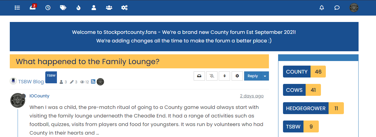
@jac I’m not so sure about this
It’s too much blue (my opinion). I’d do this
.topic-title {
    font-weight: 300 !important;
}

.topic [component="post/header"] {
    margin-top: 0;
    background: #ffc557;
    color: #00205c;
    padding-left: 20px;
    padding-bottom: 5px;
}
It’s in keeping with the club colours, and will look like this
Mark – Founder, Phenomlab Ltd
Executive IT & Security Leadership
Phenomlab Ltd -
@jac I’m not so sure about this
It’s too much blue (my opinion). I’d do this
.topic-title {
    font-weight: 300 !important;
}

.topic [component="post/header"] {
    margin-top: 0;
    background: #ffc557;
    color: #00205c;
    padding-left: 20px;
    padding-bottom: 5px;
}
It’s in keeping with the club colours, and will look like this
@phenomlab said in NodeBB customisation:
@jac I’m not so sure about this
It’s too much blue (my opinion). I’d do this
.topic-title {
    font-weight: 300 !important;
}

.topic [component="post/header"] {
    margin-top: 0;
    background: #ffc557;
    color: #00205c;
    padding-left: 20px;
    padding-bottom: 5px;
}
It’s in keeping with the club colours, and will look like this
Wow that looks great!!!
,

-
@phenomlab said in NodeBB customisation:
@jac I’m not so sure about this
It’s too much blue (my opinion). I’d do this
.topic-title {
    font-weight: 300 !important;
}

.topic [component="post/header"] {
    margin-top: 0;
    background: #ffc557;
    color: #00205c;
    padding-left: 20px;
    padding-bottom: 5px;
}
It’s in keeping with the club colours, and will look like this
Wow that looks great!!!
,
As for the blue one, would that look any better with the blue info block removed at all? Or is it still too much?
Many thanks mate
-
As for the blue one, would that look any better with the blue info block removed at all? Or is it still too much?
Many thanks mate
@jac I think it’s too much because of the header being the same colour. A blue of they shade will only work if there is something in between it. It’s made much worse as the thread gets longer.
When the page is scrolled, the title is set to sticky meaning that it’s always visible at the top of the screen. This means the colour is never out of view and is then dominant.
The yellow is a better choice as it’s not being used anywhere else in the thread and as a result won’t look overdone.
Mark – Founder, Phenomlab Ltd
Executive IT & Security Leadership
Phenomlab Ltd -
@jac I think it’s too much because of the header being the same colour. A blue of they shade will only work if there is something in between it. It’s made much worse as the thread gets longer.
When the page is scrolled, the title is set to sticky meaning that it’s always visible at the top of the screen. This means the colour is never out of view and is then dominant.
The yellow is a better choice as it’s not being used anywhere else in the thread and as a result won’t look overdone.
@phenomlab said in NodeBB customisation:
@jac I think it’s too much because of the header being the same colour. A blue of they shade will only work if there is something in between it. It’s made much worse as the thread gets longer.
When the page is scrolled, the title is set to sticky meaning that it’s always visible at the top of the screen. This means the colour is never out of view and is then dominant.
The yellow is a better choice as it’s not being used anywhere else in the thread and as a result won’t look overdone.
Thanks for the advice mate, no I agree the yellow would be a better choice definitely. I’ll apply now.
-
@phenomlab said in NodeBB customisation:
@jac I think it’s too much because of the header being the same colour. A blue of they shade will only work if there is something in between it. It’s made much worse as the thread gets longer.
When the page is scrolled, the title is set to sticky meaning that it’s always visible at the top of the screen. This means the colour is never out of view and is then dominant.
The yellow is a better choice as it’s not being used anywhere else in the thread and as a result won’t look overdone.
Thanks for the advice mate, no I agree the yellow would be a better choice definitely. I’ll apply now.
@jac said in NodeBB customisation:
@phenomlab said in NodeBB customisation:
@jac I think it’s too much because of the header being the same colour. A blue of they shade will only work if there is something in between it. It’s made much worse as the thread gets longer.
When the page is scrolled, the title is set to sticky meaning that it’s always visible at the top of the screen. This means the colour is never out of view and is then dominant.
The yellow is a better choice as it’s not being used anywhere else in the thread and as a result won’t look overdone.
Thanks for the advice mate, no I agree the yellow would be a better choice definitely. I’ll apply now.
Applied mate, looks great, thank you very much. Is there a way to change the titles to bold at all?
Many thanks as always mate. Don’t forget the Phenomlab footer
 .
. -
@jac said in NodeBB customisation:
@phenomlab said in NodeBB customisation:
@jac I think it’s too much because of the header being the same colour. A blue of they shade will only work if there is something in between it. It’s made much worse as the thread gets longer.
When the page is scrolled, the title is set to sticky meaning that it’s always visible at the top of the screen. This means the colour is never out of view and is then dominant.
The yellow is a better choice as it’s not being used anywhere else in the thread and as a result won’t look overdone.
Thanks for the advice mate, no I agree the yellow would be a better choice definitely. I’ll apply now.
Applied mate, looks great, thank you very much. Is there a way to change the titles to bold at all?
Many thanks as always mate. Don’t forget the Phenomlab footer
.@jac said in NodeBB customisation:
Is there a way to change the titles to bold at all?
Yes - just remove this block
.topic-title {
    font-weight: 300 !important;
}
Mark – Founder, Phenomlab Ltd
Executive IT & Security Leadership
Phenomlab Ltd -
@jac said in NodeBB customisation:
Is there a way to change the titles to bold at all?
Yes - just remove this block
.topic-title { font-weight: 300 !important; }@phenomlab said in NodeBB customisation:
@jac said in NodeBB customisation:
Is there a way to change the titles to bold at all?
Yes - just remove this block
.topic-title {
    font-weight: 300 !important;
}
Many thanks mate, will try this later
. -
@phenomlab said in NodeBB customisation:
@jac said in NodeBB customisation:
Is there a way to change the titles to bold at all?
Yes - just remove this block
.topic-title {
    font-weight: 300 !important;
}
Many thanks mate, will try this later
.@jac said in NodeBB customisation:
@phenomlab said in NodeBB customisation:
@jac said in NodeBB customisation:
Is there a way to change the titles to bold at all?
Yes - just remove this block
.topic-title {
    font-weight: 300 !important;
}
Many thanks mate, will try this later
.Worked great, many thanks

 .
. -
@jac said in NodeBB customisation:
@phenomlab said in NodeBB customisation:
@jac said in NodeBB customisation:
Is there a way to change the titles to bold at all?
Yes - just remove this block
.topic-title {
    font-weight: 300 !important;
}
Many thanks mate, will try this later
.Worked great, many thanks
. -
@phenomlab said in NodeBB customisation:
@jac Good
Still going with the little changes here and there, so many thanks for the continued support
. -
@phenomlab said in NodeBB customisation:
@jac Good
Still going with the little changes here and there, so many thanks for the continued support
.@jac No problems. I’ll close this thread as soon as we’re done. It currently exists as a showcase for how you’ve modified your NodeBB install to get it to look how you desire. This would then serve as a guide for others looking to go down the same rabbit hole.
Mark – Founder, Phenomlab Ltd
Executive IT & Security Leadership
Phenomlab Ltd -
@jac No problems. I’ll close this thread as soon as we’re done. It currently exists as a showcase for how you’ve modified your NodeBB install to get it to look how you desire. This would then serve as a guide for others looking to go down the same rabbit hole.
@phenomlab said in NodeBB customisation:
@jac No problems. I’ll close this thread as soon as we’re done. It currently exists as a showcase for how you’ve modified your NodeBB install to get it to look how you desire. This would then serve as a guide for others looking to go down the same rabbit hole.
Great idea!
Mamy thanks again
-
@phenomlab said in NodeBB customisation:
@jac No problems. I’ll close this thread as soon as we’re done. It currently exists as a showcase for how you’ve modified your NodeBB install to get it to look how you desire. This would then serve as a guide for others looking to go down the same rabbit hole.
Great idea!
Mamy thanks again
Looking to add a line / divider under eachother comment to seperate them properly, is this possible?
Many thanks.
-
Looking to add a line / divider under eachother comment to seperate them properly, is this possible?
Many thanks.
@jac Something like this ?
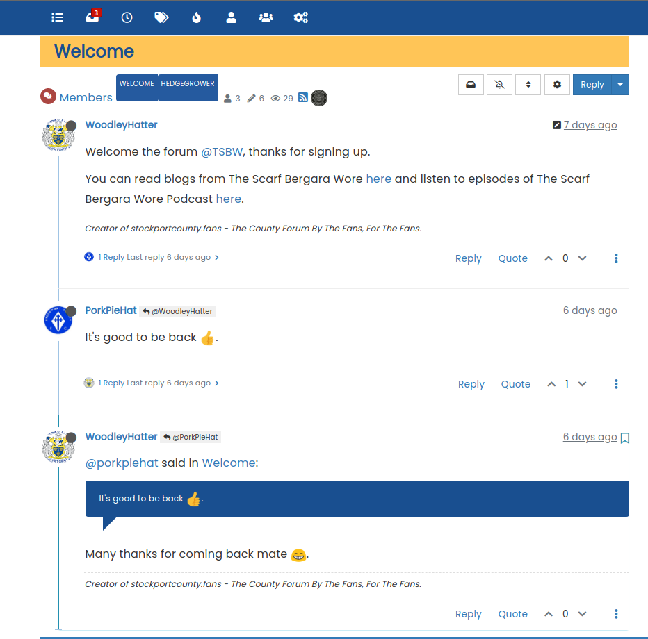
.topic .posts.timeline .timeline-event:not(:last-child), .topic .posts.timeline>[component=post]:not(:last-child) {
    border-bottom: 1px solid #eeeeee;
}
Mark – Founder, Phenomlab Ltd
Executive IT & Security Leadership
Phenomlab Ltd -
@jac Something like this ?
.topic .posts.timeline .timeline-event:not(:last-child), .topic .posts.timeline>[component=post]:not(:last-child) { border-bottom: 1px solid #eeeeee; }@phenomlab said in NodeBB customisation:
@jac Something like this ?
.topic .posts.timeline .timeline-event:not(:last-child), .topic .posts.timeline>[component=post]:not(:last-child) {
    border-bottom: 1px solid #eeeeee;
}
Thanks Mark, I’ll apply this when I can.
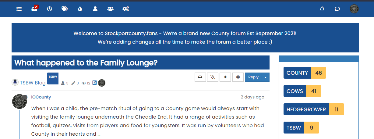
As for the tags in the screenshot are they generally big or it is the screenshot that is playing tricks?
. -
@phenomlab said in NodeBB customisation:
@jac Something like this ?
.topic .posts.timeline .timeline-event:not(:last-child), .topic .posts.timeline>[component=post]:not(:last-child) {
    border-bottom: 1px solid #eeeeee;
}
Thanks Mark, I’ll apply this when I can.
As for the tags in the screenshot are they generally big or it is the screenshot that is playing tricks?
.@jac said in NodeBB customisation:
are they generally big or it is the screenshot that is playing tricks?
They’re big. I noticed that. It’s because of the tags page we recently changed to get the Stockport colour layout. Use this to fix it
.tag-list .tag {
    height: 26px;
    border-radius: 4px;
    margin-left: 5px;
}
Mark – Founder, Phenomlab Ltd
Executive IT & Security Leadership
Phenomlab Ltd -
@jac said in NodeBB customisation:
are they generally big or it is the screenshot that is playing tricks?
They’re big. I noticed that. It’s because of the tags page we recently changed to get the Stockport colour layout. Use this to fix it
.tag-list .tag { height: 26px; border-radius: 4px; margin-left: 5px; }@phenomlab said in NodeBB customisation:
@jac said in NodeBB customisation:
are they generally big or it is the screenshot that is playing tricks?
They’re big. I noticed that. It’s because of the tags page we recently changed to get the Stockport colour layout. Use this to fix it
.tag-list .tag {
    height: 26px;
    border-radius: 4px;
    margin-left: 5px;
}
Many thanks mate, that has fixed the issue
. -
@phenomlab said in NodeBB customisation:
@jac said in NodeBB customisation:
are they generally big or it is the screenshot that is playing tricks?
They’re big. I noticed that. It’s because of the tags page we recently changed to get the Stockport colour layout. Use this to fix it
.tag-list .tag {
    height: 26px;
    border-radius: 4px;
    margin-left: 5px;
}
Many thanks mate, that has fixed the issue
.Is there a way to change the colour of the online status?
Many thanks
. -
@jac are you referring to the green dot ? What would you like to change ?
Mark – Founder, Phenomlab Ltd
Executive IT & Security Leadership
Phenomlab Ltd
Hello! It looks like you're interested in this conversation, but you don't have an account yet.
Getting fed up of having to scroll through the same posts each visit? When you register for an account, you'll always come back to exactly where you were before, and choose to be notified of new replies (either via email, or push notification). You'll also be able to save bookmarks and upvote posts to show your appreciation to other community members.
With your input, this post could be even better 💗
Register LoginRelated Topics
-
-
-
-
-
NodeBB Footer
Solved Customisation -
-
-