What is this bar called?

-
@phenomlab
Slightly, the s21 is 1080 x 2400
But the bar display is very different! -
@phenomlab
Slightly, the s21 is 1080 x 2400
But the bar display is very different!@Panda yes, I see that. The issue here is that both of those styles trigger on different viewports (based on
bootstrap) so my guess is that the flip phone you have probably renders in the same way as (for example) an iPad does, which would explain the layout if the same viewport is being used. -
Ok, out of interest, can you explain how the bootstrap logic works here?
How does a relatively small % change in pixels make a full width bar change into a small bar (which is better)
Could the logic be changed to always make it small? -
Ok, out of interest, can you explain how the bootstrap logic works here?
How does a relatively small % change in pixels make a full width bar change into a small bar (which is better)
Could the logic be changed to always make it small?@Panda It really depends on the resolution supplied by the device. More information around how breakpoints (viewports) work can be found here
-
@phenomlab Now heres a funny thing…
As if by magic, that bar is much narrower on a second mobile I tested

Actually its narrower on one phone, but not the other!!

They are both Samsung Andriod, but what a difference
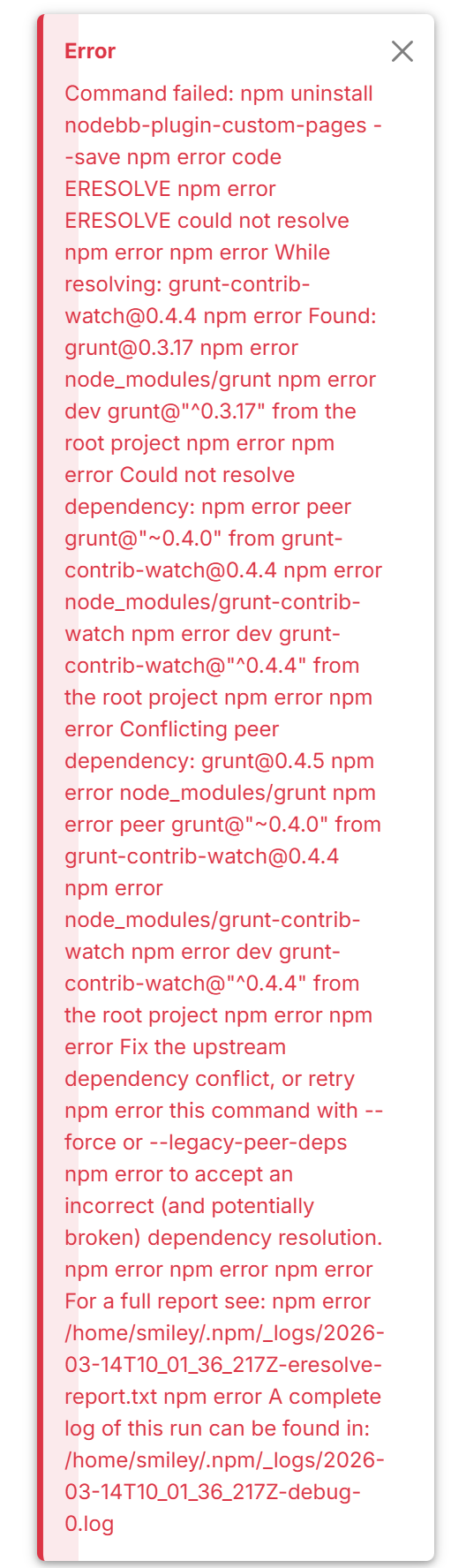
@Panda I thought some more about this specific issue, and the progress bar is clunky. The original bar was part of the
personatheme and it’s intention was to replicate the progress bar you had when reading through topics. However, theharmonytheme has changed the landscape in terms of how data is interpreted, and so it does actually make sense to review this.I’ve refactored the code to make the progress bar much less obtrusive, a bit more “modern”, and more importantly, it appears at the top (2px height) so it no longer interferes with the mobile view.
You may need to reload to see the changes.
-
Much improved!
-
 undefined phenomlab has marked this topic as unsolved on
-
undefined phenomlab has marked this topic as solved on
-
It’s a shame we lose the possibility of going down and up. Are you abandoning the bar to flarum? If yes, can be added a button at the bottom right as on v2.x and remove the scroll bar on the right
PW and WS Spirit alive
-
It’s a shame we lose the possibility of going down and up. Are you abandoning the bar to flarum? If yes, can be added a button at the bottom right as on v2.x and remove the scroll bar on the right
@DownPW said in What is this bar called?:
Are you abandoning the bar to flarum? If yes, can be added a button at the bottom right as on v2.x and remove the scroll bar on the right
Sorry, I’m not sure I follow here with the reference to Flarum? If you are talking about the return to top facility as it was (floating bottom right) then yes, I can easily put that back.
-
I think it’s more interesting to keep the scroll bar on the right side rather than at the top to keep the vertical logic of NodeBB 3.x And rather than having a navigation bar at the bottom right with the percentage, maybe putting back a button as in V2 to go up to the top of the page would be good. I don’t really know, the old bar seemed to be a problem?
PW and WS Spirit alive
-
I think it’s more interesting to keep the scroll bar on the right side rather than at the top to keep the vertical logic of NodeBB 3.x And rather than having a navigation bar at the bottom right with the percentage, maybe putting back a button as in V2 to go up to the top of the page would be good. I don’t really know, the old bar seemed to be a problem?
@DownPW I agree with the button, which would be transparent as previous. However, the bar as I explained was a copy of the old persona theme progress bar. It looked good at the time, but since Harmony, it’s out of place in my view and if I’m being honest, a little antiqued compared to the rest of the site.
Navigation control however is important, so I will put the scroll to top feature back, but I want to think about how this will look across the site and how it impacts the user experience.
I haven’t just refactored the progress bar based on a whim or “demand” from someone. If you recall, the progress bar was originally designed in the way it is now, and changed over time to fit in the persona theme.
Mark – Founder, Phenomlab Ltd
Executive IT & Security Leadership
Phenomlab Ltd -
I think it’s more interesting to keep the scroll bar on the right side rather than at the top to keep the vertical logic of NodeBB 3.x And rather than having a navigation bar at the bottom right with the percentage, maybe putting back a button as in V2 to go up to the top of the page would be good. I don’t really know, the old bar seemed to be a problem?
Just goes to show
'You cant please All of the people, All of the time!’@DownPW said in What is this bar called?:
I don’t really know, the old bar seemed to be a problem?
It took up a lot of screen space on some mobile views.
And on the home screen, what was the % even meaning, as more content loads as you go down anyway.There seems to be a vertical bar anyway with the theme, its only there for a second when scrolling up or down
Far be it for me, with half a star, to disagree with someone with 4 stars, but it makes no difference to me if its vertical or horizontal.
Being thinner is an improvement, in that it is less intrusiveAnyway its not even changed in the Topics pages
-
Just goes to show
'You cant please All of the people, All of the time!’@DownPW said in What is this bar called?:
I don’t really know, the old bar seemed to be a problem?
It took up a lot of screen space on some mobile views.
And on the home screen, what was the % even meaning, as more content loads as you go down anyway.There seems to be a vertical bar anyway with the theme, its only there for a second when scrolling up or down
Far be it for me, with half a star, to disagree with someone with 4 stars, but it makes no difference to me if its vertical or horizontal.
Being thinner is an improvement, in that it is less intrusiveAnyway its not even changed in the Topics pages
@Panda it’s not changed in the topic pages because that is the NodeBB navigation bar - not the sudonix one. I’m not going to be disabling that one as it’s part of the core.
Edit - for the avoidance of any doubt, here’s the link to the original post where the progress bar was in fact the same as it’s been recently modified to be
https://sudonix.org/topic/182/reading-meter-progress-bar?_=1688782995096
-
Just goes to show
'You cant please All of the people, All of the time!’@DownPW said in What is this bar called?:
I don’t really know, the old bar seemed to be a problem?
It took up a lot of screen space on some mobile views.
And on the home screen, what was the % even meaning, as more content loads as you go down anyway.There seems to be a vertical bar anyway with the theme, its only there for a second when scrolling up or down
Far be it for me, with half a star, to disagree with someone with 4 stars, but it makes no difference to me if its vertical or horizontal.
Being thinner is an improvement, in that it is less intrusiveAnyway its not even changed in the Topics pages
@Panda said in What is this bar called?:
Far be it for me, with half a star, to disagree with someone with 4 stars, but it makes no difference to me if its vertical or horizontal.
I wanted to add clarity to this point here for anyone else following this thread. The rating you have has %(#f50000)[absolutely zero] bearing when it comes to open discussion. There is no seniority over someone with half a star (for example) for someone with 5 stars.
Both @DownPW and @Panda have made some very valid points and as a community it’s important that everyone
- has a voice
- is heard
- is treated as an equal
I understand that it’s difficult to convey tone when responding to something, or trying to get your point across, but please remember that English isn’t everyone’s primary language here, so sometimes things do get lost in translation, or don’t come across as the original poster intended.
Either way, if you aren’t sure, it’s a good idea to ask for clarification (as I did previously in this thread).
Thanks for reading -back to the topic in hand…
Mark – Founder, Phenomlab Ltd
Executive IT & Security Leadership
Phenomlab Ltd -
@DownPW I agree with the button, which would be transparent as previous. However, the bar as I explained was a copy of the old persona theme progress bar. It looked good at the time, but since Harmony, it’s out of place in my view and if I’m being honest, a little antiqued compared to the rest of the site.
Navigation control however is important, so I will put the scroll to top feature back, but I want to think about how this will look across the site and how it impacts the user experience.
I haven’t just refactored the progress bar based on a whim or “demand” from someone. If you recall, the progress bar was originally designed in the way it is now, and changed over time to fit in the persona theme.
@phenomlab said in What is this bar called?:
Navigation control however is important, so I will put the scroll to top feature back, but I want to think about how this will look across the site and how it impacts the user experience.
It’s back!
The scroll top top function has been added back into the mix, and is now available in the usual manner. As before, it will not appear on posts within topics, as the NodeBB scrubber bar already takes care of that. The arrow itself is transparent, meaning if you are using a mobile and this function activates itself, you’ll still be able to see the text beneath, so not invasive at all.
-
Seems to be very good. Can you give code CSS & JS for that and I Can test ?
PW and WS Spirit alive
-
@Panda said in What is this bar called?:
Far be it for me, with half a star, to disagree with someone with 4 stars, but it makes no difference to me if its vertical or horizontal.
I wanted to add clarity to this point here for anyone else following this thread. The rating you have has %(#f50000)[absolutely zero] bearing when it comes to open discussion. There is no seniority over someone with half a star (for example) for someone with 5 stars.
Both @DownPW and @Panda have made some very valid points and as a community it’s important that everyone
- has a voice
- is heard
- is treated as an equal
I understand that it’s difficult to convey tone when responding to something, or trying to get your point across, but please remember that English isn’t everyone’s primary language here, so sometimes things do get lost in translation, or don’t come across as the original poster intended.
Either way, if you aren’t sure, it’s a good idea to ask for clarification (as I did previously in this thread).
Thanks for reading -back to the topic in hand…
@phenomlab yes, I was joking about my half star, but youre right, tone is hard to convey. I should have put a laughing emoji, as attempt at humour can be misinterpreted.
Incidentally what is the fractional, not even half, star about?!
When do I earn a full star?
-
@phenomlab yes, I was joking about my half star, but youre right, tone is hard to convey. I should have put a laughing emoji, as attempt at humour can be misinterpreted.
Incidentally what is the fractional, not even half, star about?!
When do I earn a full star?@Panda no issues at all. If you click on your half star, it’ll tell you how far away you are from the next level. At the rate you’re interacting, it won’t take long

Edit - if you go to your profile page and click your current level, that will tell you how many points you need to get to the next level.
Seems you need 8 points.
-
@phenomlab yes, I was joking about my half star, but youre right, tone is hard to convey. I should have put a laughing emoji, as attempt at humour can be misinterpreted.
Incidentally what is the fractional, not even half, star about?!
When do I earn a full star?@Panda said in What is this bar called?:
Incidentally what is the fractional, not even half, star about?!
You know, that’s a good point. There are lots of other forums around that use the same schematic, so I was being lazy and followed their lead. Open to suggestions on your this though.
Mark – Founder, Phenomlab Ltd
Executive IT & Security Leadership
Phenomlab Ltd -
@Panda said in What is this bar called?:
Incidentally what is the fractional, not even half, star about?!
You know, that’s a good point. There are lots of other forums around that use the same schematic, so I was being lazy and followed their lead. Open to suggestions on your this though.
@phenomlab its a minor detail really.
I clicked on it and saw Im not far away from a full star, but thats actually a hollow star (not filled in)
So I suppose you would expect a half filled in star to progress to a filled in star?
Anyway its a tiny detail.
If using unfilled stars, maybe just start with one and increase the number of stars. -
@phenomlab its a minor detail really.
I clicked on it and saw Im not far away from a full star, but thats actually a hollow star (not filled in)
So I suppose you would expect a half filled in star to progress to a filled in star?
Anyway its a tiny detail.
If using unfilled stars, maybe just start with one and increase the number of stars.@Panda yes, that’s a really good point. I’m using the pro version of Font Awesome but looking at it now after the point you just made, it seems somewhat nonsensical and should be changed.
Either 0-50 gets one star and so on, or I use a different icon to show new users. I didn’t want anyone coming here to be without any form of recognition hence 0-50.
Hello! It looks like you're interested in this conversation, but you don't have an account yet.
Getting fed up of having to scroll through the same posts each visit? When you register for an account, you'll always come back to exactly where you were before, and choose to be notified of new replies (either via email, or push notification). You'll also be able to save bookmarks and upvote posts to show your appreciation to other community members.
With your input, this post could be even better 💗
Register LoginDid this solution help you?
Related Topics
-
-
-
-
-
-
-
NodeBB upgrade now cant post
Solved Bugs -
Iframely (Nodebb)
Solved Configure