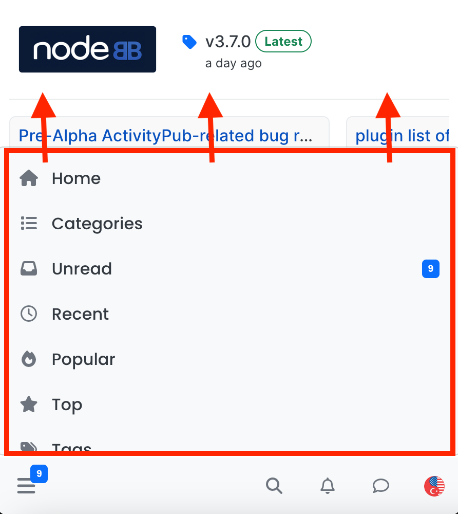
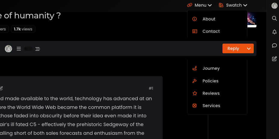
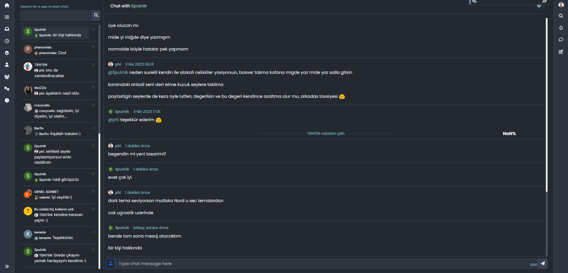
navigation bar is misplaced when the window gets smaller
-
I have the same things for the navbar when I have a lot of icons on the left.
the solution I found is to move the icons of the navbar to the left to have more room when you click on the search button and no longer have this rather annoying phenomenon
/*left*/
@media (min-width: 768px) {
.container-fluid>.navbar-collapse, .container-fluid>.navbar-header, .container>.navbar-collapse, .container>.navbar-header {
    margin-right: 0;
    margin-left: -40px;
}
}

/*right*/
@media (min-width: 768px) {
.navbar-right {
    float: right!important;
    margin-right: -45px;
}
}
PW and WS Spirit alive
-
@phenomlab additionally, “mark all read” option at the bottom of the notification panel looks completely white and not visible, FYI…
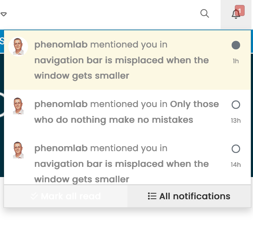
@crazycells said in navigation bar is misplaced when the window gets smaller:
@phenomlab additionally, “mark all read” option at the bottom of the notification panel looks completely white and not visible, FYI…
This has been fixed

Mark Cutting also advises organisations as a Fractional CIO, Fractional CISO and Executive Advisor, helping boards improve technology governance, cyber resilience and executive decision making. Learn more at Phenomlab Ltd
-
Hi @phenomlab ,
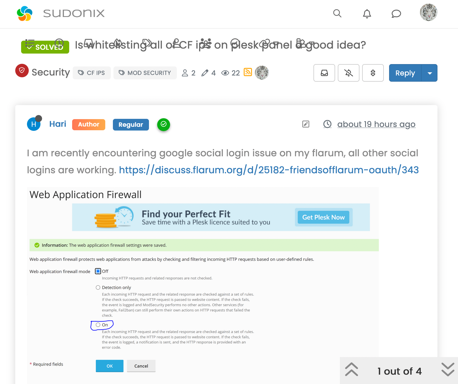
when I shrink the window, the navigation menu items are misplaced and overlap with the topic title.
@crazycells said in navigation bar is misplaced when the window gets smaller:
Hi @phenomlab ,
when I shrink the window, the navigation menu items are misplaced and overlap with the topic title.
This should also be fixed. In fact, a much cleaner way to do this is to remove the
floaton thenavbarclass@media (min-width: 992px) and (max-width: 1199px) { .navbar-nav { float: none; margin: 0; } } -
 undefined phenomlab has marked this topic as solved on
-
@crazycells said in navigation bar is misplaced when the window gets smaller:
@phenomlab additionally, “mark all read” option at the bottom of the notification panel looks completely white and not visible, FYI…
This has been fixed
@phenomlab I think the bug is still there, when I shrink the window or when I click the search button, the navigation bar icons are still overlapping with the title.

-
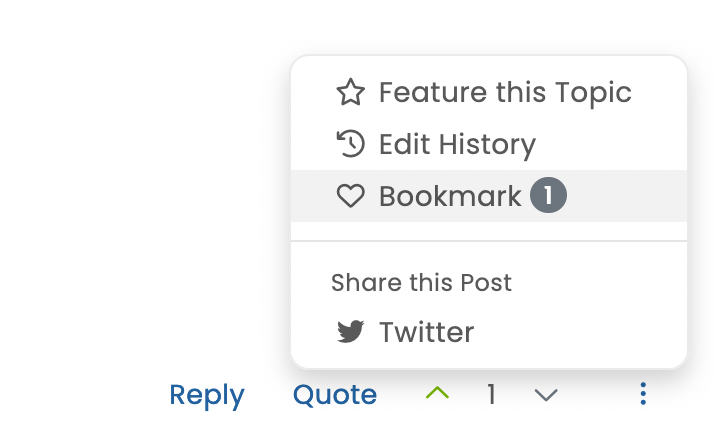
additionally, the bookmark function is working but it is not filling the heart button… I think it should turn to a dark heart from a light heart to indicate that it is bookmarked… this is how I can see the difference.
-
@phenomlab I think the bug is still there, when I shrink the window or when I click the search button, the navigation bar icons are still overlapping with the title.
@crazycells What screen size is this ? The removal of
floathappens at 992pxMark Cutting also advises organisations as a Fractional CIO, Fractional CISO and Executive Advisor, helping boards improve technology governance, cyber resilience and executive decision making. Learn more at Phenomlab Ltd
-
additionally, the bookmark function is working but it is not filling the heart button… I think it should turn to a dark heart from a light heart to indicate that it is bookmarked… this is how I can see the difference.
@crazycells said in navigation bar is misplaced when the window gets smaller:
additionally, the bookmark function is working but it is not filling the heart button… I think it should turn to a dark heart from a light heart to indicate that it is bookmarked… this is how I can see the difference.
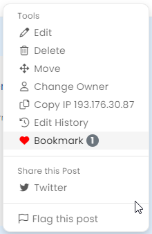
fixed

-
@crazycells What screen size is this ? The removal of
floathappens at 992px@phenomlab said in navigation bar is misplaced when the window gets smaller:
@crazycells What screen size is this ? The removal of
floathappens at 992pxfrom ~787 to ~1000 px …
below ~787 px , it goes to the mobile view…
-
@phenomlab said in navigation bar is misplaced when the window gets smaller:
@crazycells What screen size is this ? The removal of
floathappens at 992pxfrom ~787 to ~1000 px …
below ~787 px , it goes to the mobile view…
@crazycells I’ll have another look at this.
-
undefined phenomlab has marked this topic as unsolved on
-
@crazycells this should be resolved now. I’ve had to adjust the
breakpointsin Bootstrap (version 3 which NodeBB uses) to accommodate this, and it’ll fire at anything below1199px(1000 just looks odd…)Here’s the modified CSS in case you want it
@media (max-width: 1199px) {
  .navbar-header {
      float: none;
  }
  .navbar-left,.navbar-right {
      float: none !important;
  }
  .navbar-toggle {
      display: block;
  }
  .navbar-collapse {
      border-top: 1px solid transparent;
      box-shadow: inset 0 1px 0 rgba(255,255,255,0.1);
  }
  .navbar-fixed-top {
      top: 0;
      border-width: 0 0 1px;
  }
  .navbar-collapse.collapse {
      display: none!important;
  }
  .navbar-nav {
      float: none!important;
      margin-top: 7.5px;
  }
  .navbar-nav>li {
      float: none;
  }
  .navbar-nav>li>a {
      padding-top: 10px;
      padding-bottom: 10px;
  }
  .collapse.in{
      display:block !important;
  }
  div#nav-dropdown {
    display: none;
}
 .visible-xs-block, .visible-xs-inline, .visible-xs-inline-block {
    display: initial !important;
}
.container-fluid>.navbar-collapse, .container-fluid>.navbar-header, .container>.navbar-collapse, .container>.navbar-header {
    margin-right: -15px !important;
    margin-left: -15px !important;
}
.account .cover {
    background-size: auto;
    background-color: var(--breadcrumb);
    height: 150px;
}
.account .cover .avatar-wrapper {
    top: 80px;
    margin-top: 39px !important;
}
}
Note that there may be other elements that will require adjustment.
Try it out and let me know, but I think this resolves the problem.
NOTE: I’m using
varin CSS, so you may want to either remove this line, or replace it with something elsebackground-color: var(--breadcrumb); -
undefined phenomlab has marked this topic as solved on
-
I have the same things for the navbar when I have a lot of icons on the left.
the solution I found is to move the icons of the navbar to the left to have more room when you click on the search button and no longer have this rather annoying phenomenon
/*left*/ @media (min-width: 768px) { .container-fluid>.navbar-collapse, .container-fluid>.navbar-header, .container>.navbar-collapse, .container>.navbar-header { margin-right: 0; margin-left: -40px; } } /*right*/ @media (min-width: 768px) { .navbar-right { float: right!important; margin-right: -45px; } }@DownPW said in navigation bar is misplaced when the window gets smaller:
the solution I found is to move the icons of the navbar to the left to have more room when you click on the search button
I think perhaps the solution I posted is more elegant - that way, you don’t have to worry about elements shifting when you resize - just a thought
-
I always have the same problem when I click on the search button with your code. So I keep mine and add yours for the problem of window redimmension
PW and WS Spirit alive
-
I always have the same problem when I click on the search button with your code. So I keep mine and add yours for the problem of window redimmension
@DownPW sounds good.


Hello! It looks like you're interested in this conversation, but you don't have an account yet.
Getting fed up of having to scroll through the same posts each visit? When you register for an account, you'll always come back to exactly where you were before, and choose to be notified of new replies (either via email, or push notification). You'll also be able to save bookmarks and upvote posts to show your appreciation to other community members.
With your input, this post could be even better 💗
Register Login